You are using an out of date browser. It may not display this or other websites correctly.
You should upgrade or use an alternative browser.
You should upgrade or use an alternative browser.
Toronto The Well | 174.03m | 46s | RioCan | Hariri Pontarini
- Thread starter yyzer
- Start date
Red Mars
Senior Member
Sun Sep 6, 2020

Rascacielo
Senior Member
Today


Red Mars
Senior Member
Pics from the weekend.


WislaHD
Superstar
It's really shaping up now.
condovo
Senior Member
The Structural Expressionism here looks paper-thin and clumsy. Combined with the late-90s/early-2000s green glass, this is shaping up to be a big disappointment. It's been value-engineered into oblivion.
3Dementia
Senior Member
The only green glass I see is on the podium, and though a lousy choice, exactly what the renders promised. I see the building as clad in a sorta metallic blue in most shots, though sometimes it does take on an aqua leaning to emerald hue (but not the traditional "green" whine much-celebrated for decades).
smably
Senior Member
To my eye, the tower glass doesn't seem vastly different from the much-praised CIBC Square glass. Both blue and reflective, with a greener tint when the sun hits it at certain angles. (Though CIBC's diamonds are definitely a lot more successful than the pasted-on cross-bracing here.)
Lachlan Holmes
Active Member
From my perspective, it's just okay so far. On its own, the tower does look pretty good despite the glass and the ornamental cross-bracing. However, when you add in the podium, which is the same slightly greenish glass, it becomes unrelenting and just too much to bear. This project *really* needed the podium to contrast with the tower more to avoid the perception of it being a big blob of acceptable if unimpressive glass. It is a great shame that the orange fins on the podium floors did not make it to fruition, I think they would've provided the necessary contrast.
I am hoping the classical-inspired podiums of the two westerly towers will balance out the monotony seen so far.
I am hoping the classical-inspired podiums of the two westerly towers will balance out the monotony seen so far.
3Dementia
Senior Member
I agree about the podium. Even some narrow repeating black brick frames (married to the superior blue curtainwall used above) would reference the 'historic' podium look to the west.
chuckles
New Member
The cross-bracing motif reminds me of the Kinex set I had as a kid. It's fun, but with pretty limited structural utility.
AlvinofDiaspar
Moderator
The cross-bracing motif reminds me of the Kinex set I had as a kid. It's fun, but with pretty limited structural utility.
It has none - the brace is fake and is there purely as adornment (faux-Structural Expressionist).
The podium is the truly unfortunate part here - a vast expanse of mediocre glass that is such Cheapening.
AoD
karledice
Active Member
Those red fins on the podium are still coming I thinkFrom my perspective, it's just okay so far. On it's own, the tower does look pretty good despite the glass and the ornamental cross-bracing. However, when you add in the podium, which is the same slightly greenish glass, it becomes unrelenting and just too much to bear. This project *really* needed the podium to contrast with the tower more to avoid the perception of it being a big blob of acceptable if unimpressive glass. It is a great shame that the orange fins on the podium floors did not make it to fruition, I think they would've provided the necessary contrast.
I am hoping the classical-inspired podiums of the two westerly towers will balance out the monotony seen so far.
It's on the 2nd level of the podium which is just bare concrete now and they'll probably finish last as there's tons of construction equipment and people on the ground floor
Lachlan Holmes
Active Member
I was talking about the fins from earlier renderings which had them going all the way up the curtain wall podium. The fins on the second floor are a consolation prize for the grade level but I don't think they'll have an impact on improving the contrast between the podium and the tower.Those red fins on the podium are still coming I think
It's on the 2nd level of the podium which is just bare concrete now and they'll probably finish last as there's tons of construction equipment and people on the ground floor
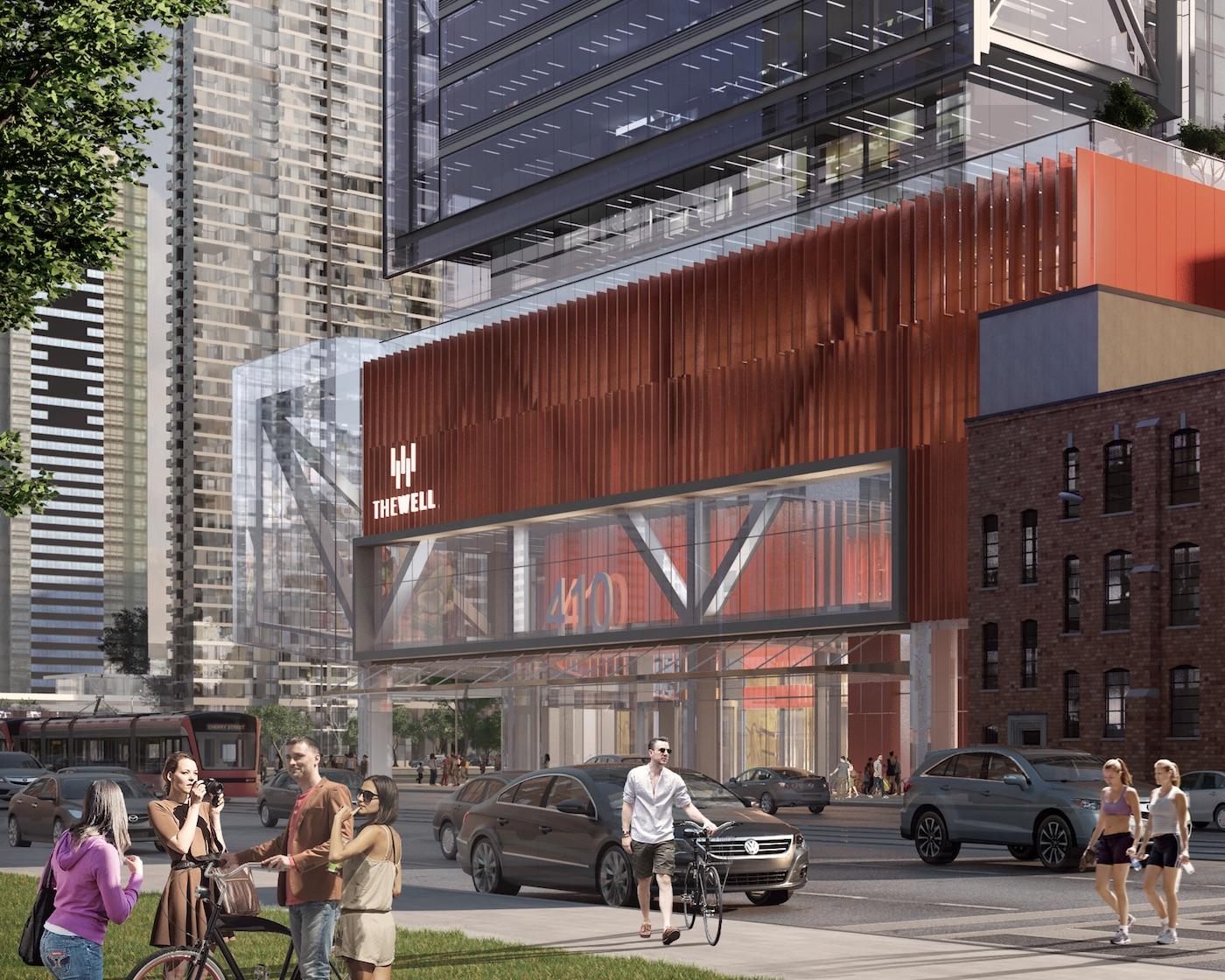
(render from the database)
3Dementia
Senior Member
^ Those fins look to be on the east or west elevation... with some red panels on the right side of the render (north?).