Toronto Union Station Revitalization | ?m | ?s | City of Toronto | NORR

New signange in the Great Hall at the entrances to each concourse. Here’s York:
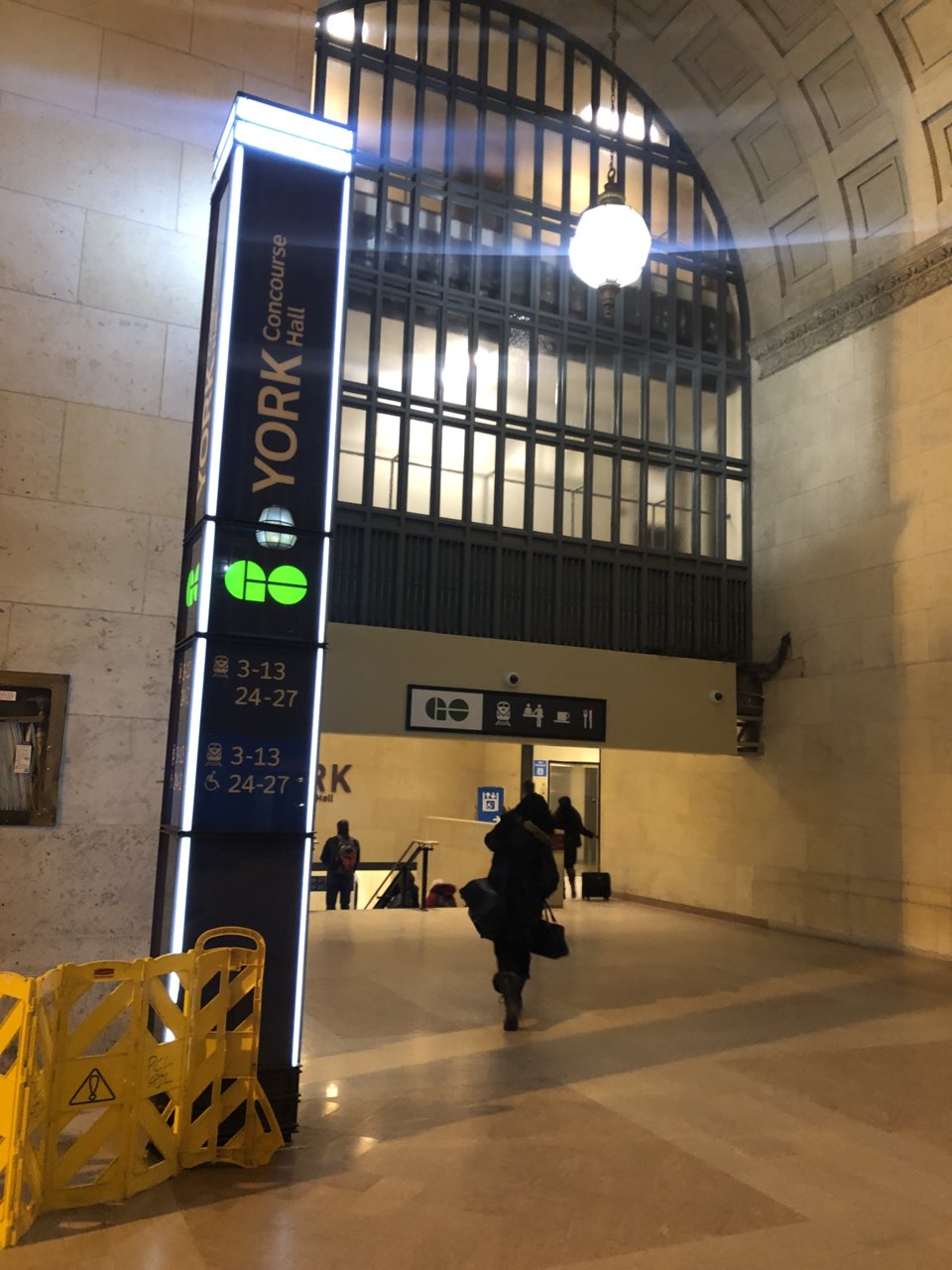
338CF4CF-6D13-4583-9FAB-710FED843C05.jpeg


Also, note that they appear to be disassembling the crossbeam. I’ve always thought that was too low. Now, I can see that almost a half of it doesn’t have to be that low. I’ve had my fingers crossed that this was temporary. Looks like it is.
 
^ More of the same meaningless schematic mumbo-jumbo. It's a damn good thing that (Entro?) http://entro.com/project/unionstation/ don't do highway signs. We'd never get to where we were going.

Here's an example of where they got it right:
1548517225840.png


http://entro.com/project/unionstation/

Perhaps it's a conspiracy to get people inside, and then purposely confuse them to the point that they can never leave?
 
New signange in the Great Hall at the entrances to each concourse. Here’s York:

View attachment 172217

Also, note that they appear to be disassembling the crossbeam. I’ve always thought that was too low. Now, I can see that almost a half of it doesn’t have to be that low. I’ve had my fingers crossed that this was temporary. Looks like it is.
Where are the other ones didn’t you say all the concourses
 
What gets me is that they didn't think to add a panel for the Food Court to the wayfinding sign.

Kind of a big feature of the York Concourse... and it's not advertised anywhere.
What gets me is that they didn't think to add a panel for the Food Court to the wayfinding sign.

Kind of a big feature of the York Concourse... and it's not advertised anywhere.
People seem to find it easily enough, it was packed earlier this afternoon.
 
All these transit agencies are so concerned about making their logos visible on these signs. Even if their logos should be displayed it should be smaller and not be as prominent.
 
What gets me is that they didn't think to add a panel for the Food Court to the wayfinding sign.

Kind of a big feature of the York Concourse... and it's not advertised anywhere.
There is a small knife and fork. and is that a coffee cup?
MTO allows the actual restaurant logos to be used.
https://www.google.ca/maps/@43.9649...4!1sY5xYssataV1LbBVSgni7TA!2e0!7i13312!8i6656
All these transit agencies are so concerned about making their logos visible on these signs. Even if their logos should be displayed it should be smaller and not be as prominent.
The GO takes up about 40% of the sign area.
 
Also, note that they appear to be disassembling the crossbeam. I’ve always thought that was too low. Now, I can see that almost a half of it doesn’t have to be that low. I’ve had my fingers crossed that this was temporary. Looks like it is.
The crossbeam? Are you talking about the part of your pic that stretches across below the window but above the escalator, and has that GO signage on it?
Yeah that always looked kind of ramshackle to me. when the Harvey's was there, wasn't it a decorative sort of ironwork stretching across there? With a matching decoration on the opposite side of the great hall (in all 4 corners?)?

EDIT: Ah, this is what I meant. Not ironwork, but looks better than the drywall. http://urbantoronto.ca/news/2011/01...architects-and-zeidler-partnership-architects
 
Last edited:
What gets me is that they didn't think to add a panel for the Food Court to the wayfinding sign.

Kind of a big feature of the York Concourse... and it's not advertised anywhere.

Good . We don't any more revolting slobs stuffing their faces and stinking up the train with their steaming takeout slop.
 
Good . We don't any more revolting slobs stuffing their faces and stinking up the train with their steaming takeout slop.
lol what trains are you riding.
I rarely see people eating on the GO, and when they do, it's usually not particularly pungent. Or steaming. And they usually don't look like slobs.
 
The crossbeam? Are you talking about the part of your pic that stretches across below the window but above the escalator, and has that GO signage on it?
Yeah that always looked kind of ramshackle to me. when the Harvey's was there, wasn't it a decorative sort of ironwork stretching across there? With a matching decoration on the opposite side of the great hall (in all 4 corners?)?

EDIT: Ah, this is what I meant. Not ironwork, but looks better than the drywall. http://urbantoronto.ca/news/2011/01...architects-and-zeidler-partnership-architects

Yes. I think that was put in storage. The other side of the great hall was taken off and restored. I’m guessing they’ll do the same here. Still, feels really low. I can touch it with my arm outreached.
 

Back
Top