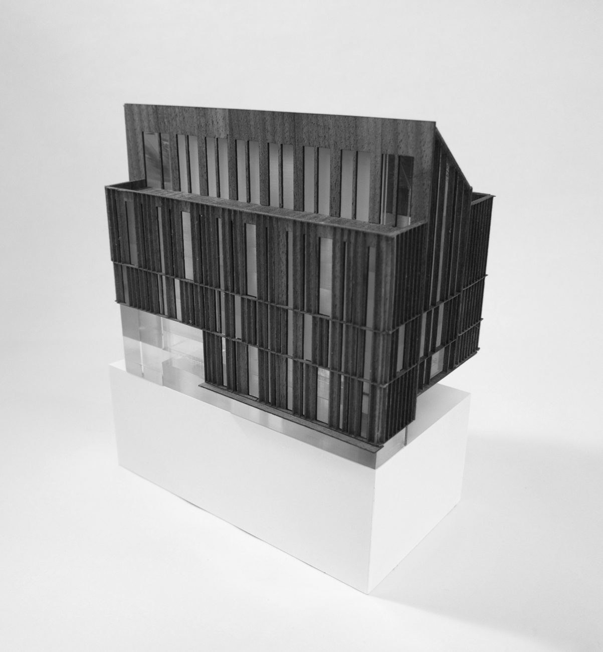
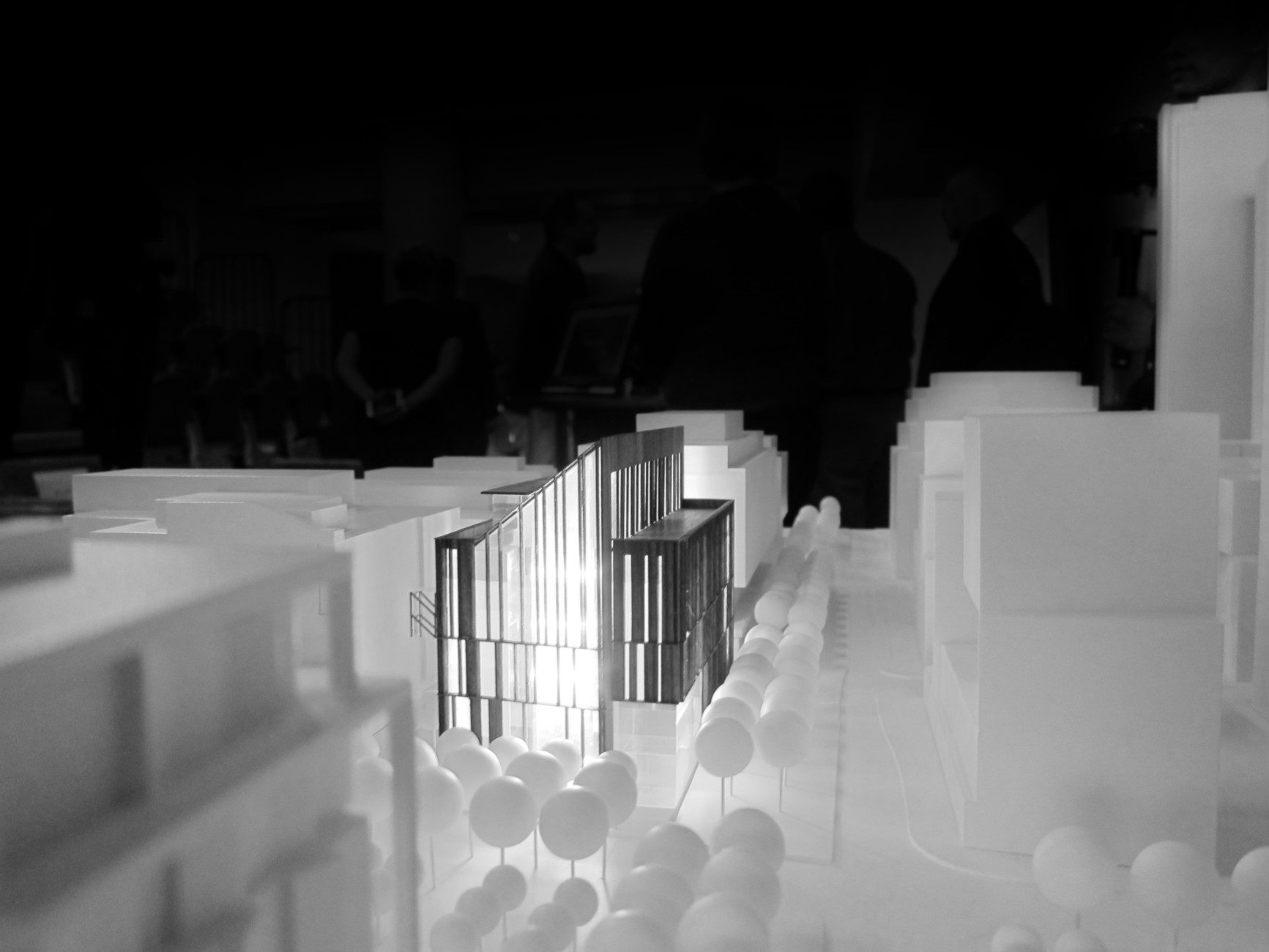
Toronto George Brown College: Limberlost Place | 52.5m | 10s | George Brown | Moriyama Teshima Architects

Which of the four finalist design teams' concept do you prefer?

  • Moriyama & Teshima Architects + Acton Ostry Architects

  • Patkau Architects + MJMA

  • Provencher Roy + Turner Fleischer

  • Shigeru Ban + Brook McIlroy


Results are only viewable after voting.
I'm very happy M+T won, and also would've been very happy if Shigeru had won, and I think it's undoubtedly a net positive for the waterfront.

I have some doubts about whether the Shigeru Ban proposal could be built as is - hard to imagine education budgets allow for curved glazing.

AoD
 
Even though it was my least favourite, I still think we are getting a strong design. Before seeing any of them I wanted to like Shigeru Ban because of the name, and it was indeed striking but I think a different site would be better suited for a different site. I thought Provencher Roy got an unfair amount of flak, those multilevel interior spaces seem like they would have been quite something - wish that were the Waterfront Innovation Centre.
 
I mean, to each his or her own, of course, but I find this far more visually striking than the Shigeru proposal, which I also liked. I certainly don't think it's fair to assert that everyone agrees with your disagreement on that front -- I don't think it is conservative at all, I don't think it looks remotely like either 1 Spadina Crescent or the proposed Waterfront "Innovation" Centre, and I thought the protrusion on the Shigeru building was random and tacked on to the detriment of the building's overall effect. And I think it's similarly unfair to criticize the M+T proposal by saying "remove the pointed roofline" -- one could levy the same criticism of literally any building ("if you remove the box and stilts, the OCAD addition is nonexistent!").

It's also simply untrue that Toronto is devoid of striking, non-rectilinear design, even if many of us want more of it (myself included), and your mention of the WTC is quizzical given that it was one of the ultimate odes to restrained simplicity, which you bemoan in the Toronto setting.

I'm very happy M+T won, and also would've been very happy if Shigeru had won, and I think it's undoubtedly a net positive for the waterfront.
I never implied that everyone agrees with me. I made it known that I was merely expressing my opinion. As for 1 Spadina Crescent: I was alluding to the similar geometry. The finer details, obviously, are quite different.

I never said that the winning proposal looks like the Innovation Centre (which everyone on here seems to loathe) rather, I don’t think it is really that much of an upgrade, though it is certainly more finely articulated.

I actually think said protrusion on the Shigeru Ban proposal enhanced its design and presence, broke it up the monotony (not that the building would have been boring without it) and provided additional visual interest. It had a bizarre, unorthodox playfulness that I admired. I thought it was a really creative, ingenious idea, both artistically and with respect to utility.

Re the protruding roofline on the winning proposal: I don’t think that even by its inclusion it makes the building all that visually appealing. I don’t think I would feel very much difference in my outlook with the inclusion of said protrusion or its omission. I don’t think it is enough to make the building stand out.

“It's also simply untrue that Toronto is devoid of striking, non-rectilinear design, even if many of us want more of it (myself included), and your mention of the WTC is quizzical given that it was one of the ultimate odes to restrained simplicity, which you bemoan in the Toronto setting.“

I never said Toronto is devoid of “striking, non-rectilinear design.” That just tends to be the modus operandi for how we have approached architectural design in Toronto for the last several decades. Even the lionized City Hall has lovely curves. Modernism can be simple, yet still have sinuous lines. The overuse of rigid, straight lines creates a harsh, urban landscape. One can achieve so much more — architecturally speaking — when they embrace a more organic philosophy.

My reference to the World Trade Center addressed the window arches, specifically, which had a light, flowing, graceful rhythm. I thought Shigeru Ban’s windows by the main entrance beckoned the twin towers, in that respect. See here:

https://www.archdaily.com/504682/ad...yamasaki-associates-emery-roth-and-sons-photo

I don’t dislike modernism. You’re projecting a lot. I like it quite a bit. My favourite firm in the city is probably Shim-Sutcliffe; but even they use curves in their neomodernist structures sometimes (Integral House; Sisters of St. Joseph). I simply would like to see us move on from it and be more bold and unpredictable with future projects. Too much of one thing becomes dissatisfying.
 
Last edited:
I simply would like to see us move on from it and be more bold and unpredictable with future projects. Too much of one thing becomes dissatisfying.

I'm totally with you on each of these assertions; where we diverge is on the conclusion that the winning proposal achieves those goals. By my eye, this is new ground for the city in terms of design, and new ground for the entire province in terms of materiality and construction at this scale.
 
I'm quite surprised to see such a strong reaction to the winning design. It was my favourite, and seems to be more feasible (within the budget) than the Shigeru Ban design.

Also, what's with Provencher Roy winning the poll on this thread? I thought it was the weakest by far.
 
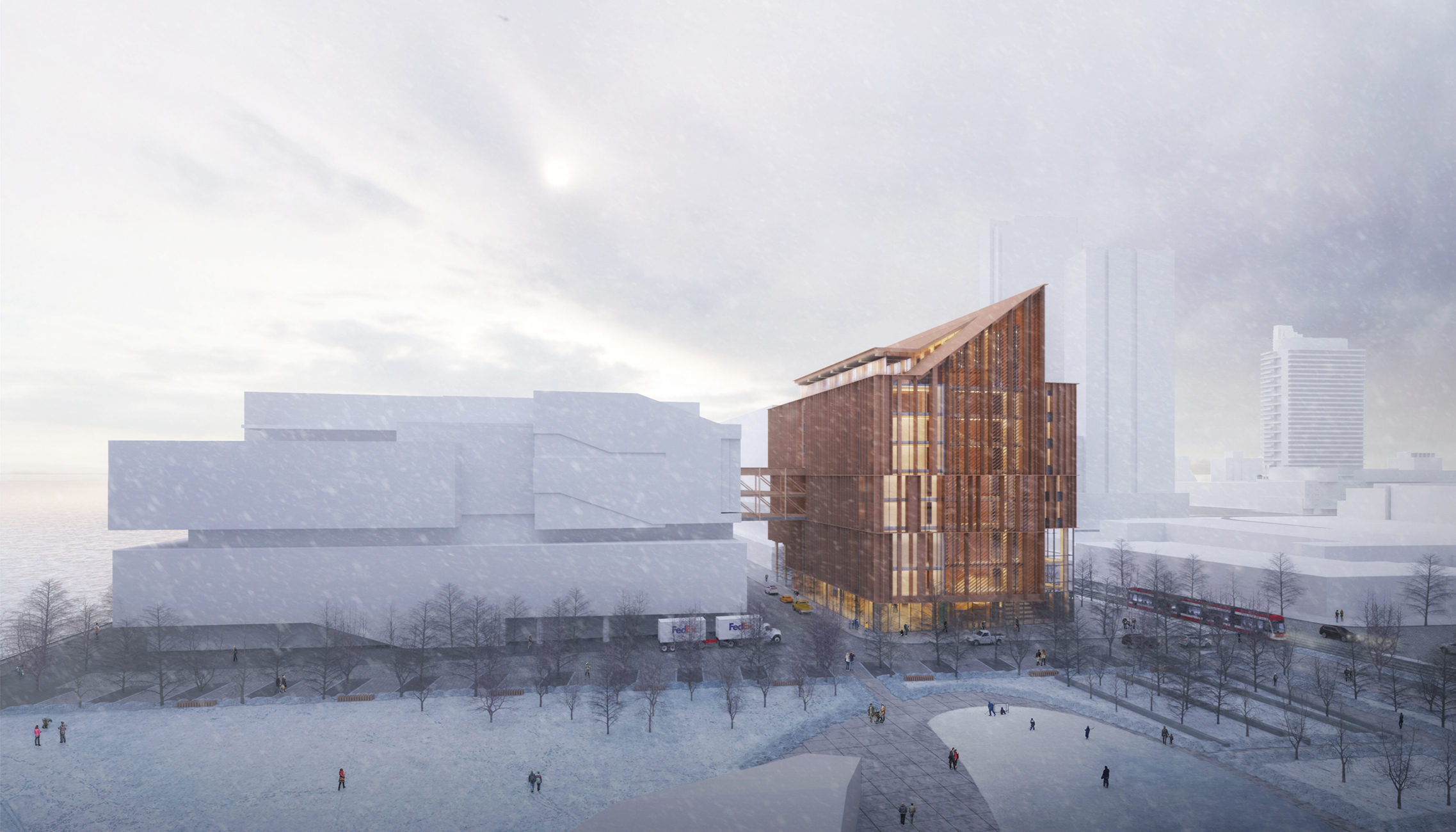
01a-IMAGE4-2275x1300.jpg
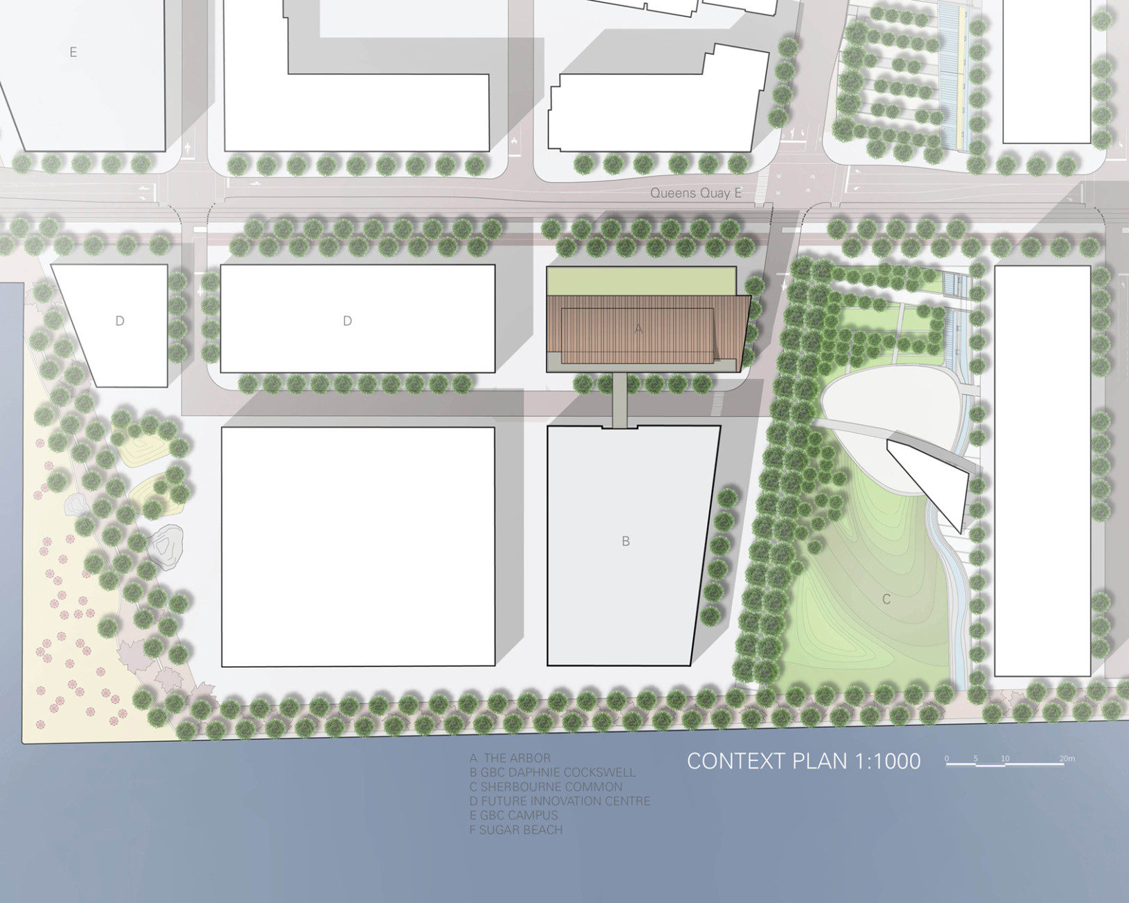
02-ContextPlan-1624x1300.jpg
IMAGE1-1946x1300.jpg
IMAGE2-1946x1300.jpg
IMAGE3.jpg
06a-stair-1040x1300.jpg
07-ATRIUM-2311x1300.jpg
08-sectional-perspective.jpg
09-Diagrams-1172x1300.jpg
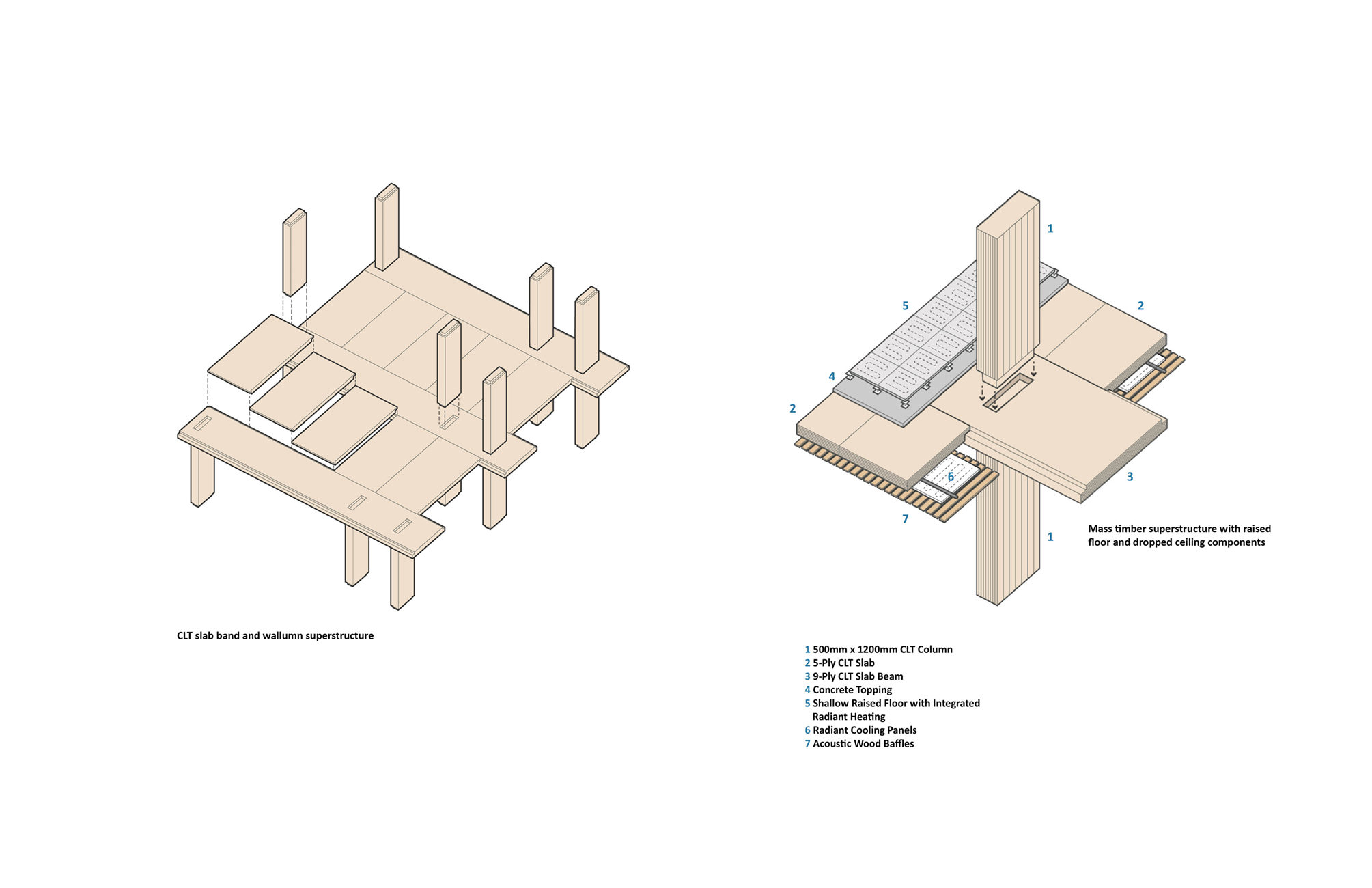
10-GBCC_Exploded-Axo-01-1125x1300.jpg
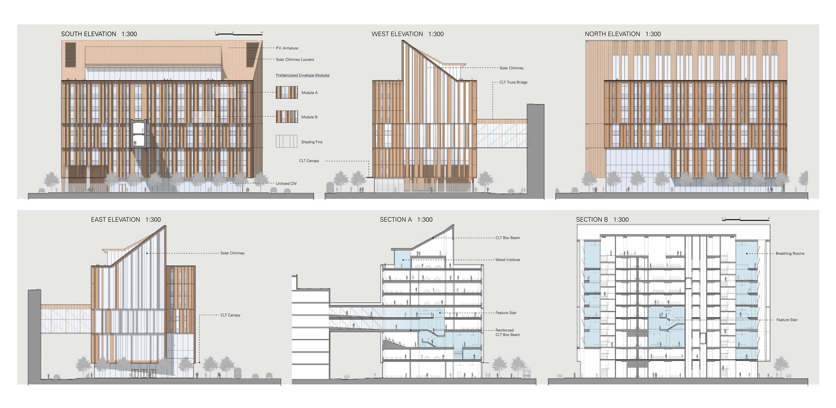
11-Elevations-Sections-2660x1300.jpg
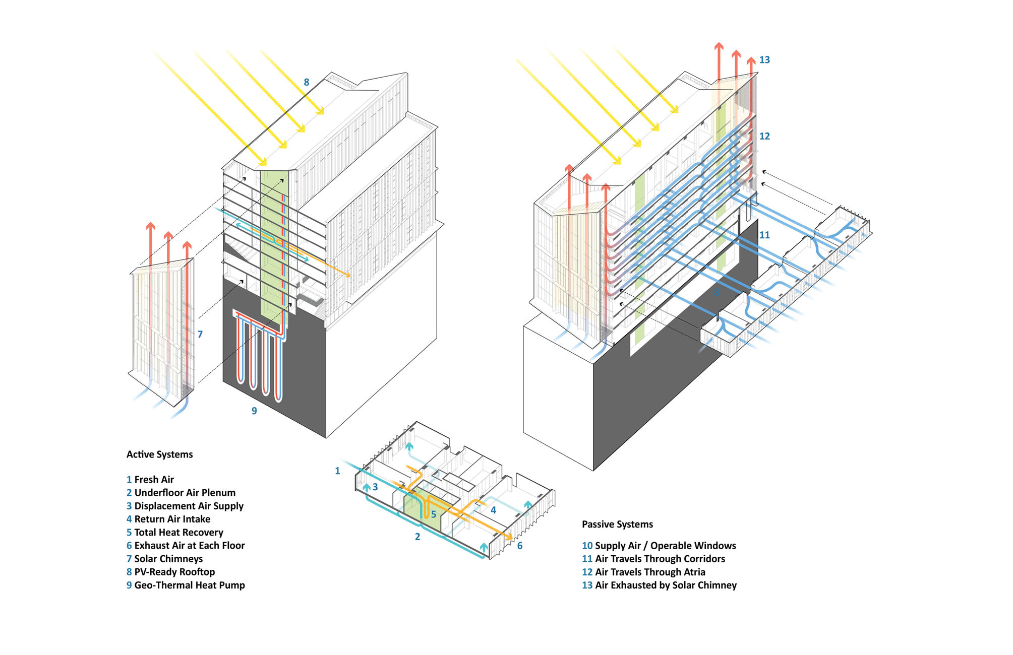
12-Diagrams4-2009x1300.jpg
13-ActivePassive-2009x1300.jpg
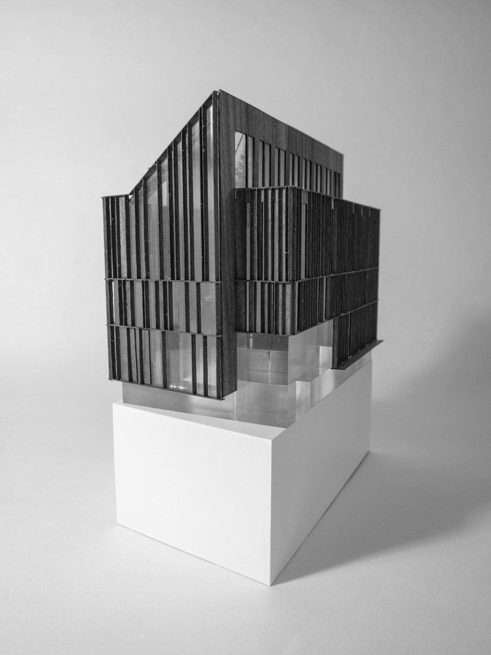
14-IMG_7419-BW-975x1300.jpg
15-IMG_7407-1203x1300.jpg
Model-In-Site-1733x1300.jpg
 
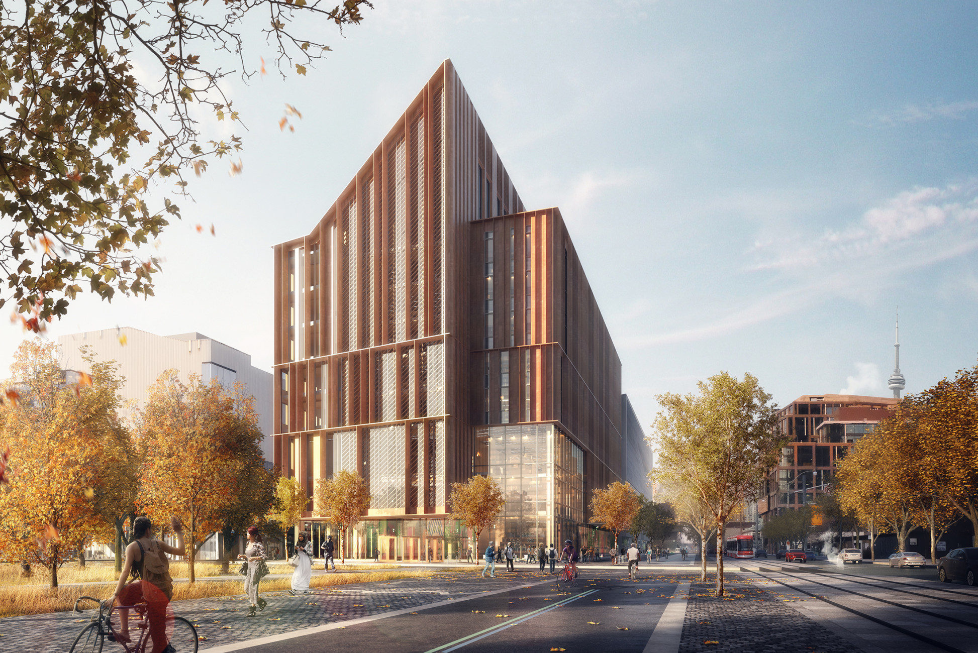
This looks somewhat similar (see link). My contention has more to do with the standard, minimalist, straight line approach to design in this city; where any deviation from that is often called ‘too busy.’ There seems to be an obsessive, unrelenting tendency toward this ‘less is more’ design philosophy, and it is tiring. Remove the pointed roofline, and this looks like almost any other neomodernist, institutional building in the city that has been built in the last couple of decades. This proposal might have been more practical with respect to its interior spaces (though, we know very little about each proposal’s interior layout). The Shiberu Ban proposal would have been a one-of-a-kind structure in Toronto. Nothing remotely resembles its supple, elegant, organic curves.

It was easily one of the most imaginative buildings this city has ever had the chance of possessing: from the clever Super Mario warp pipe on the roof, to the the tree-like columns and neo gothic window arches at the main entrance (which remind me of the World Trade Center); the large, curved, wooden beams throughout the interior space; the spiral staircase; the honey gold glazing & roof panels, etc. Is the winning proposal (though, certainly more attractive) really that far of a step up from the adjacent Innovation Centre, that has yet to be built? It looks very conservative and still very timid.

A sharp-angled roofline doesn’t really push the envelope, in my opinion. That’s the only really distinctive feature I can see with this design. It doesn’t move me in any way. This could fit into any university or college campus in Canada and not really stand out, in my view. Even to the layman, I think the Shigeru Ban proposal would demand one’s attention and would turn heads. Anyone could appreciate it solely on a visceral level. It would be nice to see this proposal get built somewhere else in the city. It is too good of a design to give up. Unfortunately, that won’t happen.

https://www.google.ca/maps/place/Sp...2!3m1!1s0x882b34c07c298151:0x6d8ea3c7a0056e10

Urban Shocker would have called Shigeru Ban the "big hair" proposal.
 
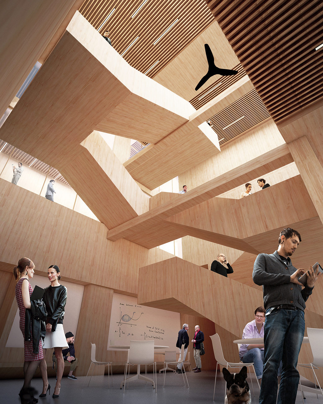
Well, to be honest, the pitched roof of the winning design looks uncomfortably like of a lot of wood beam churches from the sixties when they were building variations on the A frame idea. The third rendering down in the earlier post particularly reminds me of those structures.

But that sounds more negative about the design than I actually feel. In the first place, the all wood construction is both innovative and appropriate for a public institution in a country as dependent on lumbering as we are. As it happens, I worked very close to the Tallwood building of Acton and Ostry on the campus of UBC through much of its construction. It was fascinating to watch and the structural piers of wood were innately attractive, even during the construction phase. It's not an aesthetically stunning structure, being in effect an 18 storey rectangular box. ( But then, how many university residences are architecturally stunning, after all?) It certainly is both attractive and functional, however. The George Brown proposal is a step up in design, IMO.

What cannot be discerned from the renderings, at least to a non architect like me, is effectiveness of the interior design of the building. In a school or college the functionality and beauty of the interior is of primary importance. (I have been in at least one multiple prize winning educational structure that was despised by its users because it simply didn't work.) In an earlier stage of life, my wife worked in Jack Miner Middle School in Guildwood and both of us visited or had meetings in Momiji, the Scarborough home for Japanese Canadian seniors, built with the reparation money for the, well, mistreatment of Japanese residents of BC during WW 2. Both buildings were designed by Moriyama. The first was disastrous for its educational purposes, in my wife's view. But Momiji was lovely, largely because great attention had been lavished on the interior. That was right and proper, of course, because seniors of an advanced age lead an indoors life, for the most part. To me, then, the key questions would have to do with the interior designs of the proposals. I presume the jury weighed those carefully.
 
To me, then, the key questions would have to do with the interior designs of the proposals. I presume the jury weighed those carefully.

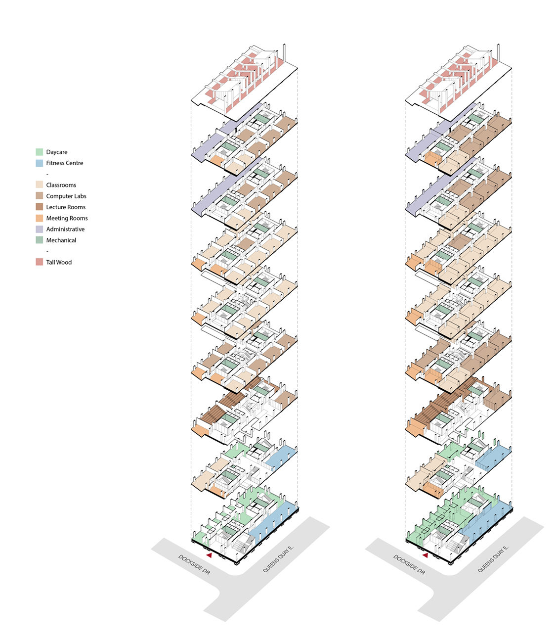
You would think. Looking again at the plans posted above, I am flabbergasted by the Jury's decision. Two rows of double loaded corridors on virtually all floors? Are they for real? Next to Patkau's full height atrium, Shigeru's spiral stair, and even PR's terraced interior, the winning scheme easily has the weakest layout in terms of function and beauty.
 
Next to Patkau's full height atrium, Shigeru's spiral stair, and even PR's terraced interior, the winning scheme easily has the weakest layout in terms of function and beauty.

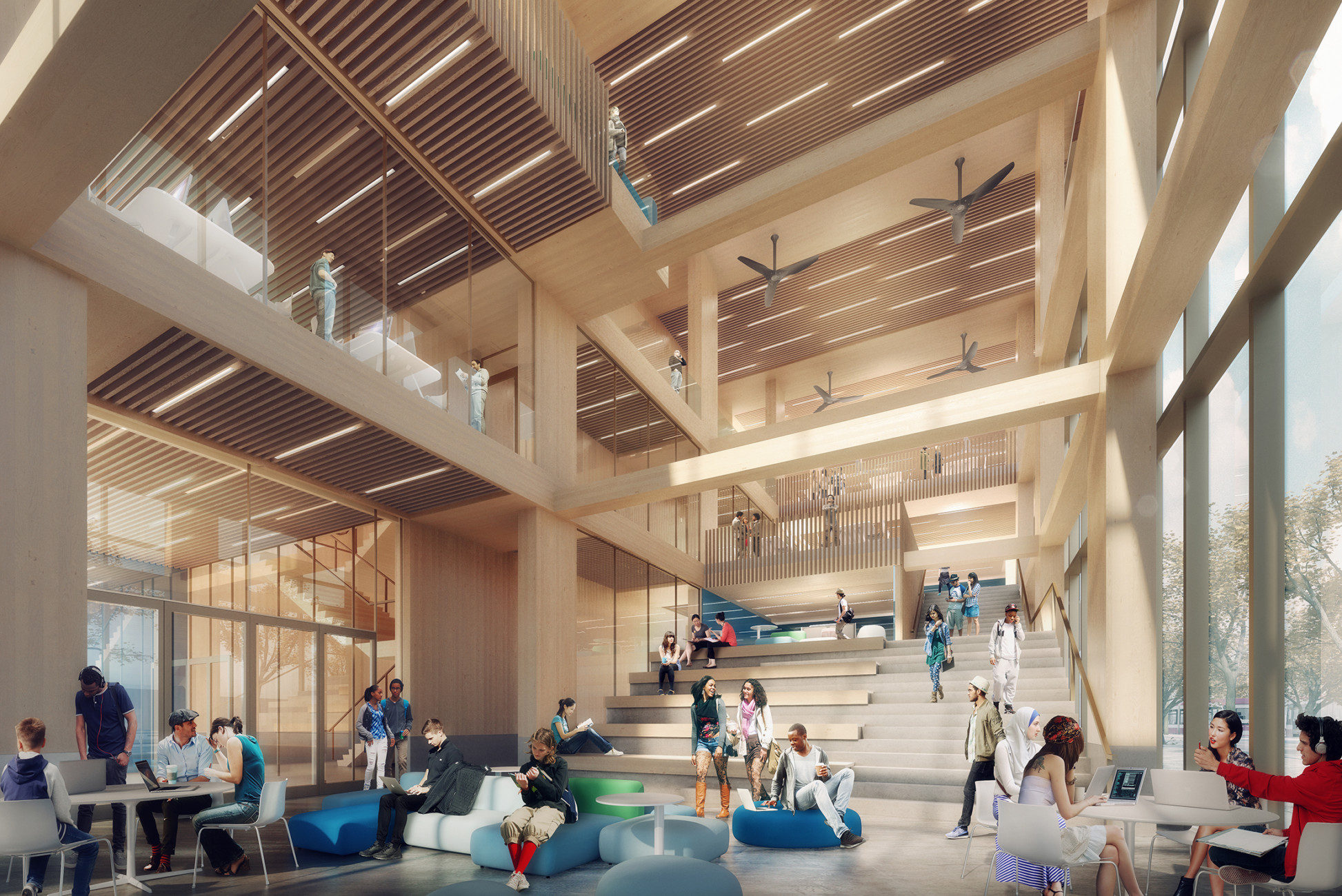
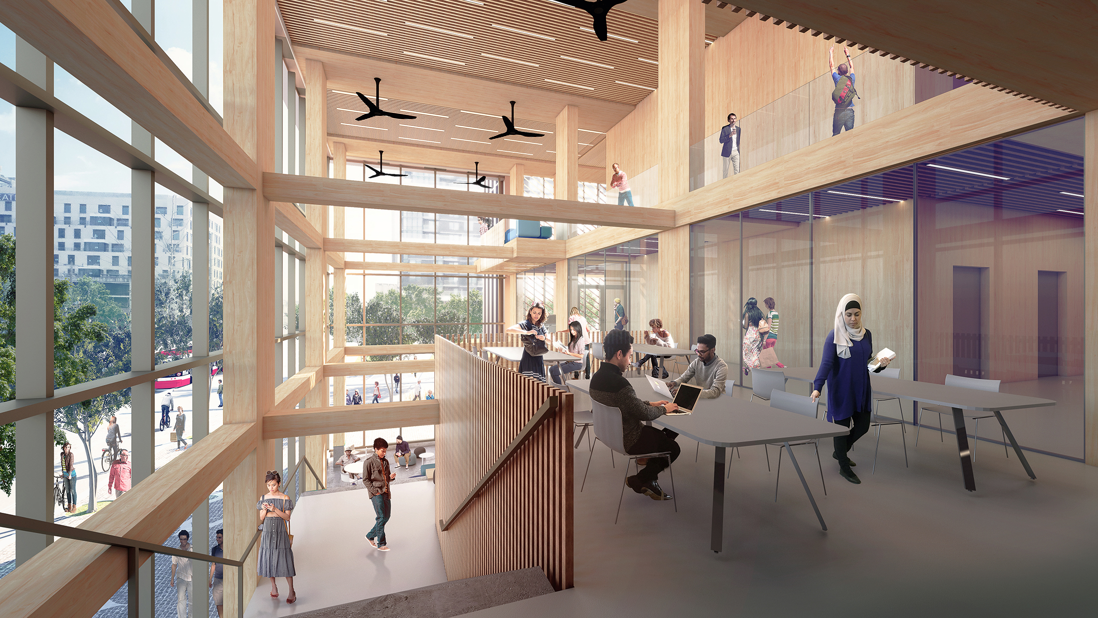
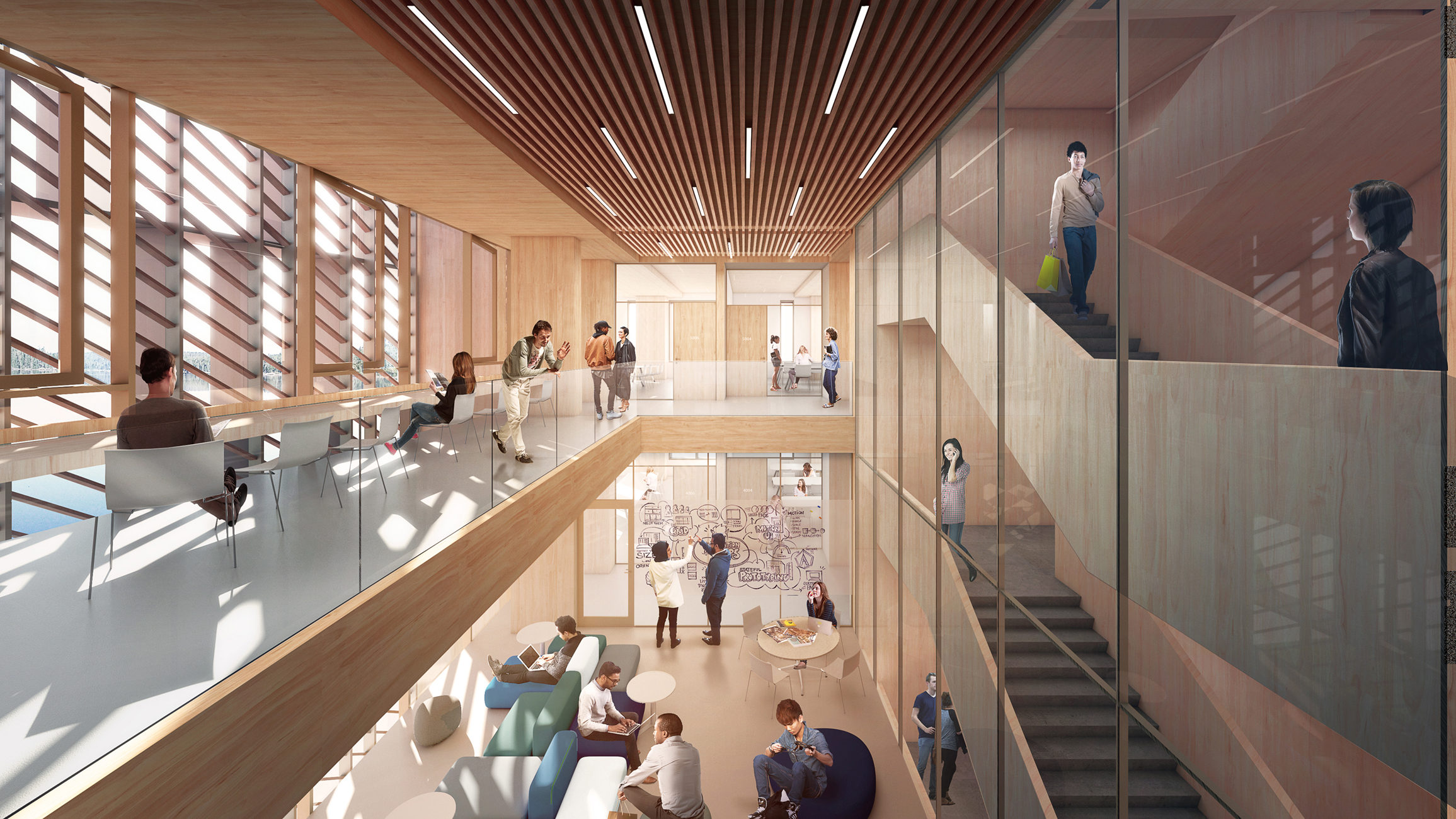
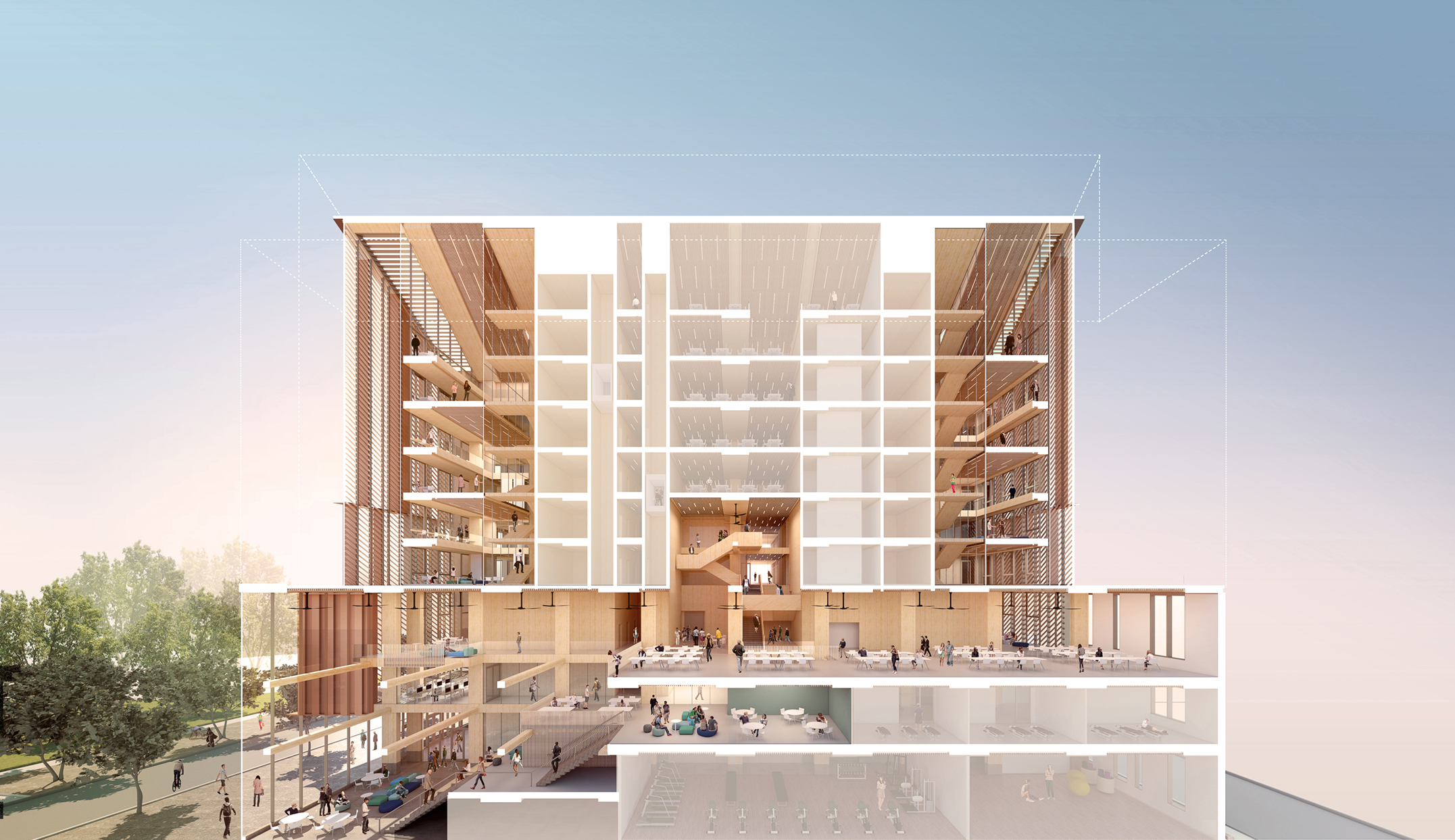
Atriums are the easy way out in terms of creating an interesting building in section. The double-height "Breathing rooms" of the winning entry are very strong, and functional too. They serve as smaller atrium type spaces but are also a space of respite in a way that a busy atrium can never be.

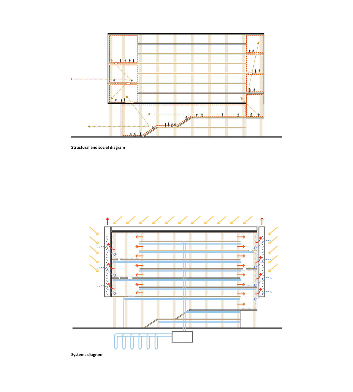
In terms of function, the winning proposal as not the weakest; the 3-bar approach allows flexible room sizes along the length of each bar, while still having the breathing room spaces at each end to create an interesting experience in section. Look at the sectional perspective of the project, above - there are lots of different types of spaces beyond just the double-loaded corridors.

You can argue that subjectively, you feel it's not as beautiful for a building to lack an atrium, but the idea that an atrium adds functionality doesn't make sense to me. I would argue that while I expected the jury to be partial to a building with a full-height atrium, they injected a ton of functionality and useable space to each floor, while the entry-level spaces and breathing rooms on each floor create interesting double-height spaces that are ultimately more functional anyway because of their semi-secluded nature; a space of respite.

A typical full-height atrium that cuts through every floor, eating up space and transferring noise? I don't find that functional, and it's certainly not creative or groundbreaking. Atriums can be done well but I don't think every new institutional building needs one, and the Breathing Room spaces will introduce double-height spaces but also provide respite that students need - a more functional take on an atrium space.
 
Last edited:
The pitched roof is the only feature that gives the winning design some character. It's a disappointing choice of a winner, but it reflects our conservatism in what we build in this city. Shigeru Ban's design had this "for the love of architecture" quality that's missing in most of our buildings--the desire to do things differently, to have fun and to innovate, and yet still build functional and practical buildings.

Even with a design competition, the winning design isn't that much different from the widely criticized Waterfront Innovation Centre with its boxy minimalism. Its pitched roof is its only point of departure from the ordinary office buildings and condos we see around the city. Instead of making large wood-framed buildings interesting to promote the building code changes, it makes them forgettable.
 
Why do people like the pimple so much?? It's visually striking the way an unwanted zit is. Thank god it isn't getting built!
Ban buildings tend to be a hit or miss, this one is definitely a miss.

And what's with this talk about local architects getting all the jobs? That's rarely the case these days. With projects by 3XN, Ghery, Larsen, Rogers etc it's nice to see a competition award the project based on design than popularity.

I was cheering for Patkau or MTA and I'm glad MTA won!
Very well deserved!
 

Back
Top