cplchanb
Senior Member
I fail to understand what you mean by actually next train displays and referring to the current screens as being garbage. There is a lot of backend tech involved with them. They are cable of provide much more information then the next train being there in five minutes. Like for example if there is a serous delay report it on ALL screens in the stations.
what i mean by garbage is the fact that all this tech as explained above is wasted due to the next stop times being squashed at the bottom corner of the screen. 85% of the onestop display is just ads and things that dont matter inside a subway platform. The things that should be on the display by order of priority are the next train train (or even 2), current time and date. Fine, they got sponsored by whatever company for the tvs but they really got the shaft on this as the most critical piece of info cant be seen clearly more than 10m away. If theyre going to get shafted by a sponsor they might as well make the screen bigger like the one on STM. At least their 10% of the screen is large enough to be read quite legibly.
I really dont get why TTC is so weak in these types of "partnership" deals. Its like they agree on it without much though on the implications.
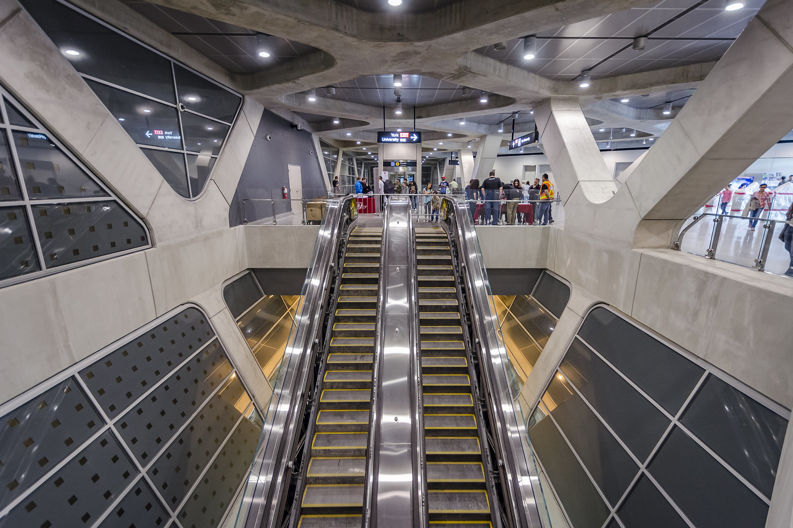
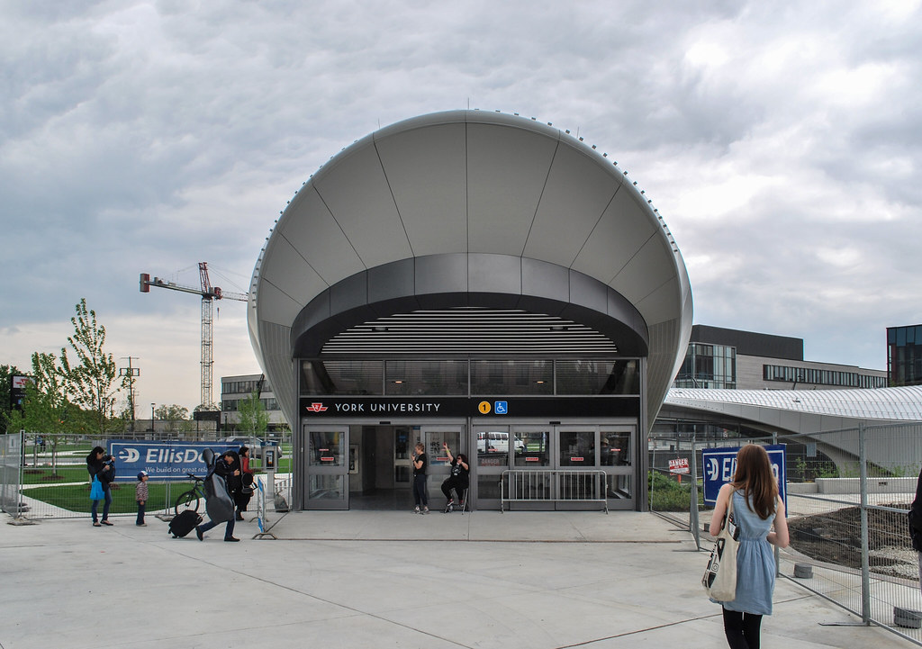 York University Subway
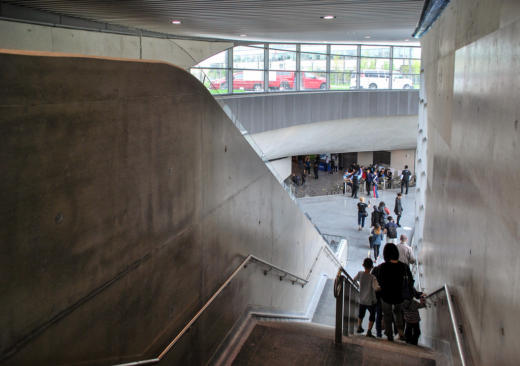 York University Subway
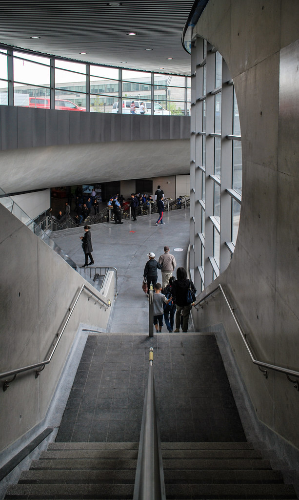 York University Subway
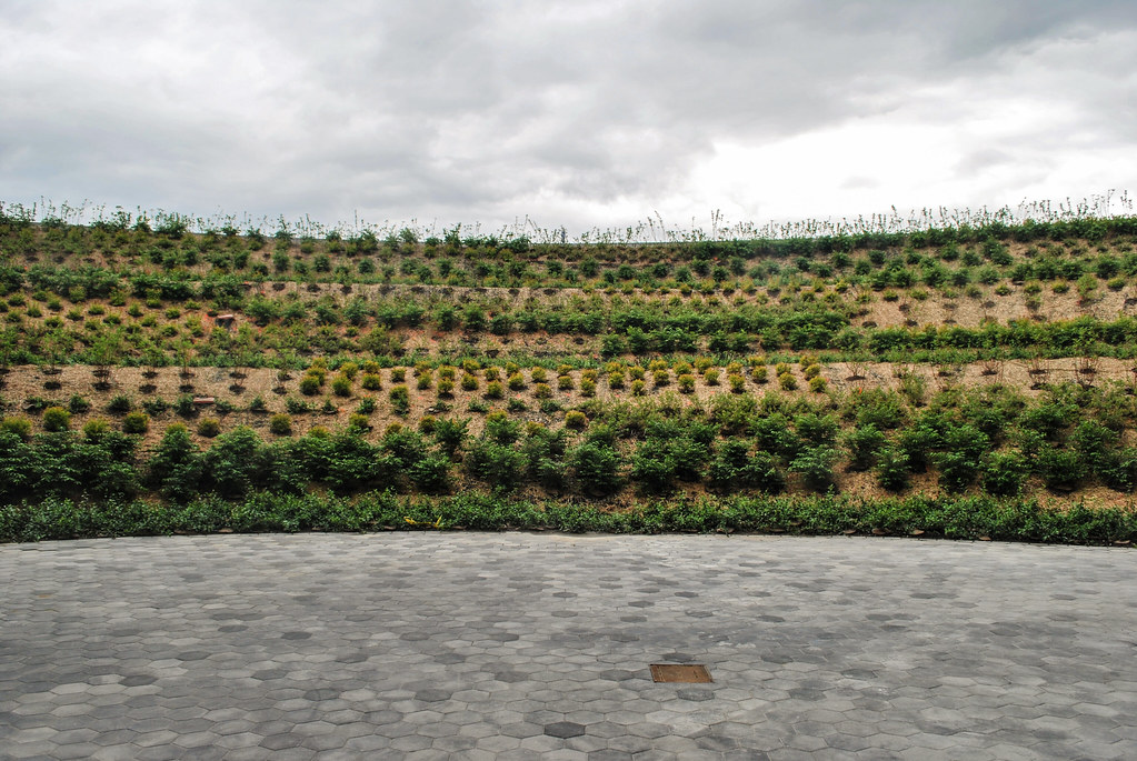 York University Subway
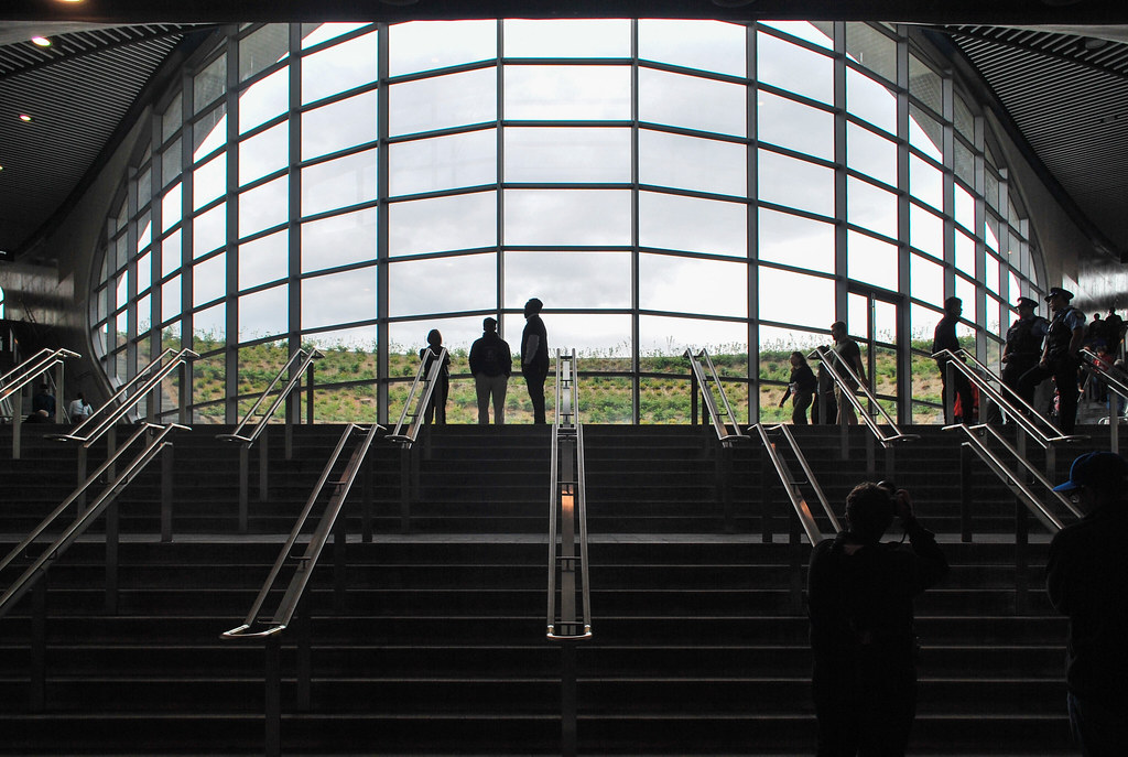 York University Subway
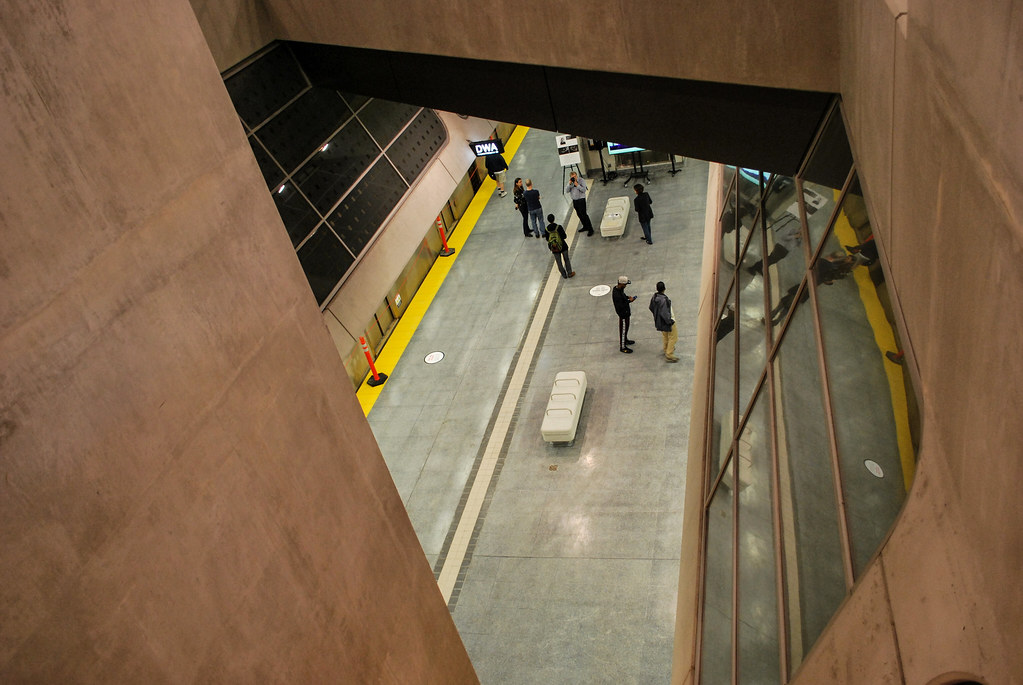 York University Subway
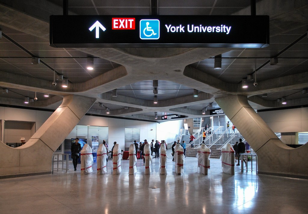 York University Subway
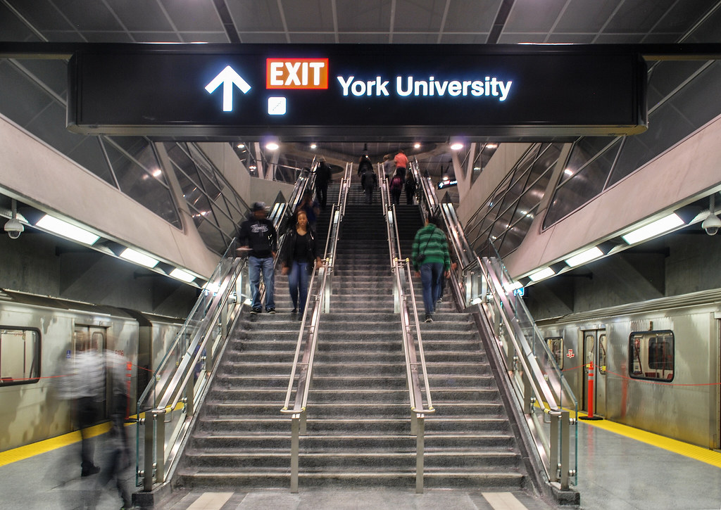 York University Subway
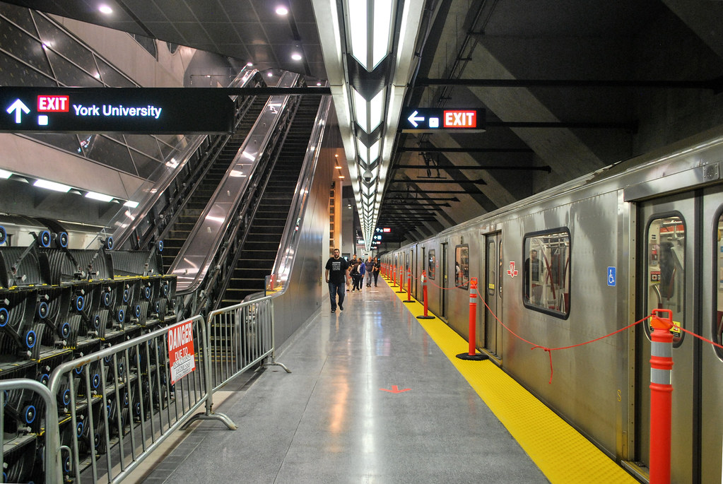 York University Subway
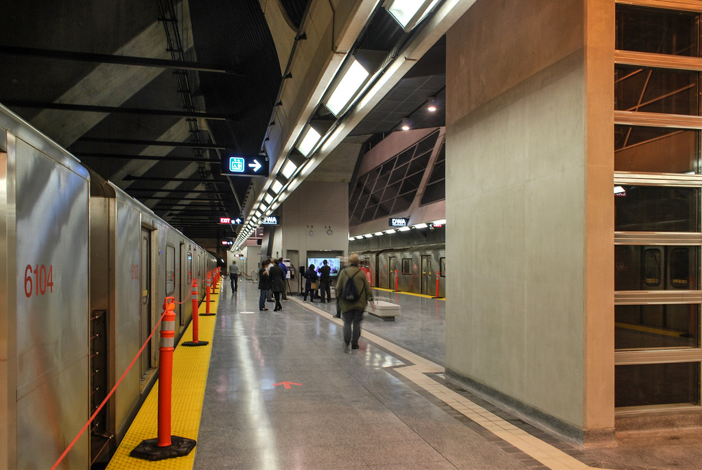 York University Subway
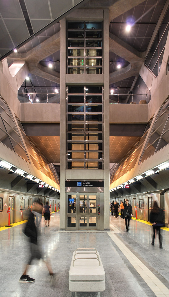 York University Subway
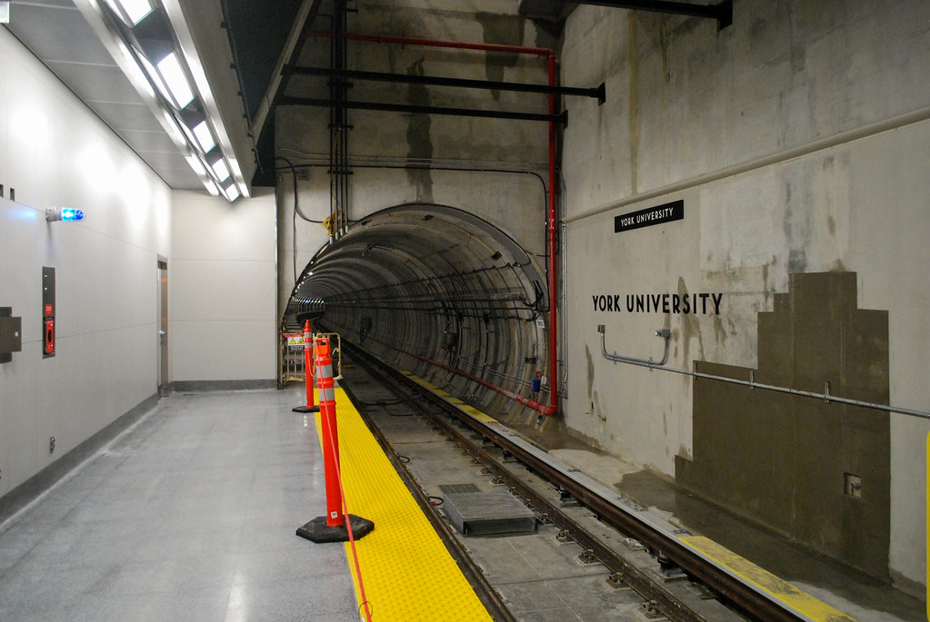 York University Subway
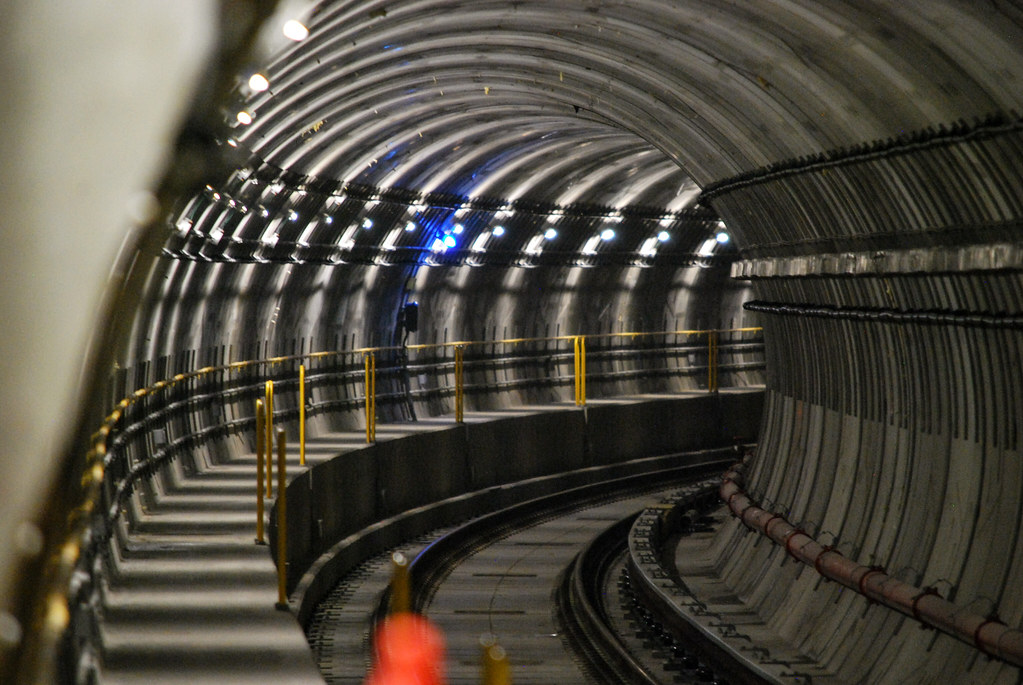 York University Subway
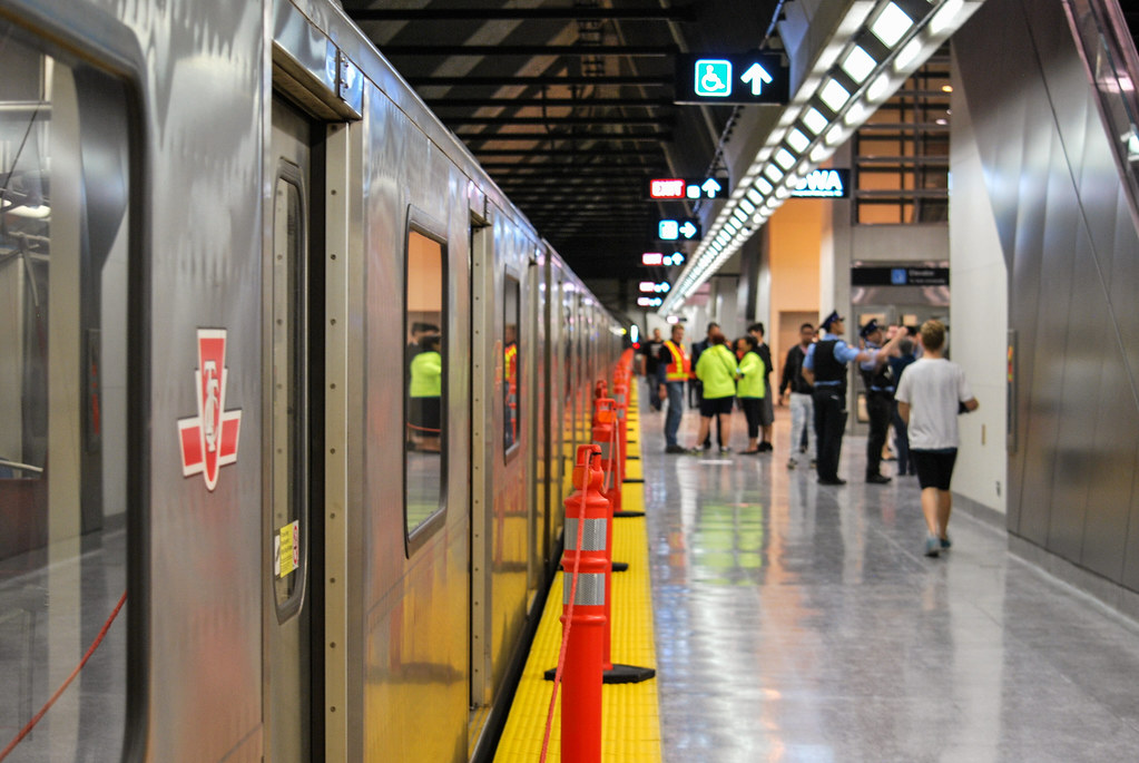 York University Subway
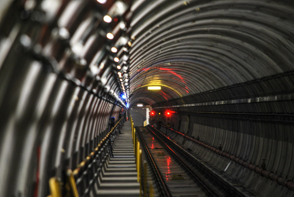 York University Subway
 York University Subway
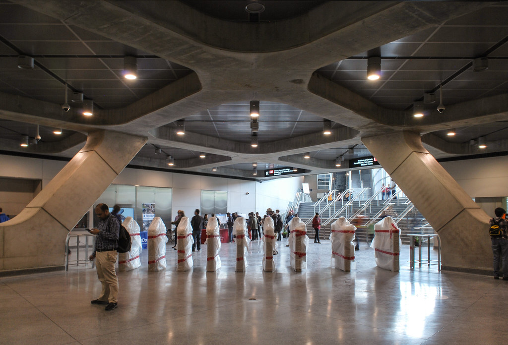 York University Subway
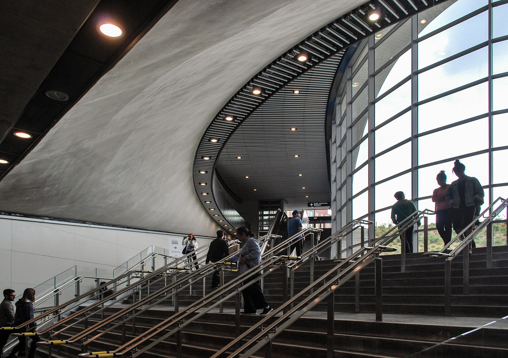 York University Subway
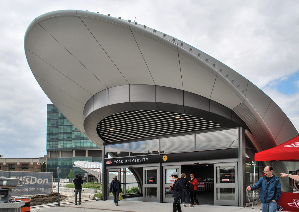 York University Subway
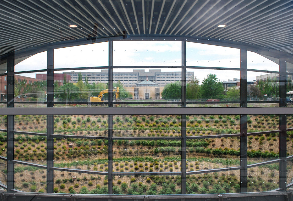 York University Subway
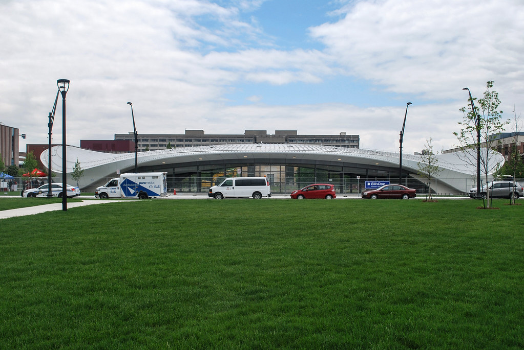 York University Subway
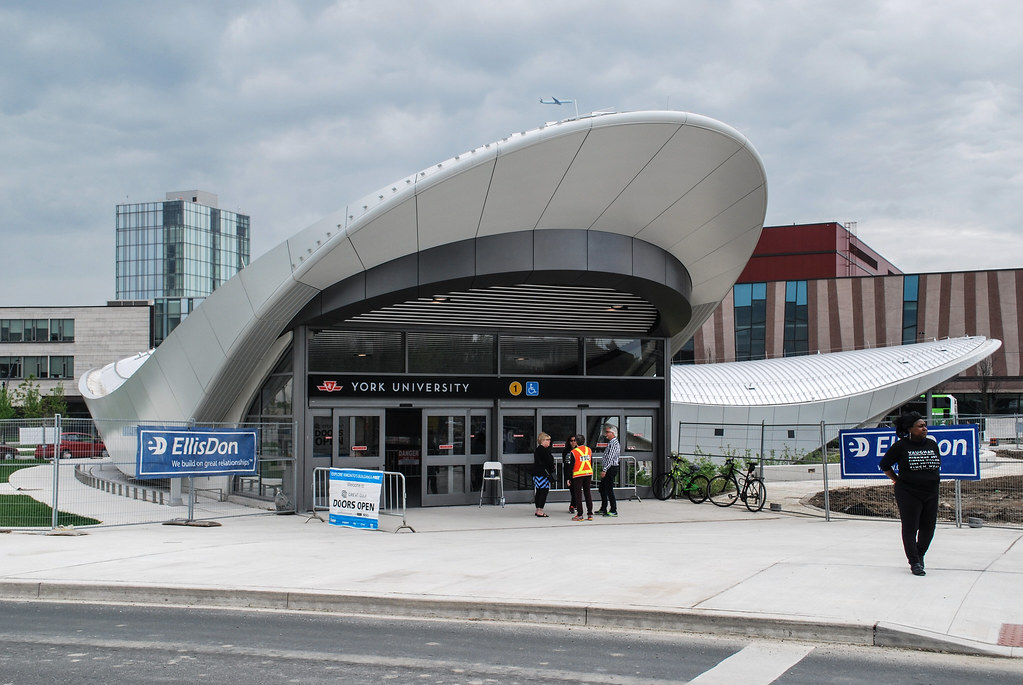 York University Subway
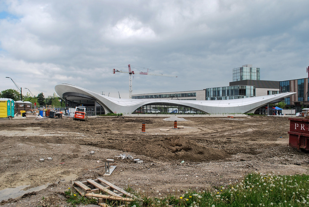 York University Subway
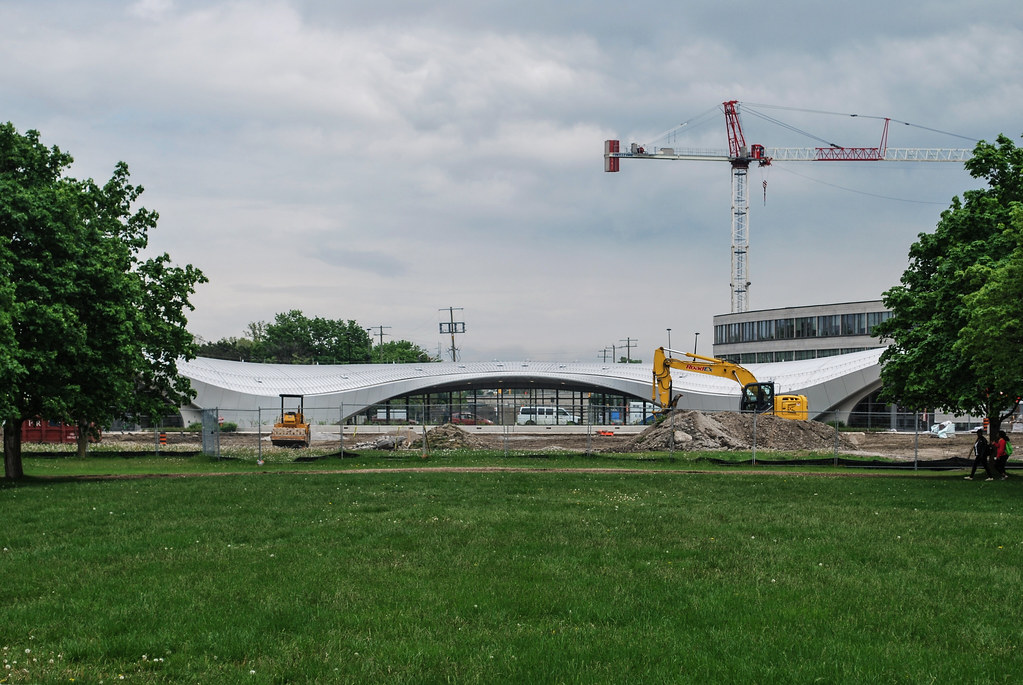 York University Subway