Razz
Senior Member
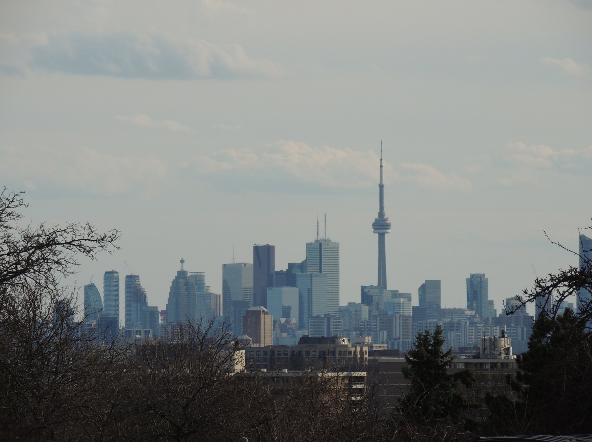
Taken March 29, 2017:

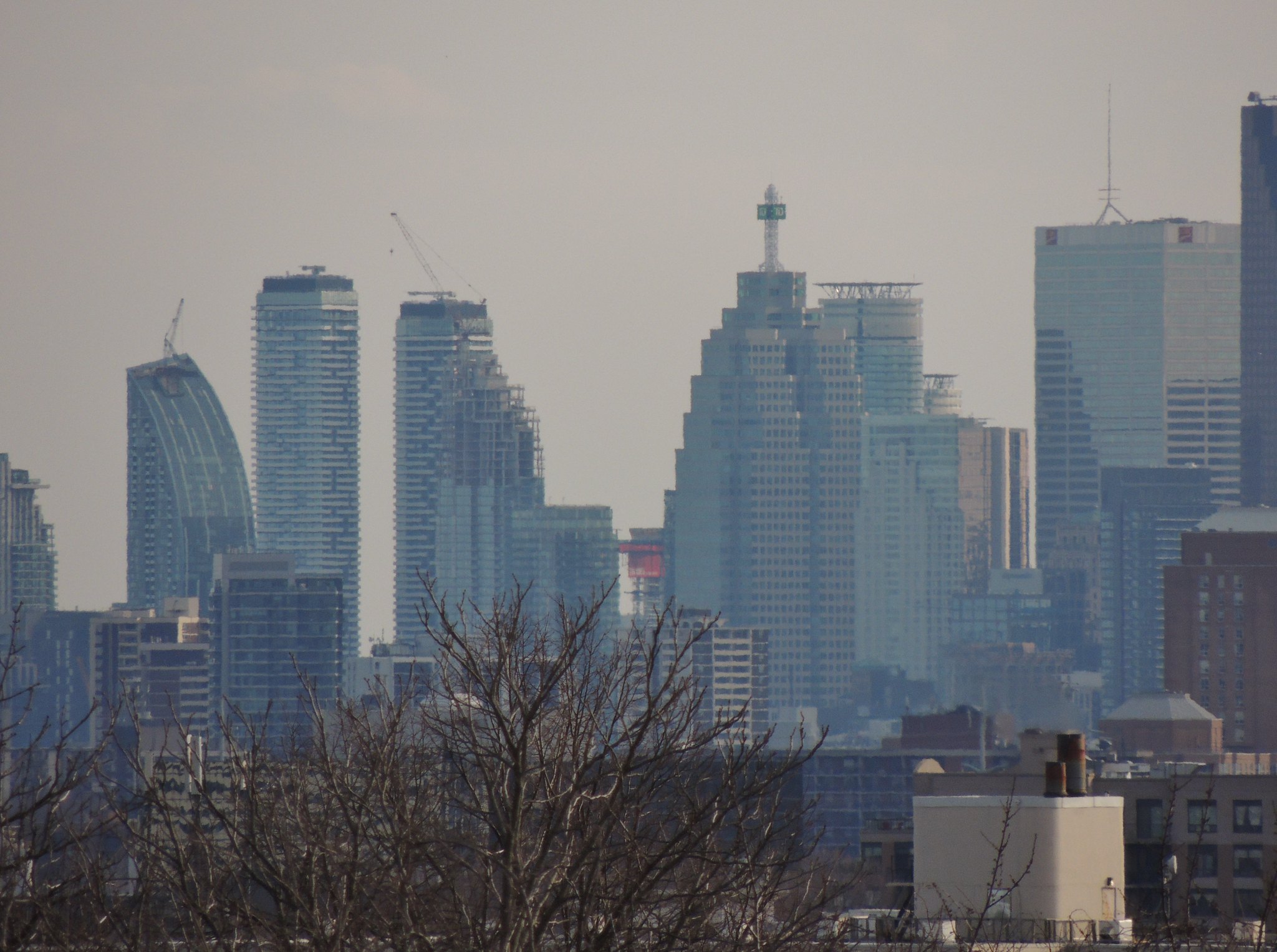
") I took the same one...
I took the same one...
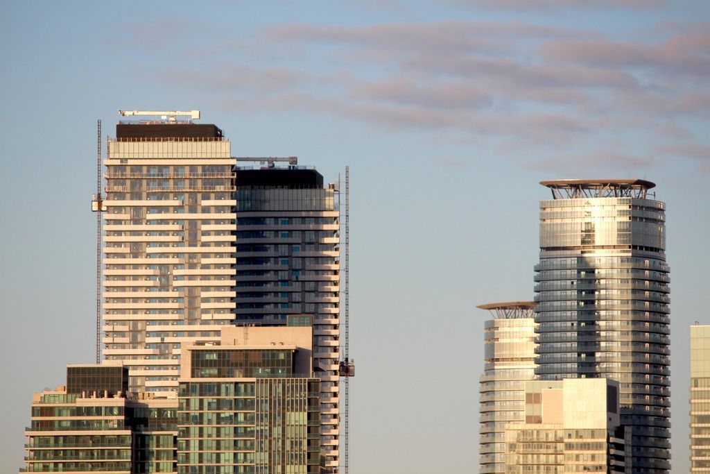
Yes, this and 88 Scott have been fantastic additions for 2016.
--
As much as I like the towers, I do dislike the final crown treatment. The visual break in colours combined with the setbacks lend itself to a much stumpier look, at least when compared to previous renderings. A tall crown, like Casa II's, would have been more fitting in relation to the slenderness of the towers.
Disagree 100%. I find Casa II's mechanical level awkward and clumsy, whereas Harbour Plaza's is quite fitting and restrained. The roof shouldn't be a stand out feature. The balconies are the feature here.
No need to add on a tacky hat to complete these towers.
Edit: Probably should've worded this better. I like Casa 2's hat on Casa 2 - where the tower itself is pretty tame and the roof makes the statement. It would be clumsy and tacky if something similar were done on Harbour Plaza, where the tower is strong enough on its own.

The original renderings depicted a mechanical crown that I believe was more fitting to the overall design of the towers, and the balconies. While these areas serve solely as a functional element that I don't expect to stand-out feature, and I agree are the balconies, I find if a crown can be implemented organically into the design language of a building, the entire design is elevated as a whole. Take One Bloor for example, where the curved lines of the tower portion continue throughout the entire length of the building.
I still stand by the mechanical feature depicted original rendering vastly superior to what ended up being built:
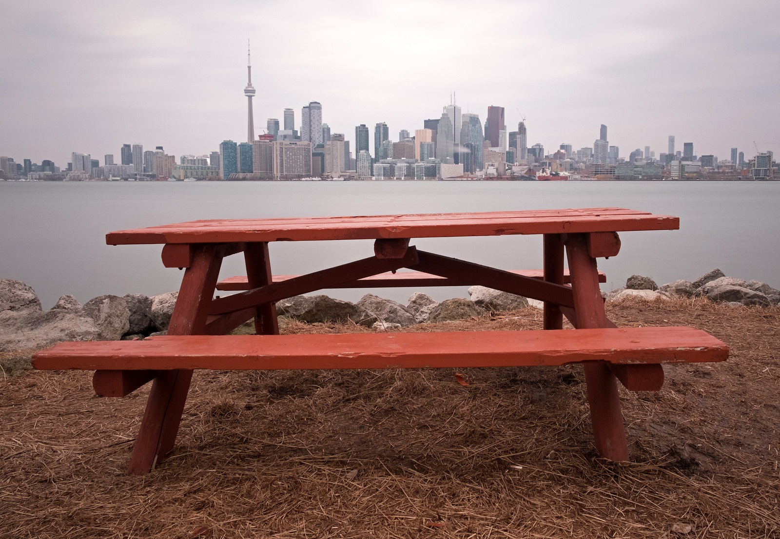 Toronto skyline by Timothy Neesam, on Flickr