Toronto Minto Midtown | 160.01m | 52s | Minto Group | Zeidler

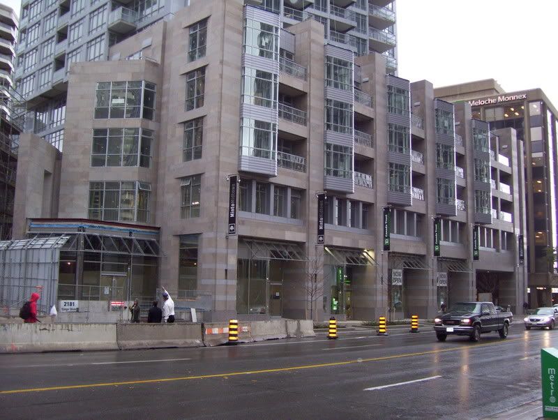
I am not sure what your beef is. Flush signs cannot be seen from the sidewalk one is walking on anyhow. The banners are much more prominant to those walking on the sidewalk (many successful stores in New York only use banners as signs).
 
You're right, every street in the city should be so lucky as to have charming retail like this...oh, wait, they will, eventually.

I do like the towers, though...rarely do buildings acknowledge the fact that Yonge isn't perpendicular with the rest of the street grid.
 
I don't think TD will suffer (or any of the other business for that matter) for having reduced signage. Business will make thier signs as big as you let them so making the storefronts this way is a way of controlling the overall aesthetic impact of the building from the street. Most towers do this otherwise their street level presense is a mish-mash of signs and the architecture gets lost.
 
Picture Courtesy of Photolass on flickr.com

1527257858_82c35cb678_b.jpg
 
GalleriaMall077.jpg


Instead of pathetic glass awnings, there could be space for large customizable signs.

Why does there need to be big customizable signage? Go down to Dundas Square for that.

There are many thriving North American neighbourhoods where major retail is almost hidden due to the signs that blend in or are all the same as all the other signs. I think it's much more pleasing to the eye. And besides, if you live at Yonge & Eglinton I guarantee you'll know where everything is in a very short while. The retail at the base of these buildings are not meant to attract the people driving through Yonge & Eglinton. (Besides, there's barely any place for them to stop and park anyways). These retail outlets are for the people who work and live and walk through this increasingly thriving neighbourhood.
 
Yeah, glass awnings can be very architecturally pleasing, as well as functional.

Big light-up signs are... overrated and ugly after awhile. Visually tiring, too.
 
I'm not just talking about enormous MCDONALD'S signs, I'm talking about something as simple as a variety of store fronts. Minto's glass awnings look token and ridiculous.

If all of Yonge & Eglinton's retail was replaced with this, the area would not be as thriving, it'd be Bay Street...in which case this conversation might as well dosado over to the St. Mike's thread.

Everything doesn't have to look the same for it to fit the area. The signage for the retail looks just fine in person and you cant miss the TD when walking by it. The base of the tower fits in with its surroundings and doesn't look bad at all. As for the doors being set back, yes they are... but that doesn't stop someone from going in. The windows meet the sidewalk and you can clearly see that there is retail. Anyone who misses it while walking by is just blind.

I suggest you take a walk there before making any conclusions.
 
Yes, I want everything to look exactly the same, I walked by and didn't even notice the bank, I've never walked by at all, New York does it so it must be perfect, at least there's no precast arcade, etc., etc., etc.

Won't this city be so great when every arterial is lined with similar condo retail!
 
Nice stone, great windows of curved glass - this is an exceptional podium. I am not sure what exactly you want a bank to look like at the base of a building. Bay Street should be so lucky as to have retail like this.
 
It would fit right in on Bay Street.

And as for what I want, I'm just not ready to proclaim this the best thing since sliced bread. I find the street level well-intentioned but sterile.
 

Back
Top