Toronto Whitehaus Condominiums | 107.28m | 31s | Lifetime | Turner Fleischer

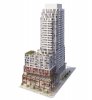
Now there's an interesting way to create more green space in the city....Hover Condos at the Republic of Y&E! :)

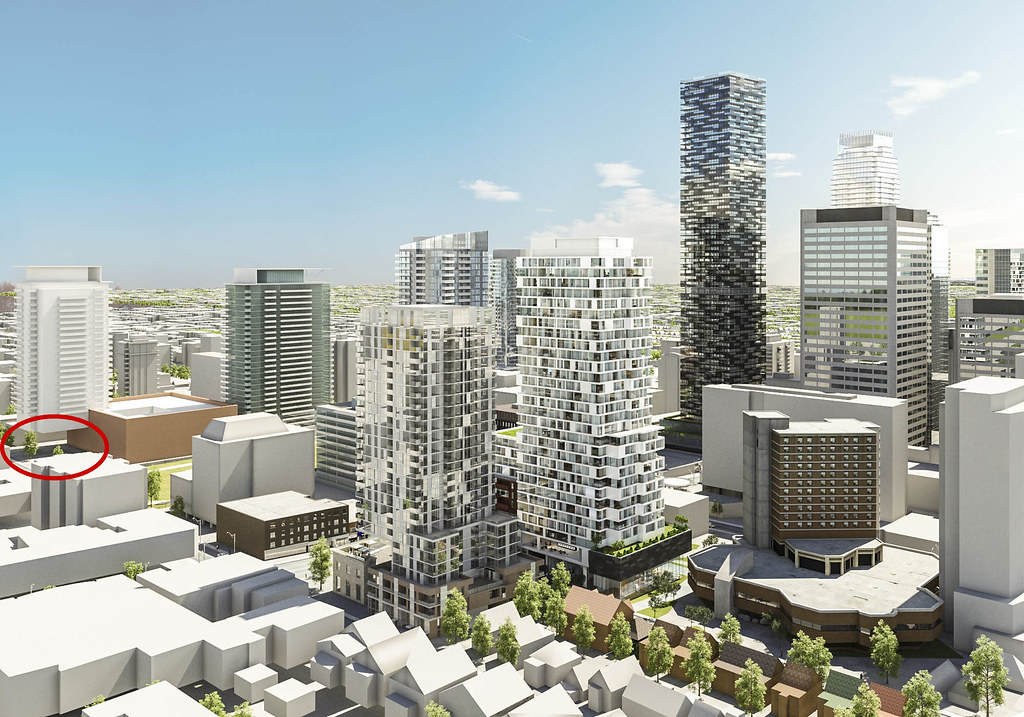
...looks like someone wasn't too careful with their rendering, but at least the shadowing is accurate :)

18124859012_dc5ae091b1_b.jpg
 
Crap. I was really looking forward to this one. What an utter disappointment.
 
Last edited:
Protruding balconies; just what we need more of in this city. The design went from an A+ to a D-. The original design would have looked so nice next to Montgomery Square. I'm so sick of this perpetual watering down of buildings. If only we had more firms like Westbank operating here, that actually care about leaving behind beautiful buildings that enhance the fabric of the city. What I don't get is why the developer would originally set out to build a gorgeous building, then improve upon the design with the second batch of renderings, then completely throw in the towel and offer up something so banal? Why not just go straight for the bottom of the barrel from the start, if they're so cheap?
 
Last edited:
The developer is wealthy. Would it really hurt their wallets that much to splurge and build something decent? Instead of wiping their behinds with Borden's mustache, they could live with using King's schnoz, surely?
 
On p.19? I'd say it's been pretty well eviscerated. It seems to now have more in common with Daniel's High Park than the early ideas which drove the rezoning submission.
 

Attachments

  • 20151021_cam_white_final.jpg
    20151021_cam_white_final.jpg
    1.7 MB · Views: 1,593
:eek: I quite like that design. the tower portion seems to mesh well with what is happening next door at Montgomery Square despite its rather benign design but thats ok. Though lets be honest, the zig zag clacony cladding effect can be kinda gimmicky and looks bad when done wrong. Also while i know these are just artistic renderings, i dont see venting being done through the window wall glazing which is a nice thing to have and makes window wall glazing better.

The third floor set back and patio is also welcome and the use of colour and corten? steel to break up the base is a welcome fix to the common glass wall. Could we be witnessing a shift in ground level retail design taking hold? One that emphasizes the breaks in shop space and one which encourages people to keep walking along next to them? lets hope so.

I'd say the corten base compliments the historic Postal Station K facade next door, while contrasting significantly to allow that facade to shine on its own. Making the base airier, it doesnt compete with or overbear the PSK square and facade. Again the corten retains its function in defining the edge of the pedestrianized? Hellenadle bit and the tower which i believe is critical to making a public space inviting to be in. Glass walls abound don't add any intimacy or flourish to public realm edges so this is a welcome design aspect. The corten hangers (or perhaps stained timber?) also add some minimalist ornamentation to the base which compliments and contrasts the more complex ornamentation on the PSK facade.

All in all I actually prefer this base design to the previous one. Appropriate Glazing quality and reflectivity and cladding material quality will be important to make this a success.:)
 

Back
Top