


W. K. Lis
Superstar
I fear for the ability of TTC to get something significantly more complicated right when they can't even do simple LED dot matrix displays.
AoD
Wonder if the reports will be printed using ribbon-ink dot-matrix printers.
|
|
|
I fear for the ability of TTC to get something significantly more complicated right when they can't even do simple LED dot matrix displays.
AoD
Exactly I don't think there is any transit agency that doesn't currently use them for identification of routes. If they did go with video screens like some people think they should have it would be expensive as hell becuse they would have to special order them from a manufacturer to fit the sizes they would need.I don't think there is anything particularly wrong with the LED displays - it is sufficient for the task and offers good visibility. It is how one uses it that's the problem in this instance.
AoD
I actually prefer LED displays in most cases. They are typically more legible at a distance than backlit screen displays and are much cheaper to purchase, maintain and program. You can also use special characters for our line symbols.
When the TTC said they would add displays inside stations I had hoped they would use LED boards due to their simplicity, but they went for Ad-supported televisions instead which is disappointing since you can't even read the information from further than a few feet. You could cover the top edge of the entire platform with an LED board for a similar cost, and it would be able to display much more information than the tiny portion they have now underneath the commercials and other garbage.
whoever is "sponsoring" those tvs at the stations essentially have TTC by the balls when it comes to what is installed. in their vanity ttc thought they could save a few bucks by allowing for sponsorship for these next stop displays but the end product is
just essentially TV advertising with a small "btw" display of the time. i agree you cant see the eta from more than 20ft away. ttc really shouldve invested on actual displays that show legible info. at least for STM they have it projected on a large screen.
it would seem that ttc is the only agency in the world dumb enough to be satisfied with a small advert display for their next train signage
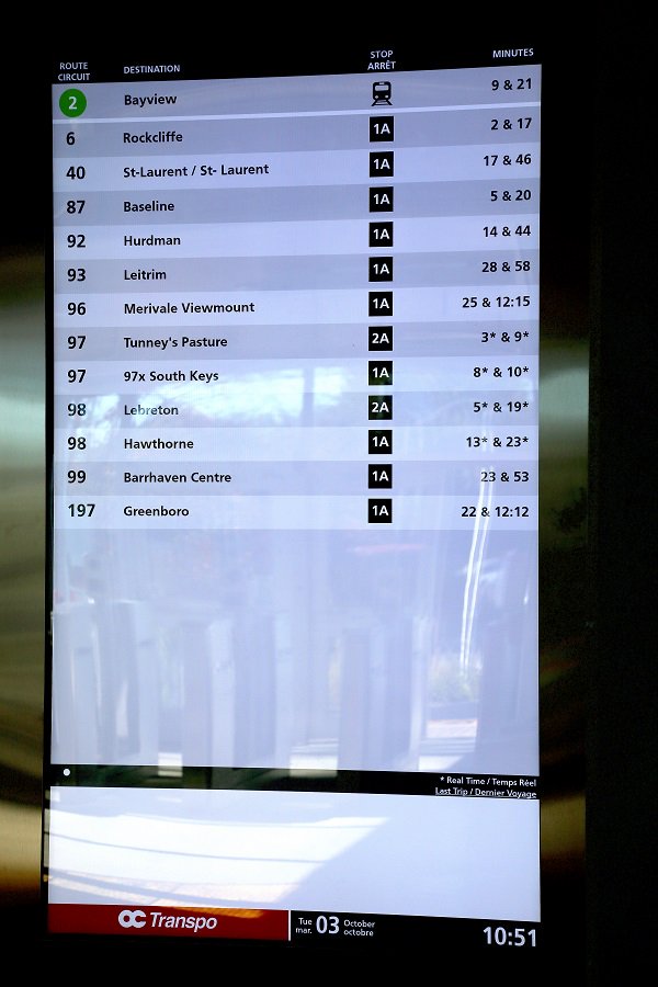
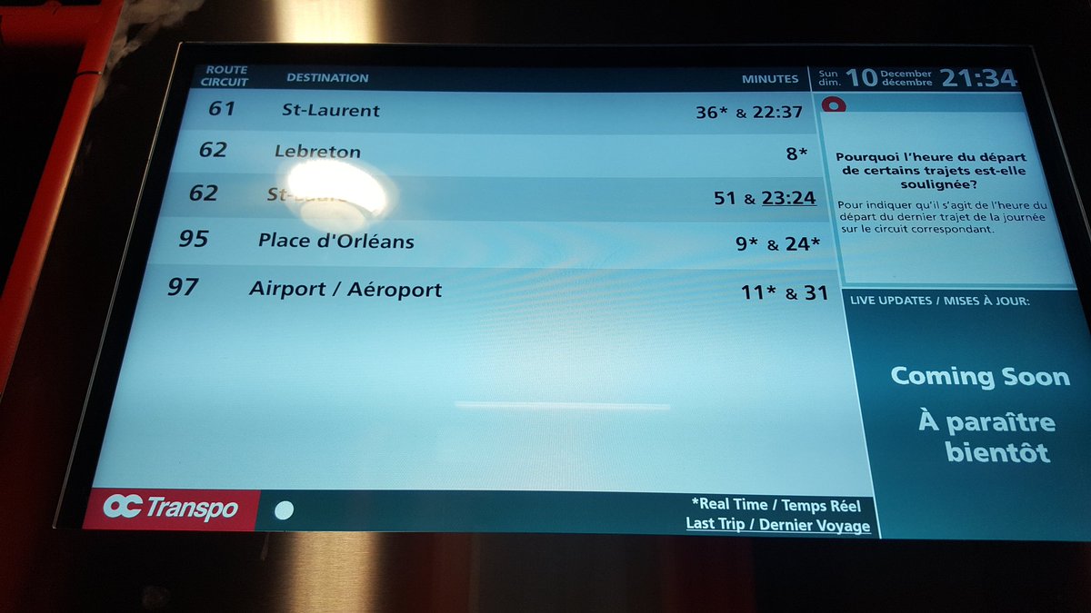
Hey, there's not Bayview Station on Line 2. Oh wait...For comparison, this is what we just started using up here in Ottawa now. This giant screen (approx 4 foot tall) screen is used by the faregates at Greenboro station, so you can see when the bus or train is leaving before you tap in and where it's going to depart from:
These kinds of screens appear at the stops:
A shorter version of this screen is put on O-Train platforms for it's departure times
Hey, there's not Bayview Station on Line 2. Oh wait...
/cdn.vox-cdn.com/uploads/chorus_image/image/57818001/rd211_27.0.jpg)


Overlay the TTC one on top.Start with (from Wikimedia)
Funny OCTranspo picked the same symbol as the TTC. They thought it was very important that the Confederation Line be Line 1.
I wonder if the rich folks in Rockcliffe are upset that they are losing Route 1 to the confederation?
It’s al interesting that the old route 2 was east-west, while now it’s north-south. Same goes for the Confederation Line.
Given that the Confederation Line will handle the vast majority of ridership, it makes sense.
And who told you this?The 2027 stock will look like the new streetcars with the same colour scheme and the large continuous windows, and be slightly longer to better fit the whole platform. And have at least 12 much shorter articulated carriages to navigate tighter turns better.