News   Apr 19, 2024
 1.8K     1 
News   Apr 19, 2024
 855     3 
News   Apr 19, 2024
 1.3K     3 

TTC: Redesigning TTC Signage

It's Main. It's the south elevator in the mezzanine. The one that leads to the street, buses, Wheel-Trans, Streetcars, and Eastbound Trains. Not sure what's confusing about that. In the opposite direction is the elevator that only leads to the westbound trains.
 
It's Main. It's the south elevator in the mezzanine. The one that leads to the street, buses, Wheel-Trans, Streetcars, and Eastbound Trains. Not sure what's confusing about that. In the opposite direction is the elevator that only leads to the westbound trains.

I think it's confusing because the far sign and the near sign appear to present conflicting information, while in reality the far sign is intended to refer only to the elevator.
 
I think it's confusing because the far sign and the near sign appear to present conflicting information, while in reality the far sign is intended to refer only to the elevator.
The signs aren't close to each other. It doesn't appear confusing standing in the station. The photo seems to have been taken from a distance, and this is only a small portion of it.

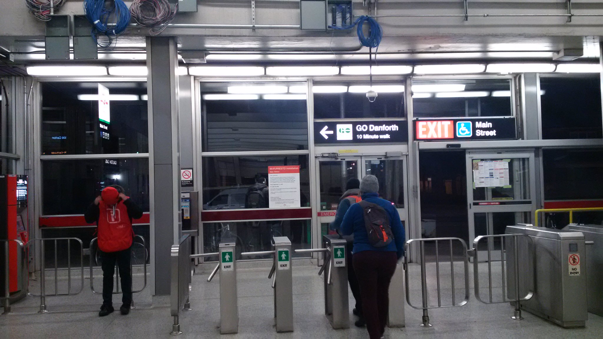
With it's unusually large and open mezzanine, Main Street has to be one of the easiest stations to navigate. Though the recent installation of a sign near above the front doors that says it takes 10 minutes to walk the 300 metres to Danforth GO is misleading.

CaxuYnmUEAAtUw2.jpg:large
 
Though the recent installation of a sign near above the front doors that says it takes 10 minutes to walk the 300 metres to Danforth GO is misleading.
In general it is best to exaggerate the time taken for a walk like this; (which is why the '5 minute" etc 'walk circles' on street maps are often a bit misleading) as people prefer to be pleasantly surprised the walk is shorter and for some people it will take at least 10 minutes considering the stairs at the GO end.
 
Last edited by a moderator:
In general it is best to exaggerate the time taken for a walk like this; (which is why the '5 minute" etc 'walk circles' on street maps are often a bit misleading) as people prefer to be pleasantly surprised the walk is shorter and for some people it will take at least 10 minutes considering the stairs at the GO end.
There's no stairs at the GO end. It's a ramp - which has been there for years. There is an old staircase that's chained off, similar to at Dufferin Street to access the old (now gone) Exhibition station platforms.

And 300 metres in 10 minutes? Come on ... that's the length of a GO platform.

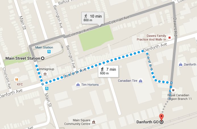
When TTC Customer service was asked why the sign said 10 minutes, they said because that's what happens if you walk down Coleman and Dawes Road - like this:
CayHtXHUAAAst-7.jpg:large


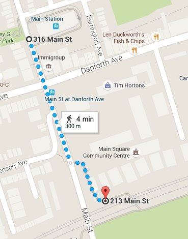
And they didn't seem to realise, that you can't actually do that, because you need to trespass over private property, and climb a chain-link fence. All you need to do is this:
CayHSXHUEAA257x.jpg:large


So no, it doesn't say "10 minutes" to provide enough time. It says 10 minutes, because TTC used Google Maps erroneously to determine the walking time.
 
The signs aren't close to each other. It doesn't appear confusing standing in the station. The photo seems to have been taken from a distance, and this is only a small portion of it.

With it's unusually large and open mezzanine, Main Street has to be one of the easiest stations to navigate. Though the recent installation of a sign near above the front doors that says it takes 10 minutes to walk the 300 metres to Danforth GO is misleading.

CaxuYnmUEAAtUw2.jpg:large
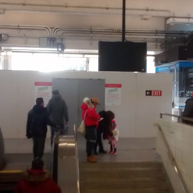
wow it's funny to think it wasn't that long ago that the entrance looked lie that. Currently the exit/ entrance is this.
24858687555_7f705dc554_z_d.jpg
 
I mentioned in another thread that the B-D should change colours to avoid confusion with the GO network.
I propose that all GO lines are green with coloured dashes.
All streetcar LRT's would be red with coloured dashes.
All Rapid Transit lines would receive a single solid colour (avoiding both Green for GO and Red for TTC).

I also think this Line 1, Line 2 stuff has not caught on and few people know was is being talked about when TTC announces a certain line is closed. Thus, I propose each line should have a 2 Characters to describe it. The stations could be numbers - which makes it much easier to navigate and to know which direction you want to go. This is true especially on lines that curve (Yonge-U), where it is much easier to simply know if you are going in the ascending or descending direction. This made it quite easy to navigate in Tokyo where I didn't speak the language.

Lines2.jpg
 

Attachments

  • Lines2.jpg
    Lines2.jpg
    90.9 KB · Views: 921
Nitpick: it's East Bayfront.

Neat idea. Though, I'm not sure it's really necessary to treat the ROW streetcars differently than the other local surface routes. I do like the idea of preserving the RT line names.
 

Back
Top