News   Apr 19, 2024
 311     1 
News   Apr 19, 2024
 618     3 
News   Apr 19, 2024
 728     1 

TTC Cartography, Signage, and Wayfinding

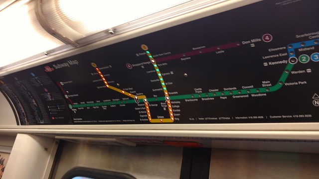
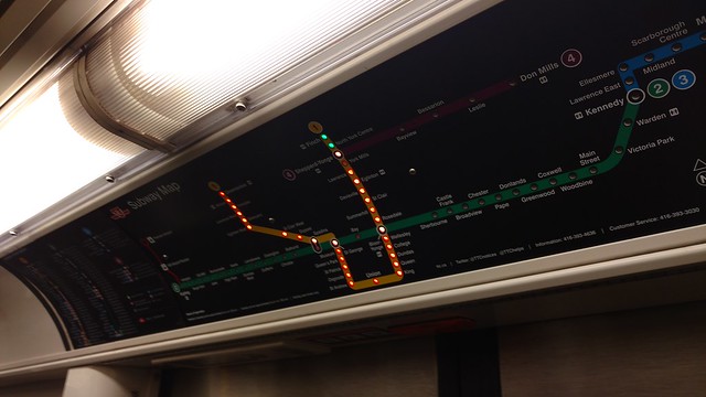
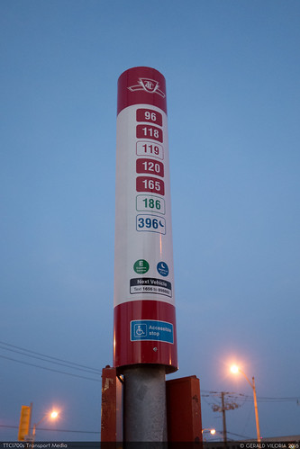
The lights should just turn off for every station already passed. None of the orange/green nonsense.

I was in NYC last week and that's how they had it on some of their trains

Lights off currently represents other lines or a short-turning train. For instance, when service is suspended on Yonge north of Bloor, Rosedale-Finch will be turned off.

Lights off should represent any station that train isn't going to, whether it be stations already serviced or other lines all together.
 
This is one of the stupidest things the TTC has ever done. Personally, I don't agree that it makes any more sense--I think the options (green>red or red>green) are about the same, with the existing one maybe making a bit more sense, but whatever, let's even assume the previous option was counter-intuitive and this one makes perfect sense. What on Earth is the logic behind changing them several years in? There are a few people that live in this city that ride the subway, last time I checked, and one or two of them might have looked at the light maps by now...suddenly reversing it will be extremely disorienting.
If they are changing over, great! Let's get them all reprogrammed as quickly as possible so that there aren't two versions of it rolling at the same time. The version with green for the stations you're going to is far more obvious, and people will only be disoriented briefly, and then never again.

I agree though, even better than that would be to simply turn off the lights for stations that the train is not going to… but make the ones where it's going green. Flash them red when you're in that station.

42
The problem would be solved if they had arrows light up for the direction of the train light up like the Hong Kong MTR. Maybe they can consider it when the put in the Eglinton and Finch West Lines.
 
I've noticed a couple of toronto rocket trains now have the map reversed so that the red lights show where the train has been and green is where it's going to stop

26634436674_a5d7176339_z_d.jpg


27144166072_172ba5d6eb_z_d.jpg


I was heading north from Bloor and Younge
I knew something was different!
 
I think the options (green → red or red → green) are about the same

Yes, and they’re equally useless, given equivalent illumination (as is the case here), to the 4% to 8% of males, and some females, with colour deficiency. Engineers (well more than 8% of whom are male) are and remain too ignorant to understand the implications of colour choice.
 
The Toronto Subway font is iconic for the TTC brand, but they should keep it on larger applications like titles/headlines of documents, and of course on subway station tiles.

No, in fact this typeface (which has more than one weight, but try telling TTC Design™ that) should and must be confined to sidewalls in subway stations, though arguably the ferry-docks terminal one stop outside Union could also use it.

Maybe – maybe – typesetting names of stations in that face is viable in a system map.

Then we get to a discussion of collector-booth wraps, all of which use what is vaguely known as the TTC font even if the station itself does not.
 
Rode the subway yesterday and the car I was in still had the colours the other way. Doesn't appear to be an "all at once" switch, which is even more confusing. Heading down the University subway at Union.
image.jpeg
 

Attachments

  • image.jpeg
    image.jpeg
    735 KB · Views: 1,027
Doesn't appear to be an "all at once" switch, which is even more confusing.

Much like the extra grab bars they started added to the ceiling. It was at least 2 or 3 years ago when I first saw this and they still haven't installed it on all of the trains yet.

Screen shot 2016-05-27 at 1.12.00 PM.png
 

Attachments

  • Screen shot 2016-05-27 at 1.12.00 PM.png
    Screen shot 2016-05-27 at 1.12.00 PM.png
    300.5 KB · Views: 1,024
No, in fact this typeface (which has more than one weight, but try telling TTC Design™ that) should and must be confined to sidewalls in subway stations, though arguably the ferry-docks terminal one stop outside Union could also use it.

Maybe – maybe – typesetting names of stations in that face is viable in a system map.

Then we get to a discussion of collector-booth wraps, all of which use what is vaguely known as the TTC font even if the station itself does not.

Yay JoeClark.

But why must ttc font be confined to subway walls?
 
Yay JoeClark.

But why must ttc font be confined to subway walls?

Because in smaller font applications it fails readability tests miserably. It's iconic for large font applications like subway walls, but for any kind of smaller application, not good.
 
I agree. I'm glad they are making to stations the train is going to green. That makes far more sense than red which indicates negative/no for most people. I also agree that with colour blindness it is probably more intuitive to turn off stations that have already passed. I'm curious how they are colouring the interline now when in interchange stations... is it red, green, or yellow? Maybe yellow would make sense to avoid using red.
 
Not sure if this was mentioned elsewhere, but the new stop signage is going up on some routes. I saw the new poles/boards with individual route stickers along Wilson this past week. One concern I have is that there is only room for 6 routes on these, and I'm pretty sure there are parts of the city with more than 6?
 
Not sure if this was mentioned elsewhere, but the new stop signage is going up on some routes. I saw the new poles/boards with individual route stickers along Wilson this past week. One concern I have is that there is only room for 6 routes on these, and I'm pretty sure there are parts of the city with more than 6?
There's room for up to 8. IIRC the only stop that has 8 routes serving it is Triton at McCowan outside STC.

DSC05797
by G.Viloria Photography | TTC1700s Transport Media, on Flickr
 
I see, that might be a longer version then because the ones I saw had 5, with only room for 1 more. I guess they have a couple different sizes.
 

Back
Top