|
|
|


You are using an out of date browser. It may not display this or other websites correctly.
You should upgrade or use an alternative browser.
You should upgrade or use an alternative browser.
TTC Cartography, Signage, and Wayfinding
- Thread starter 299 bloor call control.
- Start date
salsa
Senior Member
Change can be hard to get used to, I don't know what to think. Here are some of the big changes.
1.
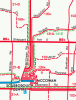
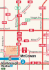
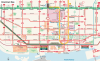
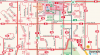
Where multiple bus routes overlap, the new map consolidates these routes into one line. The change is most obvious on heavy bus corridors such as McCowan where many routes converge, which now looks a lot neater than before.
2.
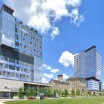
GO Lines are more prominently displayed, including the name of the line. Even the colours match the ones used by Metrolinx (e.g Blue for Barrie, Orange for Milton, Brown for Stouffville). Also, GO bus terminals now have the GO logo on them, such as my above example showing Scarborough Centre.
3.
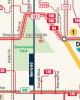
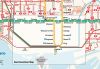
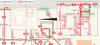
To view the downtown area, now you have to scroll to a separate section of the map.
It's annoying having to do this, however the downtown is larger, more detailed and easier to read than before. It also labels many popular destinations such as parks, universities, museums, shopping malls, City Hall, Distillery District, Rogers Centre, etc. The suburbs also have similar labelling (e.g Yorkdale, Downsview Park, Science Centre, Sunnybrook Hospital).
Old version:
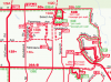
Northeast Scarborough is the only other section where the map is now enlarged in it's own separate box.
4.
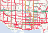
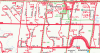
My least favourite change is that the new map does not reflect real life. What I mean is that the streets and subway lines don't have the subtle curves anymore. All roads are mostly straight as an arrow and point exactly north-south, east-west, or diagonal. I can't easily go on Google Maps to figure out which streets some of these buses are taking, especially in and around York University.
Old version:
So how does everyone else feel about the new map?
Attachments
-
 Screen shot 2016-01-29 at 12.51.17 AM.png79.3 KB · Views: 1,017
 -
 Screen shot 2016-01-29 at 12.54.53 AM.png76.9 KB · Views: 1,012
 -
 Screen shot 2016-01-29 at 1.05.49 AM.png52.2 KB · Views: 994
 -
 Screen shot 2016-01-29 at 1.06.26 AM.png66.7 KB · Views: 987
 -
 Screen shot 2016-01-29 at 1.15.15 AM.png174.7 KB · Views: 996
 -
 Screen shot 2016-01-29 at 1.17.17 AM.png331.7 KB · Views: 1,128
 -
 Screen shot 2016-01-29 at 1.16.38 AM.png290.2 KB · Views: 1,053
 -
 Screen shot 2016-01-29 at 1.33.59 AM.png81.5 KB · Views: 982
 -
 Screen shot 2016-01-29 at 1.34.20 AM.png97.9 KB · Views: 988
 -
 Screen shot 2016-01-29 at 1.51.42 AM.png152.2 KB · Views: 959
 -
 Screen shot 2016-01-29 at 1.52.21 AM.png172.3 KB · Views: 1,022


Last edited:
TheTigerMaster
Superstar
Love it. This is so much easier to read and understand. Bravo TTC.
picard102
Senior Member
Glad they went with clarity over geographic accuracy. Makes it much easier to parse.
Fred.S
Active Member
I like it too, much clearer and better looking. I know it doesn't really matter much, but I always wished that streetcar lines were a different colour than bus lines.
the lemur
Senior Member
Glad they went with clarity over geographic accuracy. Makes it much easier to parse.
Yeah, I think it looks tidier, the way the MTA subway map does it, or the Underground.
P23
Active Member
Glad they went with clarity over geographic accuracy. Makes it much easier to parse.
Agreed. I'm surprised to find I don't have many issues with the new map. I agree with brainfreezed about the streetcar lines as well, no idea why the TTC continues to make streetcar and bus routes basically identical.
ShonTron
Moderator
Member Bio
- Joined
- Apr 24, 2007
- Messages
- 12,396
- Reaction score
- 9,045
- Location
- Ward 13 - Toronto Centre
I really like it as well. The landmarks are more prominent, the connections to suburban bus systems are shown again (as logos, not as lines like the old regional map). The loss of geographic scale in favour of a schematic map works. Very tidy.
ShonTron
Moderator
Member Bio
- Joined
- Apr 24, 2007
- Messages
- 12,396
- Reaction score
- 9,045
- Location
- Ward 13 - Toronto Centre
Well, I did find a few things I didn't quite like:
- Hospitals are labelled inconsistently. Humber River, Sunnybrook, and Scarborough Centenary are, but North York General, Etobicoke General, Scarborough General, St. Joseph's, East Toronto General, and the downtown hospitals are not.
- Some suburban connections are shown, most are not. Pearson Airport shows GO, Brampton, and Miway logos, and York U shows GO, Zum, and YRT logos, but they are missing from Humber College, a major terminal for Brampton Transit (511, 11, 50) and Miway (22, 107), it's a terminus for a YRT route as well. Rouge Hill GO shows a DRT logo, even though this is a very limited service, but there isn't one for Miway at Long Branch, where two major routes, 5 and 23, terminate.
- I'm not sure I like how branches are labeled now. I miss the use of the "+."
christiesplits
Senior Member
Huge improvement.
I agree with ShonTron that hospitals should be labelled better.
I agree with ShonTron that hospitals should be labelled better.
APTA-2048
Senior Member
Other than a greater capacity, what really is the difference?I agree with brainfreezed about the streetcar lines as well, no idea why the TTC continues to make streetcar and bus routes basically identical.
DSC
Superstar
Member Bio
- Joined
- Jan 13, 2008
- Messages
- 18,589
- Reaction score
- 25,262
- Location
- St Lawrence Market Area
The map is much better and I generally like NOT differentiating between bus routes and streetcar routes. The maps are to find transit and whether it's a bus or a streetcar is really not the issue. If you care the route numbers tell you.
I agree with ShonTron that a bit more work is needed on the connections but the map is revised fairly often so one hopes that someone at TTC reads these comments and the next issue is better. I give them a 9 out of 10.
I agree with ShonTron that a bit more work is needed on the connections but the map is revised fairly often so one hopes that someone at TTC reads these comments and the next issue is better. I give them a 9 out of 10.
ottbike
Active Member
Great map. Great to see that the TTC has given up on sticking with the classic subway station font.
The TTC has really improved their game in the last couple years with their graphics. Looks like they hired the right people.
The TTC has really improved their game in the last couple years with their graphics. Looks like they hired the right people.
devjohnson
Active Member
The Toronto Subway font is iconic for the TTC brand, but they should keep it on larger applications like titles / headlines of documents, and of course on subway station tiles.
Doesn't work very well on a map for readability. Good step for getting rid of it.
Doesn't work very well on a map for readability. Good step for getting rid of it.
Johnny Au
Senior Member
Helvetica makes a return on the subway map.
However, Holland Bloorview Kids Rehabilitation Hospital is MIA.
However, Holland Bloorview Kids Rehabilitation Hospital is MIA.