salsa
Senior Member
Now if only something can be done about the monstrosity that is the main subway entrance.
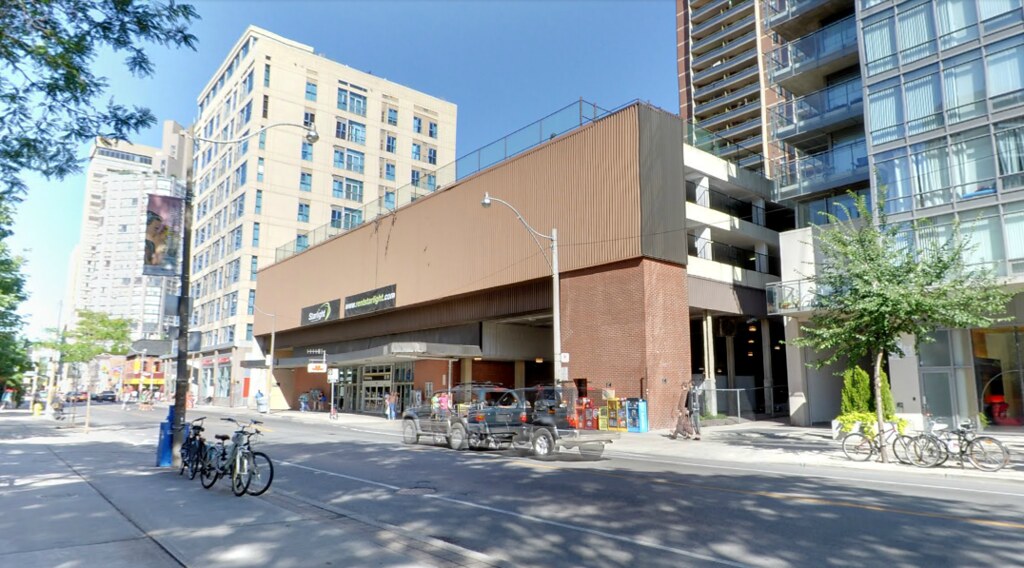
Now if only something can be done about the monstrosity that is the main subway entrance.
The problem is the monolithic beige cladding. Given its location, rainbow cladding would be more appropriate.
But any sort of public art solution might work.
Pretty cool but I'd prefer if they just removed the heavy box altogether and ran with a simpler parti of gridded, stacked and intersecting boxes.
") )
)Sexy building, more of this please.
The building is a gem and is worth saving. Those of you who don't agree really don't know that much about architecture. That is why I have stopped commenting about most of the threads on this website. 99 percent of you really haven't got a clue.


Hmm. The new rendering looks like an office building.
It looks wonderful.