You are using an out of date browser. It may not display this or other websites correctly.
You should upgrade or use an alternative browser.
You should upgrade or use an alternative browser.
Benito
Senior Member

Benito
Senior Member
Attachments


ProjectEnd
Superstar
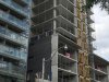
Ahh. We can all breathe easy. This one's going to be fine.
innsertnamehere
Superstar
It's your standard aA condo. It's going to be fine. Clean, simple looking, good materials, but something that ultimately fades into the background.
Benito
Senior Member


Benito
Senior Member


Benito
Senior Member


steveve
Senior Member
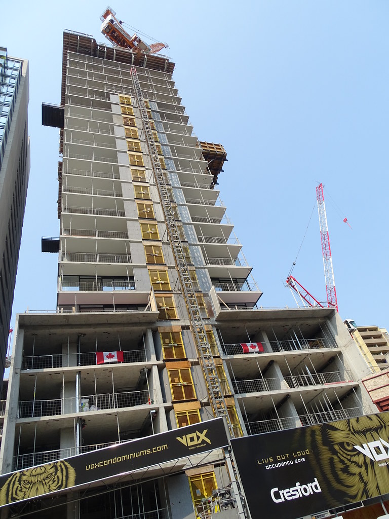
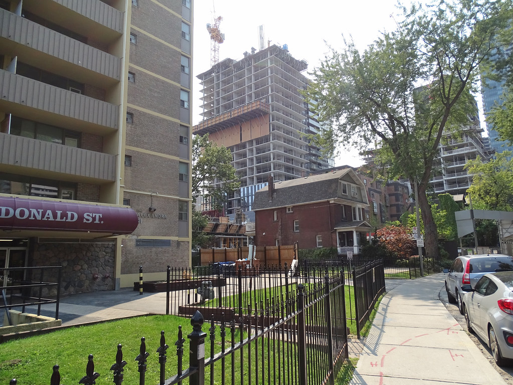
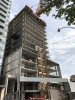
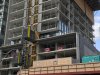
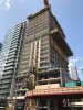
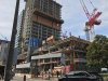
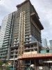
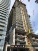
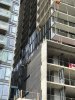
Today (in front of One Bloor):

Benito
Senior Member


ptbotrmpfn
Senior Member
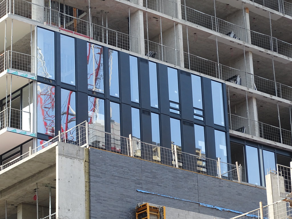
This one's turning out great so far.
TheKingEast
Senior Member
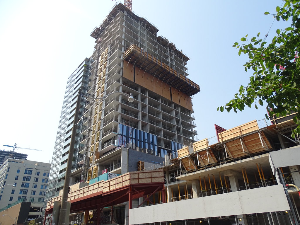
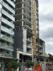
So far I like. Cresford doesn't really have much variation with their buildings. black brick, full glass, black/dark framed windows, minimalist designs.
innsertnamehere
Superstar
^ Aa doesn't have much variation. Consistently quality materials with simple, modernist designs.
Despite it being orthodoxy amongst many on UT, I don't believe that first sentence is true. aA has shown that when the developer wants something a little more out-there, aA delivers something not quite as simple, (yet which still has aA discipline). Take Smart House: it cannot be mistaken for any other building going up, with its angles and bold red stripes. The same uniqueness will hold true for Sixty Colborne, as it did for the Harbour Plaza towers, as it did for Theatre Park… and so on. It's just when you pair aA with a developer like Cresford who really wants it minimalist that the buildings are tougher to distinguish between (and even then, a practiced eye will still be able to tell them apart).
42
42
drum118
Superstar
Sept 4