AlbertHWagstaff
Senior Member
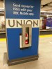
Many out of town people coming to the subway from Bay St. enter by the east end automatic entrance and have no idea that the collector booths are at the south side of the middle of the mezzanine, so they end up looking confused and buying tokens. I've seen others coming from the west end of the moat looking for the subway entrance, walking all the way around the glass "box" to the north side turnstiles, only to find that the booth there isn't staffed, and that they have to walk all the way back around to the south side. They need to put up more signage directing people to the main entrance side with the staffed booths.