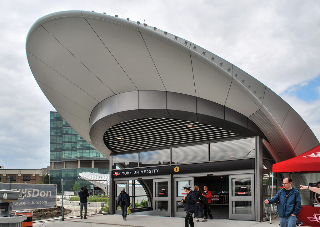
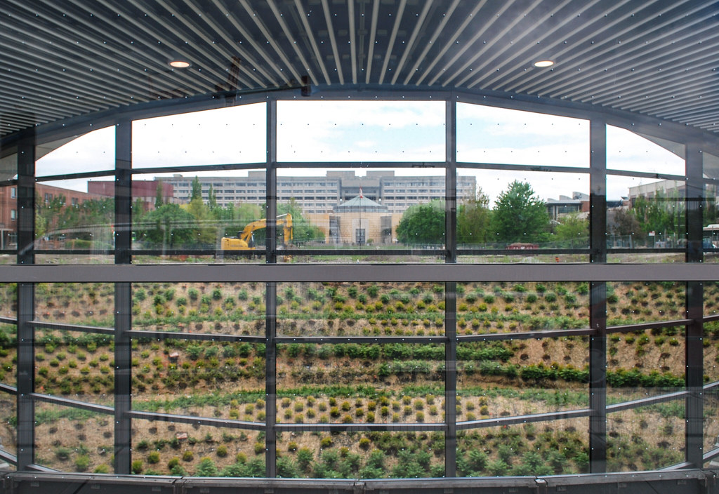
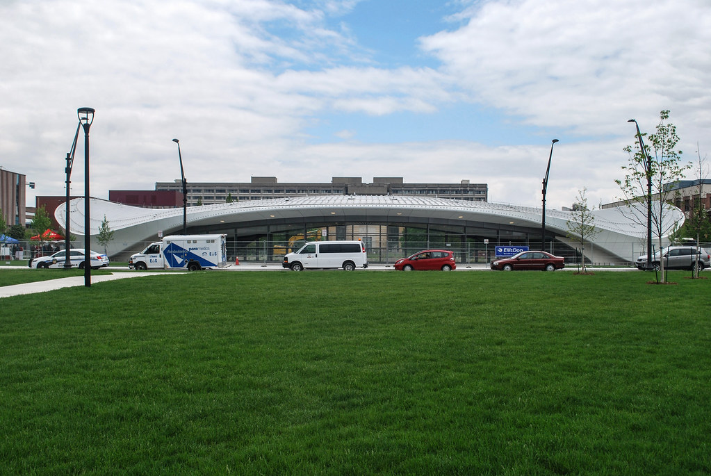
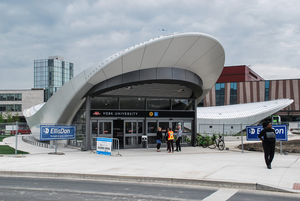
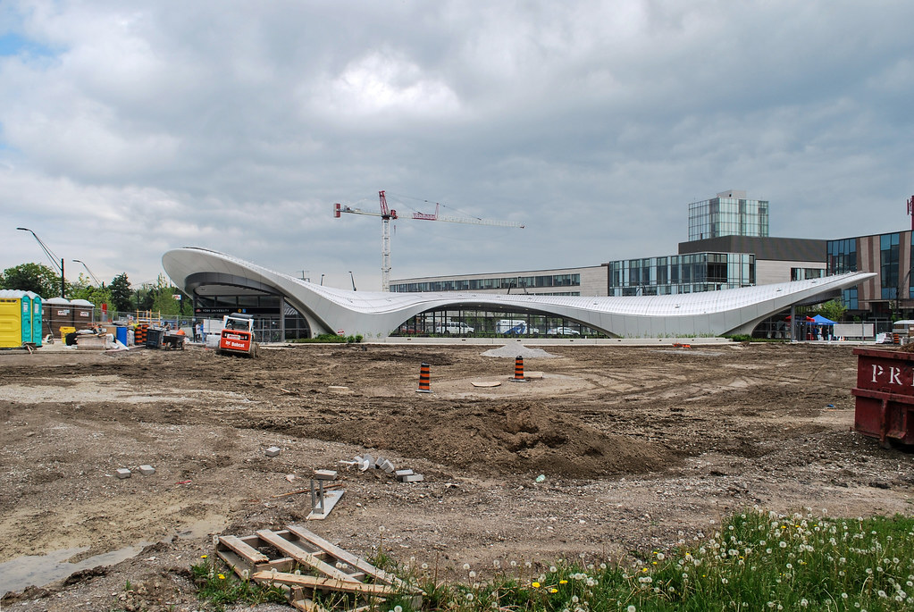
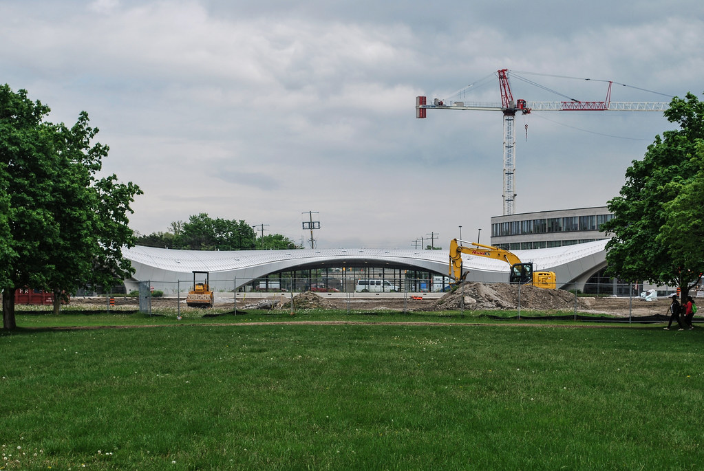
Toronto TYSSE: York University Station | ?m | 1s | TTC | Foster + Partners

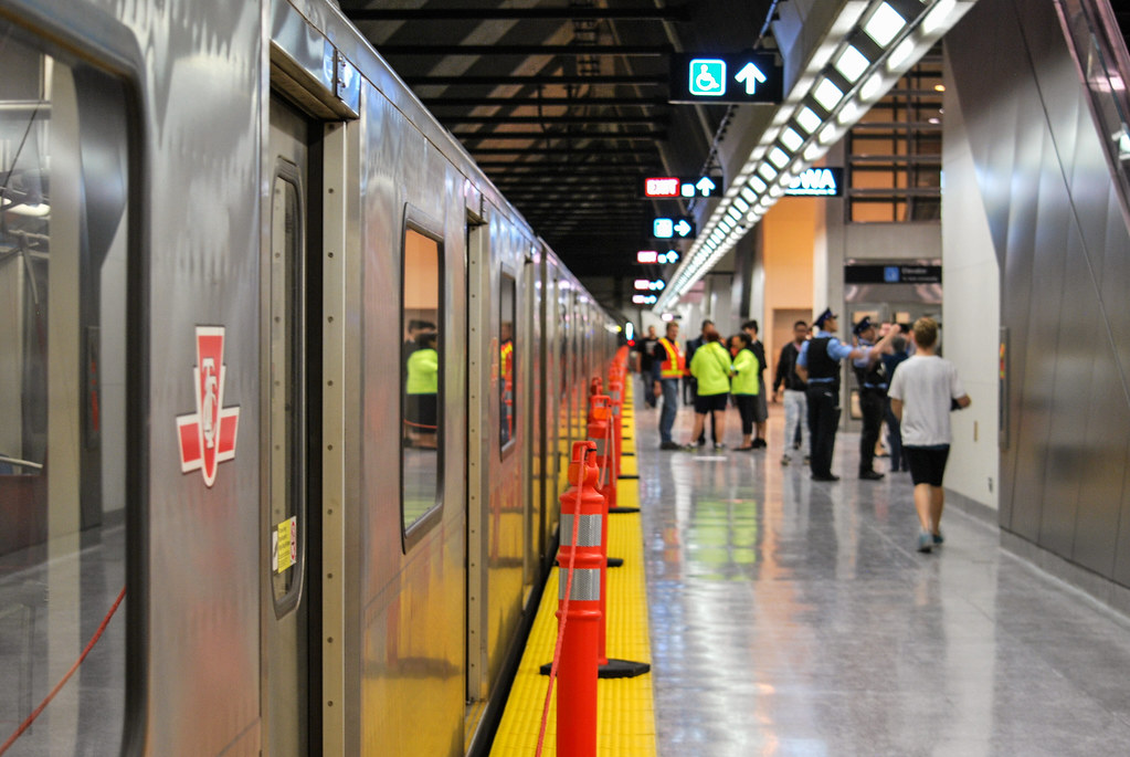
I fail to understand what you mean by actually next train displays and referring to the current screens as being garbage. There is a lot of backend tech involved with them. They are cable of provide much more information then the next train being there in five minutes. Like for example if there is a serous delay report it on ALL screens in the stations.

what i mean by garbage is the fact that all this tech as explained above is wasted due to the next stop times being squashed at the bottom corner of the screen. 85% of the onestop display is just ads and things that dont matter inside a subway platform. The things that should be on the display by order of priority are the next train train (or even 2), current time and date. Fine, they got sponsored by whatever company for the tvs but they really got the shaft on this as the most critical piece of info cant be seen clearly more than 10m away. If theyre going to get shafted by a sponsor they might as well make the screen bigger like the one on STM. At least their 10% of the screen is large enough to be read quite legibly.

I really dont get why TTC is so weak in these types of "partnership" deals. Its like they agree on it without much though on the implications.
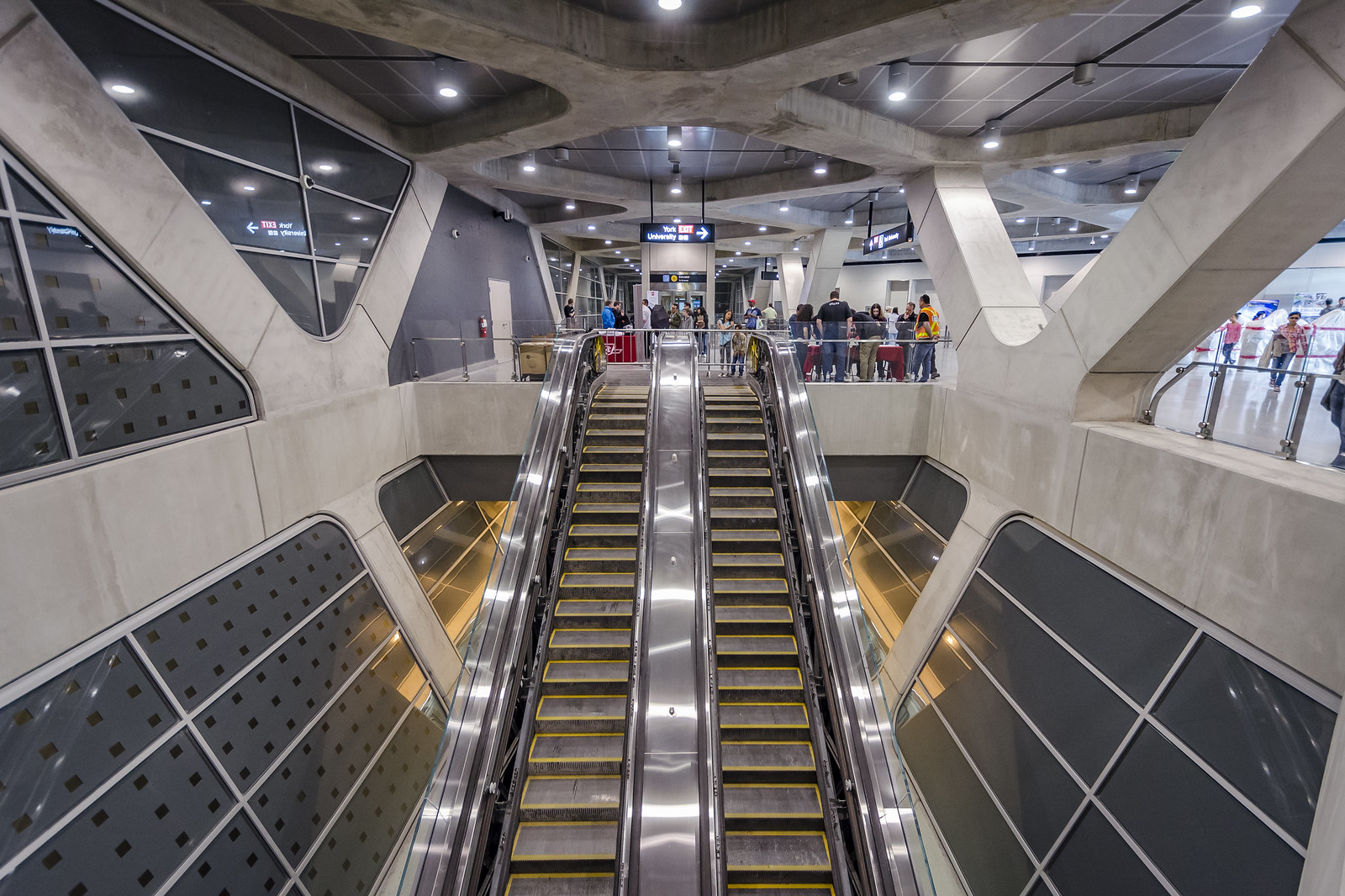
 
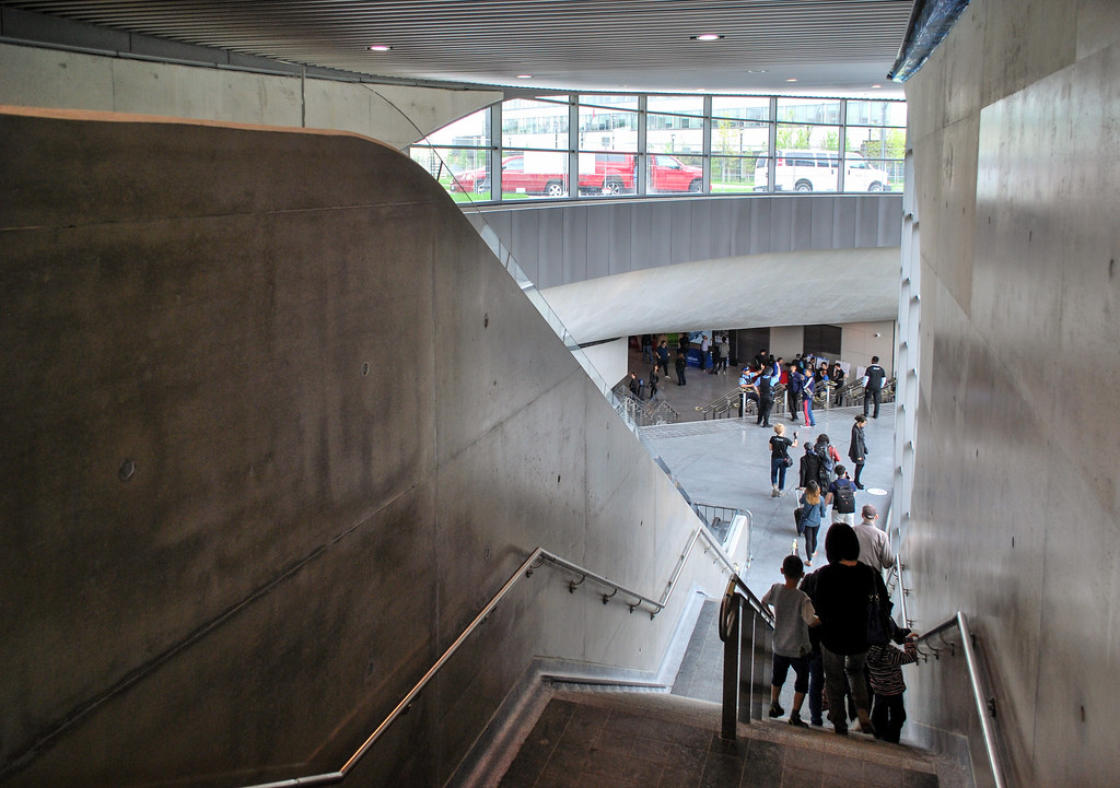
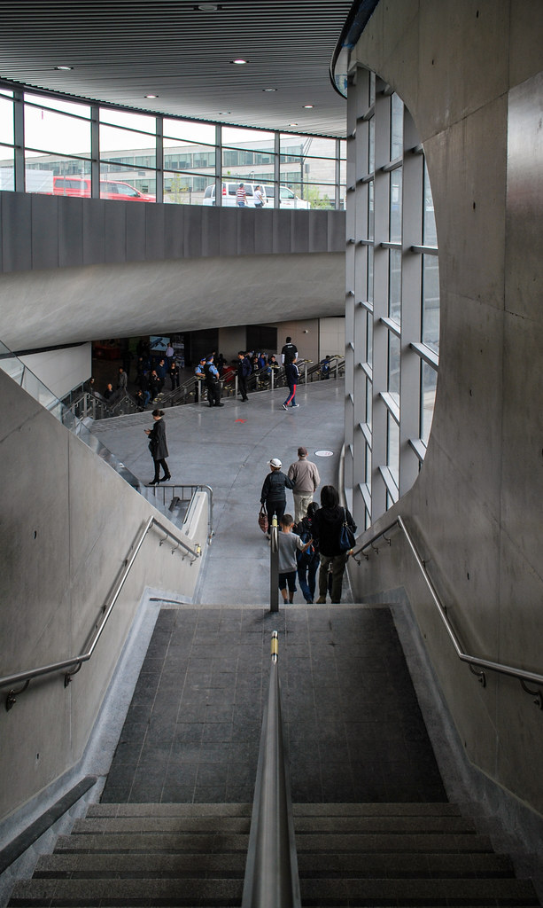
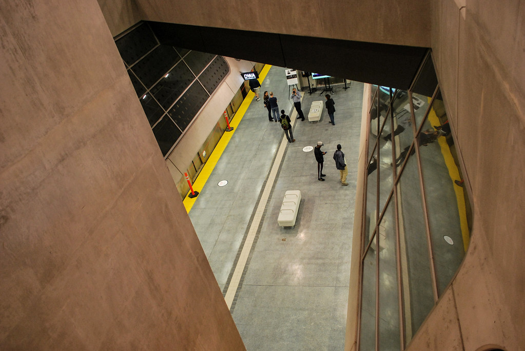
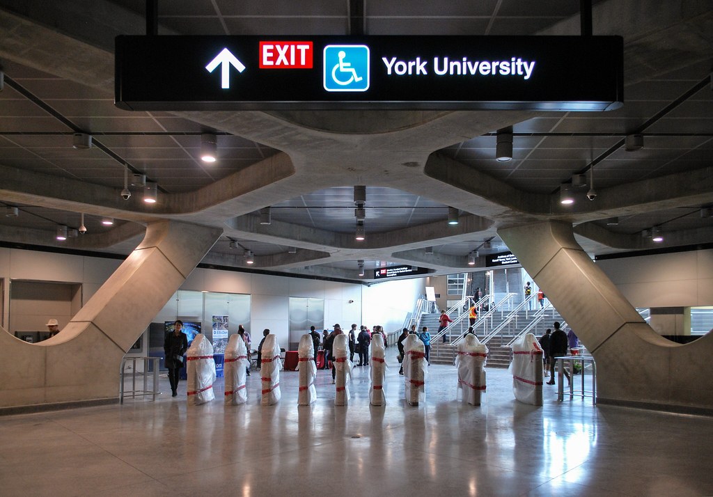
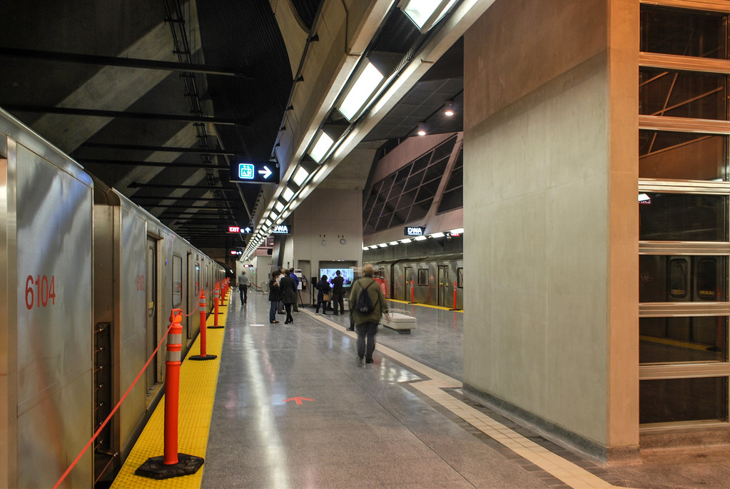
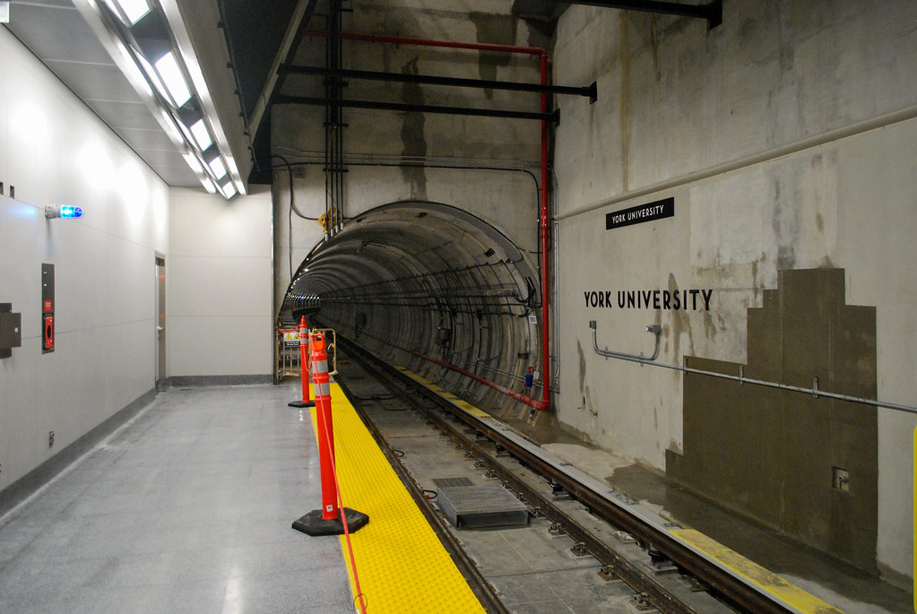
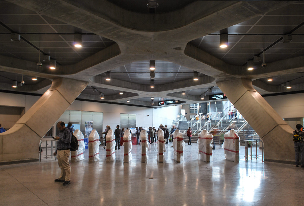
Why so much exposed concrete?

Apparantly its the new "trend" in architectural design... and also its a cost saving exercise to some degree. precast and other finishes for such a giagantic structure is $$$$$$$$, especially the hwy 407 mausoleum,
 
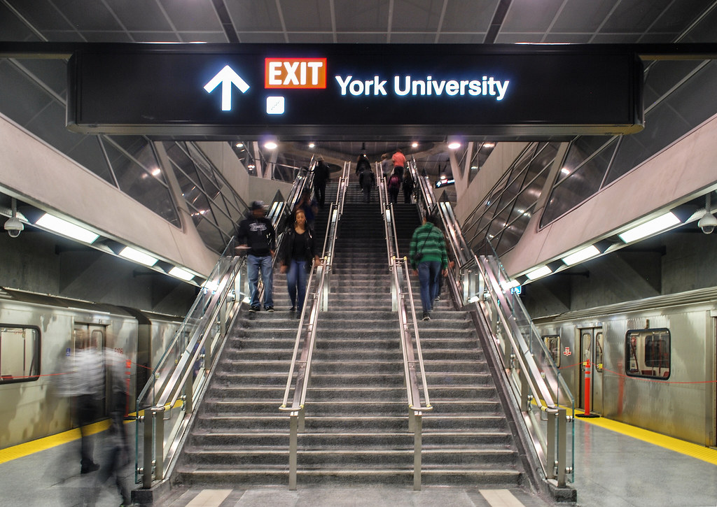
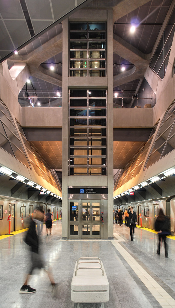
I really quite like the look of it, more sophisticated than your typical station here. No bathroom tiling is definitely good. It is reminiscent of Montreal Metro stations with its spaciousness and the exposed concrete forms.
 
As the only station on this extension that will be heavily used (for the next 10 or 20 years or so) it's grandiosity is somewhat earned. Not so for the other ones--esp 407 which doesn't deserve much more than a manhole cover at this point.
 
Apparantly its the new "trend" in architectural design... and also its a cost saving exercise to some degree. precast and other finishes for such a giagantic structure is $$$$$$$$, especially the hwy 407 mausoleum,
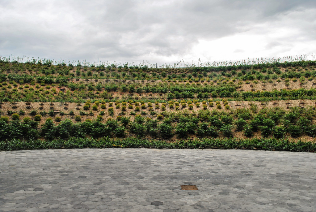
Not to mention that it's eco-friendly
 
what i mean by garbage is the fact that all this tech as explained above is wasted due to the next stop times being squashed at the bottom corner of the screen. 85% of the onestop display is just ads and things that dont matter inside a subway platform. The things that should be on the display by order of priority are the next train train (or even 2), current time and date.
I really don't get why it's' necessary for them to display the time the next train is coming but since they do I think they need more of them then just the one in most of the stations. Most of the time it's usually 5 minutes between trains anyway . I just don't get what the big deal about knowing about the next two trains though?
 
I really dont get why TTC is so weak in these types of "partnership" deals. Its like they agree on it without much though on the implications.
Simple reason is they don't have the money to do it on their own. Take for example Tconet who provides internet service on the platforms of the stations, they actually pay the TTC to put in the equipment and maintain it, it cost the TTC nothing at all.
 
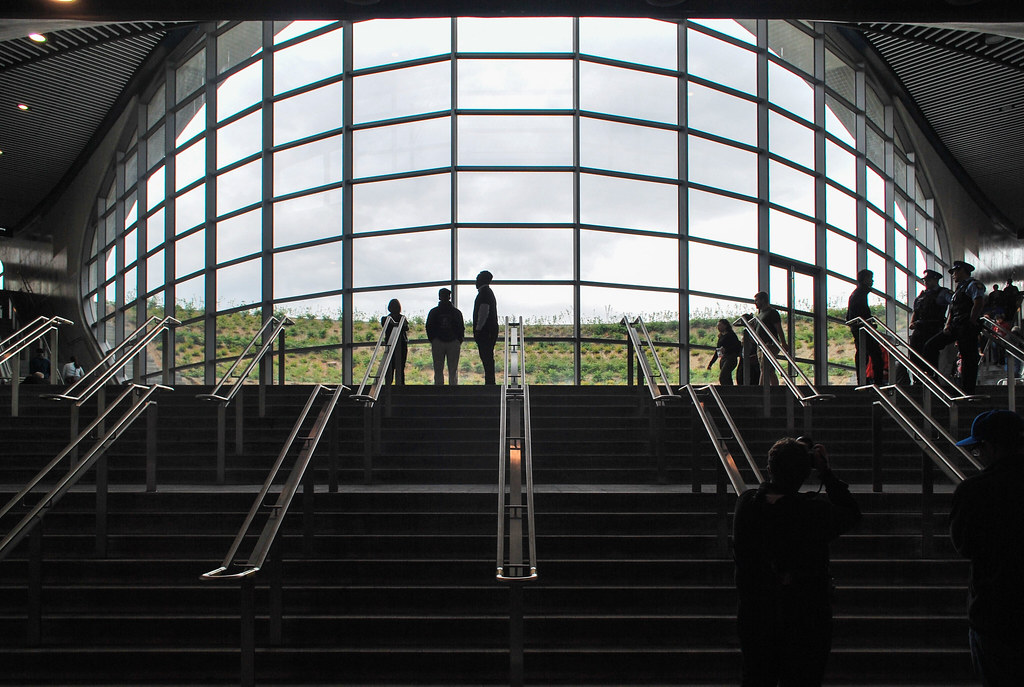
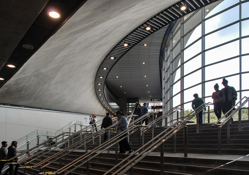
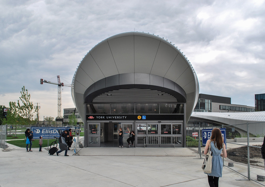
The project suffered a lot from the lack of attention to details - the concrete is more stained than it should be, and not at all at a level that I will associate with Foster. It's nice (especially th e lightscoop/entry pavilion), but in terms of finishing I think Downsivew (to be Sheppard West) has it beat.

AoD

Yeah I guess Foster is renowned, didn't really put two and two together that we had real deal architects on these. Knew they were starchitects, but Foster is like way up there. And Downsview/Sheppard West is always a good one. I like simple open concept stations, and it really didn't cost all that much relative to these. Still though, with this station I wouldn't be surprised if TTC isn't already getting filming proposals. Would make a good sci fi futuristic station on screen.
 
Yeah I guess Foster is renowned, didn't really put two and two together that we had real deal architects on these. Knew they were starchitects, but Foster is like way up there. And Downsview/Sheppard West is always a good one. I like simple open concept stations, and it really didn't cost all that much relative to these. Still though, with this station I wouldn't be surprised if TTC isn't already getting filming proposals. Would make a good sci fi futuristic station on screen.

Of course, the irony is that Downsview/Sheppard West was held up as an example of overspending on stations - so much so that David Gunn refused to attending the opening, and that the Harris government held it up as the example of excess during Sheppard design/construction.

https://www.theglobeandmail.com/new...few-cars-short-of-a-full-train/article761016/

AoD
 
The project suffered a lot from the lack of attention to details - the concrete is more stained than it should be, and not at all at a level that I will associate with Foster. It's nice (especially th e lightscoop/entry pavilion), but in terms of finishing I think Downsivew (to be Sheppard West) has it beat.

AoD
Glad you concede the point. That's why it's termed "gray concrete" because that's what they cheaped out on instead of "white concrete" which was probably spec'd in the original drawings. The early renderings were clearly white. What an incredible waste of an excellent design concept. I guess you could always paint it....phhh...
 
My impression of York is that the lighting/ceilings, particularly, on the middle/upper levels is a cut above the average.

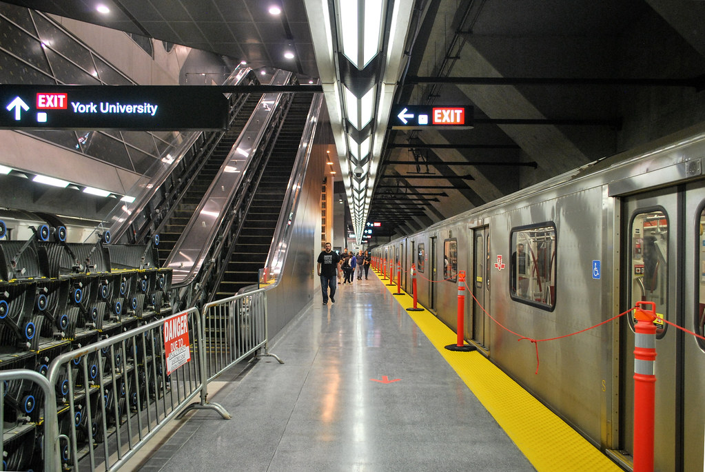
I'm really not a fan of the TTC's standard platform light fixture (the v-shaped).

As with others, I think the bare concrete concept has its place, and York might have been it, but the execution comes up short.

I would, however, add, I think there's too much concrete across the line. Doing all the trackside walls that way is boring at best, very repetitive, but also
just too much grey on grey at many stations.

I know many folks revere the original Paris subway stations for their iconic white tiles. To me it was always the weakness of their system that all (most) of the stations looked the same.

I think Toronto really hit the high-water mark with the original Spadina Line and w/Downsview/Sheppard West. (my fav station.).

Everything since feels under-finished.

Including reno jobs.
 
I really quite like the look of it, more sophisticated than your typical station here. No bathroom tiling is definitely good. It is reminiscent of Montreal Metro stations with its spaciousness and the exposed concrete forms.

To be honest I actually like the so called "bathroom tile" stations. Not necessary for the aesthetics but because they are so much more compact and closer to street compared to modern subway stations. I just find them much easier to use.
 

Back
Top