Lenser
Senior Member
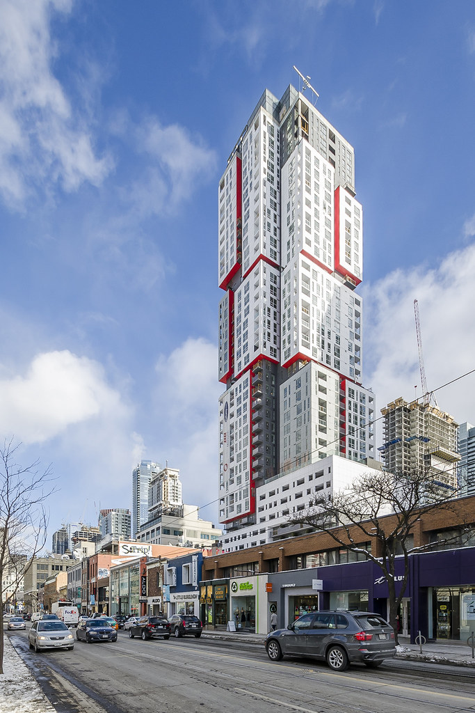
Apart from the lower wall with the odd slit windows, I rather like the look of Gloss - at least, as far as I can trust a render.
I love how it looks almost like a render in MafaldaBoy's shot.18 February 2016
I completely agree -- the red is punchier, and the overall palette is much cooler. This is a real gem.I have to say, I think it looks better in person than the renders suggested!
On second thought - those windows in plan are probably really deceptive to potential homeowners. You might think you're getting an entire wall of glass, and end up with a tiny slit.