You are using an out of date browser. It may not display this or other websites correctly.
You should upgrade or use an alternative browser.
You should upgrade or use an alternative browser.
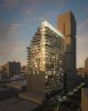
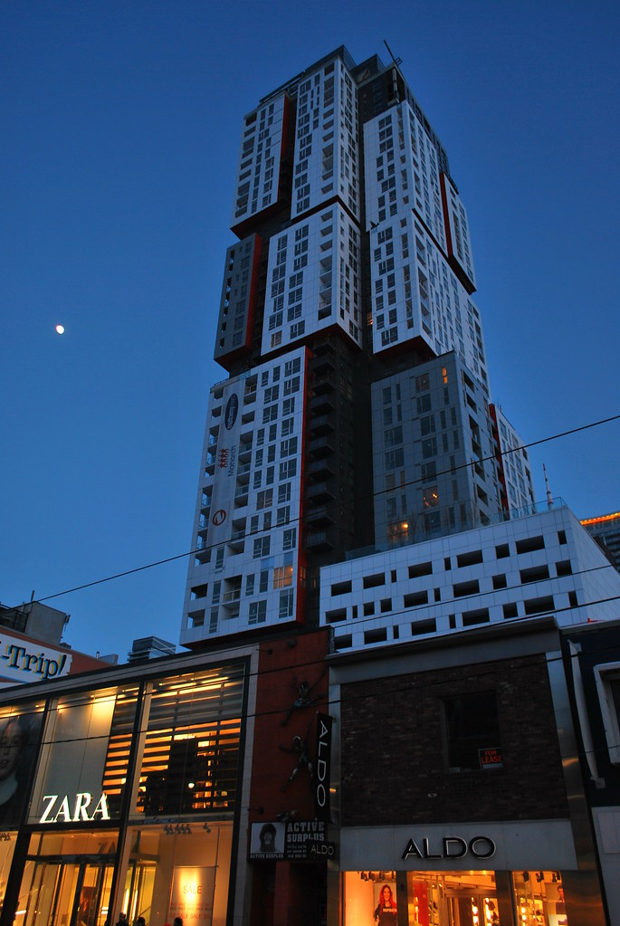
Toronto Picasso Condos | 128.62m | 39s | Mattamy Homes | Teeple Architects
- Thread starter maestro
- Start date
smuncky
Senior Member
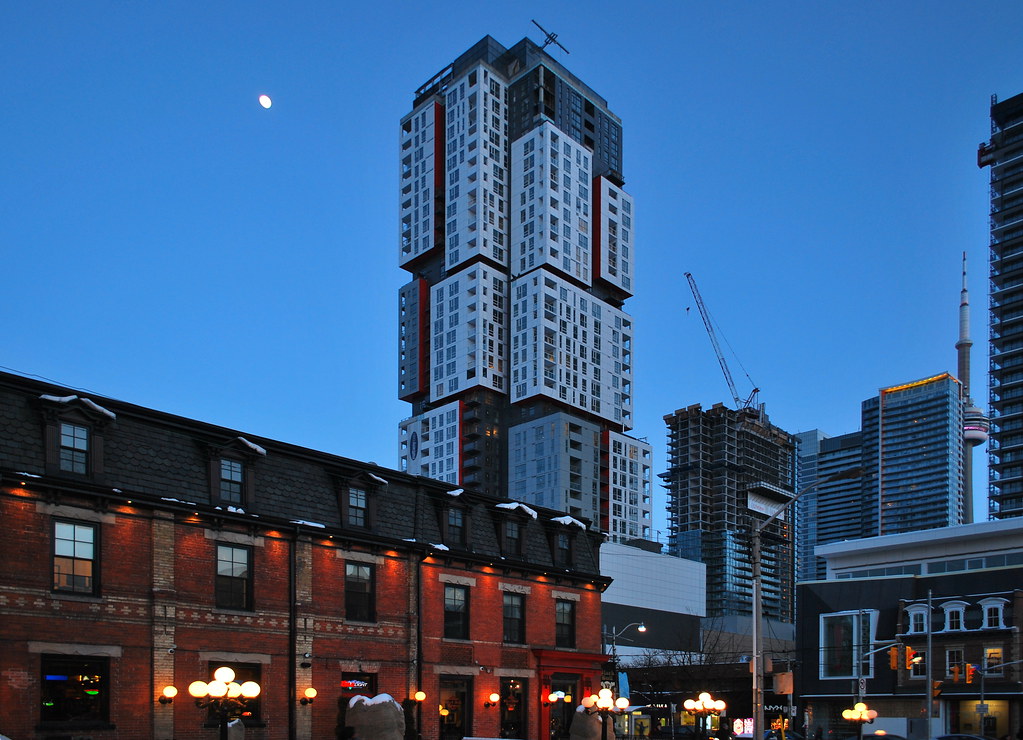
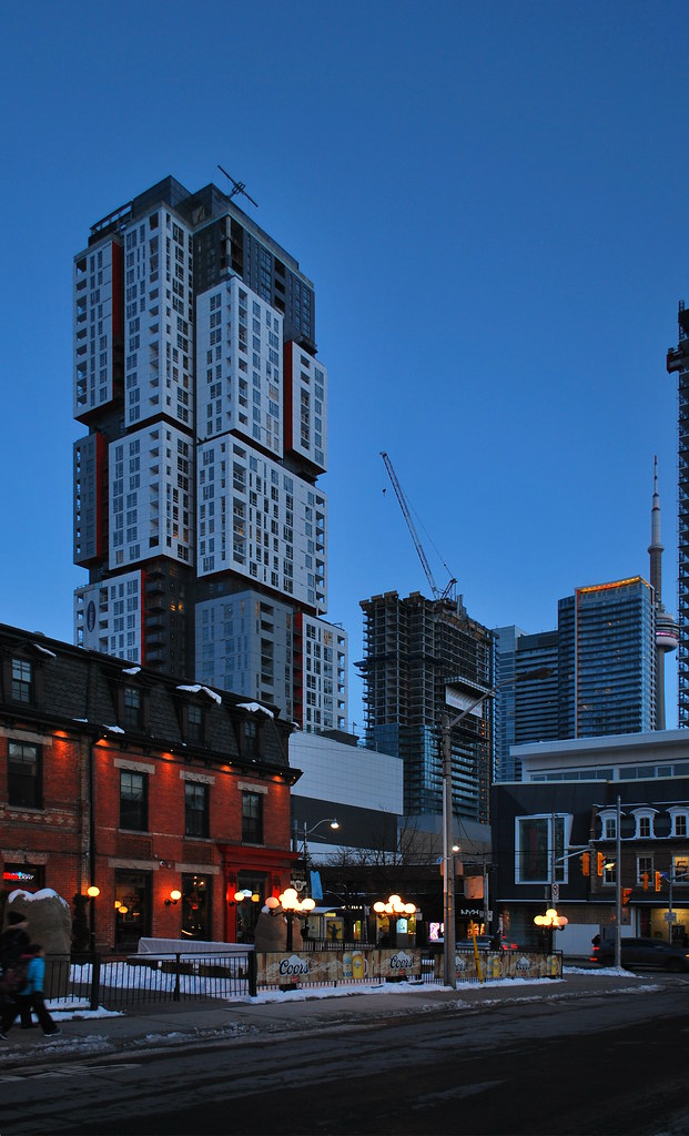
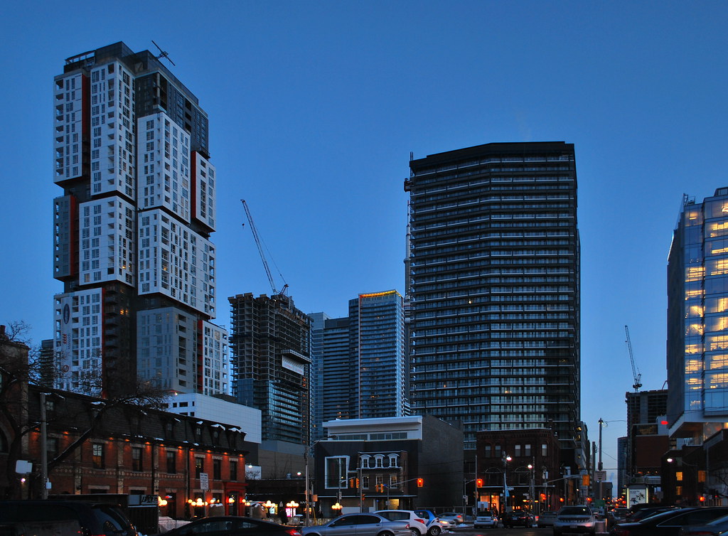
Looking east from Queen Richmond Center.

G.L.17
Senior Member


Marcanadian
Moderator
Thursday:
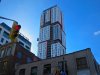
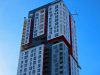
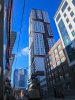
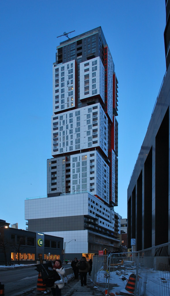 Picasso by Marcus Mitanis, on Flickr
 Picasso by Marcus Mitanis, on Flickr
 Picasso by Marcus Mitanis, on Flickr
 Picasso by Marcus Mitanis, on Flickr
 Picasso by Marcus Mitanis, on Flickr
Picasso by Marcus Mitanis, on FlickrPicasso by Marcus Mitanis, on FlickrPicasso by Marcus Mitanis, on FlickrPicasso by Marcus Mitanis, on FlickrPicasso by Marcus Mitanis, on FlickrTewder
Senior Member
I hate to be a pooper about it because I really like the tower but....
How the heck is this monolithic, soul-crushing blank wall considered good design? The tower doesn't excuse this dreadful, nay criminal, gesture at street level. This is pretty much everything I hate about design. A cool concept that is more concerned/impressed with its concept than with the reality of how it exists/functions in its real urban setting, in fact is dismissive of it.
I'm giving this a fail because of the stupid, thoughtless podium. You can't trick me with a fancy bauble on top, as nice as that bauble is.
Yes, it looks good from a distance. So does Aura.
greenleaf
Senior Member
I hate to be a pooper about it because I really like the tower but....
How the heck is this monolithic, soul-crushing blank wall considered good design? The tower doesn't excuse this dreadful, nay criminal, gesture at street level. This is pretty much everything I hate about design. A cool concept that is more concerned/impressed with its concept than with the reality of how it exists/functions in its real urban setting, in fact is dismissive of it.
I'm giving this a fail because of the stupid, thoughtless podium. You can't trick me with a fancy bauble on top, as nice as that bauble is.
Yes, it looks good from a distance. So does Aura.
I can't comment on actual street level, but there is a blank wall because this is going next door: http://urbantoronto.ca/database/projects/330-richmond-was-gloss-condos
modernizt
Senior Member
I agree that the podium isn't great from an urban design standpoint, but taking issue with the blank firewall is a waste of your time. It's at the property line, it's a firewall, and as one would expect in an urban setting, a new building is going to abut that wall directly, forever banishing it from view.
marcus_a_j
Senior Member
It's one of the more decent blank walls built along a property line. It's fairly large which makes it more imposing, but hopefully it will be out of view soon with Gloss going up beside it.
My only issue with building - and I hate bringing it up also since it's a very nice building overall - are the white mullions in the windows within the white cladded areas. Same with the grey mullions but a little less so. I'd prefer darker mullions that match the glass instead of the cladding. It would make the windows pop out more. As is it now, I find the contrast between the white mullions and dark windows to be a little too messy for a tower that has clean and distinct colour separations.
My only issue with building - and I hate bringing it up also since it's a very nice building overall - are the white mullions in the windows within the white cladded areas. Same with the grey mullions but a little less so. I'd prefer darker mullions that match the glass instead of the cladding. It would make the windows pop out more. As is it now, I find the contrast between the white mullions and dark windows to be a little too messy for a tower that has clean and distinct colour separations.
Tewder
Senior Member
I agree that the podium isn't great from an urban design standpoint, but taking issue with the blank firewall is a waste of your time. It's at the property line, it's a firewall, and as one would expect in an urban setting, a new building is going to abut that wall directly, forever banishing it from view.
I can't comment on actual street level, but there is a blank wall because this is going next door: http://urbantoronto.ca/database/projects/330-richmond-was-gloss-condos
Ah ok, that explains it. I just knew something was off here. Now I can like this building!
")
Lyphe
Active Member
This building still feels like a white couch to me. You see it in the brochure ... it looks great when you bring it home ... but then in a year or two, you wonder what you were thinking as it hasn't held up well. I hope I'm wrong, but my biggest concern with this building is whether or not it ages well.
Armour
Senior Member
I hope the panels will remain white and pristine and not become dull and dirty.
wolfewood
Active Member
I hope the panels will remain white and pristine and not become dull and dirty.
Eh will it matter? The Gloss condos development (or whatever comes after, if that one fails) next door will cover it up eventually.
Armour
Senior Member
I'm not talking about the base, but the tower. No tower is entirely covered up by another.Eh will it matter? The Gloss condos development (or whatever comes after, if that one fails) next door will cover it up eventually.
wolfewood
Active Member
Ah my bad, I thought you were referring to the debate earlier about the firewall. I'd be curious to see how it ages as well.I'm not talking about the base, but the tower. No tower is entirely covered up by another.
salsa
Senior Member
It's fairly large which makes it more imposing, but hopefully it will be out of view soon with Gloss going up beside it.
Hopefully? Gloss looks like cheap crap compared to Picasso. Complain all you want about the blank wall, but all you're gonna get out of it is a new blank wall that will probably look even worse than the one it replaced. How is this an improvement?