Ryan_T
Senior Member
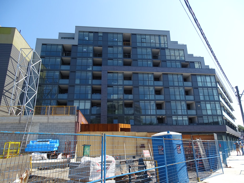
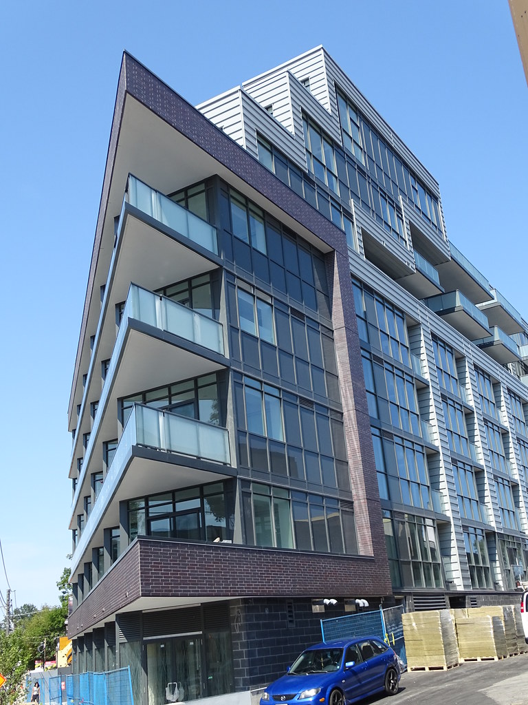
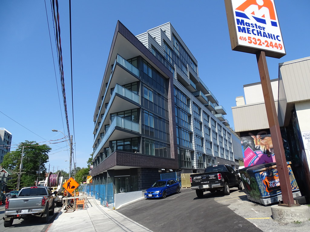
Wow, let's hope they are putting some framework on top of that nasty grey siding for plants to climb up. That is the Only thing that can redeem it.
UD is right about the Vancouver/Seattle/Portland aesthetic. There are a lot of really nice buildings on the west coast that have similar cladding to this siding. I don't *love* it, but it isn't just cheap or crap or whatever anyone is saying. Typically on the west coast natural materials - especially wood but also, IMHO, unfortunately, stone - are used in conjunction with the siding. Wood usually contrasts well. Brick doesn't have quite the same effect. Often there are also coloured panels, or the siding is itself red or back, which this building is missing. Still, you can see that the adjacent building also has similar cladding (though it is green on the top) and it blends in well, creating a kind of industrial aesthetic that melds brick warehouse with contemporary postindustrial. I think it looks good.

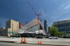
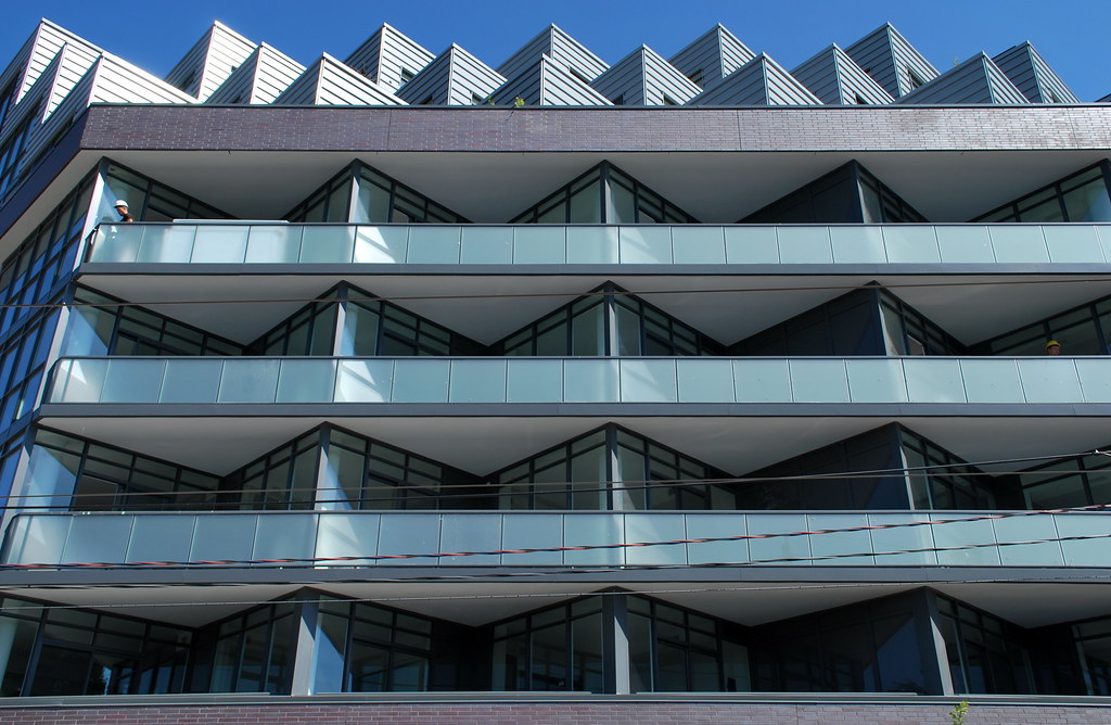 Howard Park by Marcus Mitanis, on Flickr
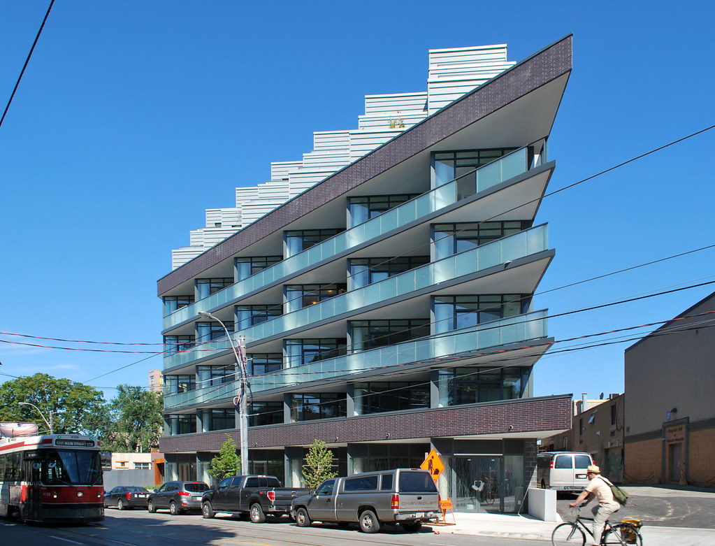 Howard Park by Marcus Mitanis, on Flickr
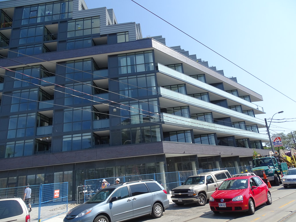
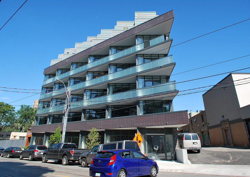 Howard Park by Marcus Mitanis, on Flickr
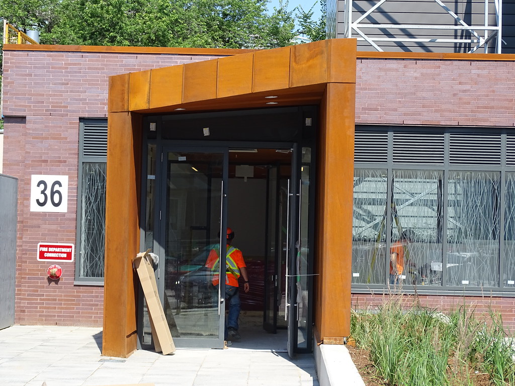
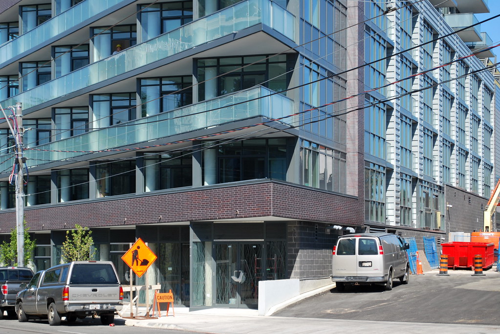 Howard Park by Marcus Mitanis, on Flickr
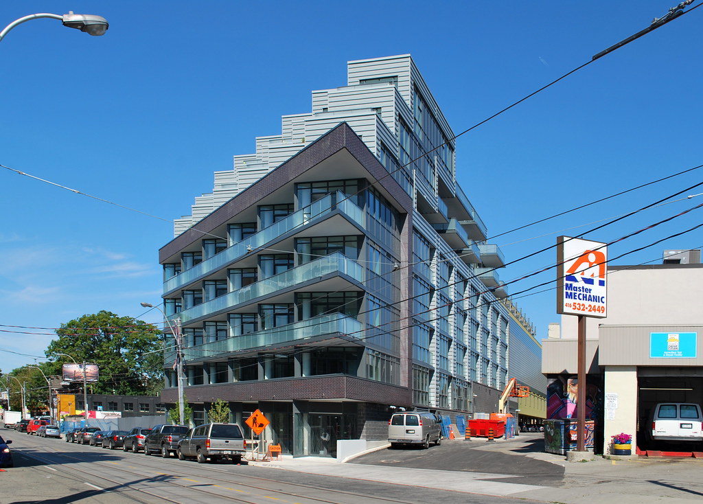 Howard Park by Marcus Mitanis, on Flickr