Toronto Velocity at the Square | 122.52m | 40s | HNR | P + S / IBI

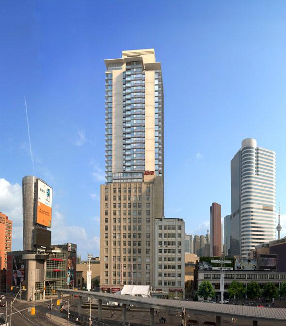
well if anything, at least the materials/colours are quite consistent to the one and only rendering available on this project:

urbantoronto-2990-29544.jpg

http://urbantoronto.ca/database/projects/hnr-dundas-square-tower
 
Those are some of the ugliest set of precast panels i've ever seen. I mean they look bad now, but just imagine how they will look in 3-5 years.
 
They are also much more...uhhh...salmon hued than they appear in the photo I took. Not cute.
 
ya... I wouldn't describe them as anything but ugly. However they are quite peachy-pink in person... so at least they aren't grey, but that's really all I can say nice about them.
 
There's a nice warmth to these panels and a good change from grey and/or straight-up beige. They should age fine as they get dirty with pollution.
 
The salmon-coloured precast and the window wall both look horrendous. Every time I see this thing I cringe.
 
The salmon-coloured precast and the window wall both look horrendous. Every time I see this thing I cringe.

From what I can tell, the glazing that has been installed so far on the south facade is almost entirely a weird brown/copper spandrel, with little cutouts for windows. This has only been installed on the first floor or so above the Mirvish Theatre. As it becomes easier to view, I'll post a photo. It's frightening.
 
Was thinking that same thing, AG! It's amazing how people's tastes vary. I'd rather something more interesting than all the grey/blue/green/black we have in new construction. Salmon and copper are the new black. (Guess I'm biased because of living in a black clad building -- that is horrible to keep clean, and is fading big time in the sun and will look grey in a few years).
 

Back
Top