Toronto Casa II Condos | 184.09m | 56s | Cresford | a—A

I'm not a big fan of BSN as much as I wish the balconies on casa 1 were not so transparent I definitely prefer them over the beige BSN. The lighting feature on casa 1 is very pleasing to me (most colours - it's been an aqua blue for awhile now, I enjoy it)
 
BSN, 1Thousand Bay, Casa 1,2,3.....One of these things is not like the other. All developed by the same builder too.
 
I actually don't mind and rather quite like the lower 16s of BSN, what messed it up to me is when Cresford plunked the tower on top (later revision/addition) with the green spandrels

Casa 1 on its own was ok ... but 1+2+3 is definitely too much of the same (same effect in the entertainment district)
 
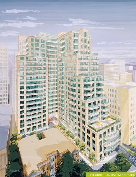
The original BSN
Here's an old render with the small apartment building (but keep in mind, BSN will be about 8 floors higher than this render).

bsnrender.jpg
 
Casa 1 on its own was ok ... but 1+2+3 is definitely too much of the same (same effect in the entertainment district)
At least we are getting varying roof heights here! And, while I know that few people agree with me, I do not mind the repetition of building designs when there are only a few of them. I do not consider Casa to be the same design as Casa II/III.

42
 
I actually don't mind and rather quite like the lower 16s of BSN, what messed it up to me is when Cresford plunked the tower on top (later revision/addition) with the green spandrels

Casa 1 on its own was ok ... but 1+2+3 is definitely too much of the same (same effect in the entertainment district)

Going up I thought BSN was looking quite nice...then came the tower portion and it really turned from promising to mediocre. Since then Cresford has gone the glass box route.

Casa 1 was a very nice project especially given when it was built. Casa 2 is saved by the balconies. Still pretty solid. Casa 3 I'll have to see. But I guess this is no different than a project that has 2 or 3 towers just like a One Park Place in Regent Park. The buildings are going to be the same or similar. If you consider that this is all the same project then I don't mind all 3 towers. At leas they're all slightly different.

As big of a critic I am of "boring glass boxes" I actually like this little cluster better than BSN.
 
why not? they are all glass boxes with wrap around balconies.
One can differentiate between them with just a quick look: design elements as simple as balcony frit make it immediately obvious. Yes, they are of a family, but no, one cannot confuse Casa for Casa II.

42
 
Last edited:
Yep, I agree. Casa I and II are different beasts--and I think Casa II is superior. Casa 1 lacks differentiation from a distance, and ends up looking messy. Case II is sharp and pointed. I think it's a fantastic building.
 
The materiality and design of CASA is much more sophisticated, and it's clear to me that the new project is being pushed to have a higher ROI for Cresford. I also get the sense that the team doing CASA II is a very different team than the one behind CASA. It's trying to emulate CASA but misses the mark. (Again, not just the fault of the design team, but likely pressures from the developer to do things a certain way.)

Take a walk around both projects (of course taking into account that CASA II is not yet completed.) The podium is where this difference is most noticeable. The architectural plans also tell the story as does a look at the materials and detailing.
 
Slow progress on the mechanical level. I'm not sure if the grey cladding is the final finish or if it is still part of the insulation.
image.jpeg
 

Attachments

  • image.jpeg
    image.jpeg
    806.5 KB · Views: 495

Back
Top