AlvinofDiaspar
Moderator
Airstrip One, more like.
AoD
AoD
beware some godawful signage coming soon on the side
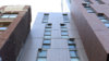
June 10:
View attachment 111684
Generally speaking it is quite atrocious, but not completely awful if you don't look up.
And frankly most of the public don't look up.
And frankly most of the public don't look up.
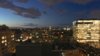
Apparently this thing makes a T on the skyline when seen from the south in the evening:
View attachment 125175 View attachment 125176
(Didn't have the whoop-de-doo camera with me.)
42