You are using an out of date browser. It may not display this or other websites correctly.
You should upgrade or use an alternative browser.
You should upgrade or use an alternative browser.
Toronto QRC West (Queen Richmond Centre West) | 71.93m | 17s | Allied | Sweeny &Co
- Thread starter voxpopulicosmicum
- Start date
AHK
Senior Member
The first two tenants, e-one and Diageo, have taken occupancy of their initial floors in QRC West. The building is now occupied.
Last edited:
AlvinofDiaspar
Moderator
Interesting, Diageo used to be up at Burnhamthorpe and 427 - looks like it's another example of relocation to the core.
AoD
AoD
Mike in TO
Senior Member
Sorry if this has been posted before - but an interesting article from Architect Magazine:
http://www.architectmagazine.com/awards/r-d-awards/citation-queen-richmond-centre-west_o
The Journal of the American Institute of Architects also recognized QRC West, with an R+D Award for its architectural, engineering solutions and innovations. The American Institute of Architects issues the R+D Awards annually to nine projects out of hundreds of entries, celebrating the most innovative building research, materials, and technologies worldwide.
AHK
Senior Member
I am note sure whether the entire 427 and Burnhamthorpe Diageo office would be relocating downtown, whether it might be part of the office, or whether it is expansion of the existing Diageo office space into a new downtown location. From the Allied 2014 Annual Report, the section on Leasing Activity (Page 43):Interesting, Diageo used to be up at Burnhamthorpe and 427 - looks like it's another example of relocation to the core.
AoD
(vii) the lease of approximately 11,500 square feet of GLA at QRC West, Phase I, to Diageo Canada for a term of 10 years commencing August 1, 2015;
Marcanadian
Moderator
 CN Tower by Marcus Mitanis, on Flickr
agoraflaneur
Active Member
stjames2queenwest
Senior Member
good ole barnacle
urbandreamer
recession proof
Have the tenants moved in yet? Security desk is operational as is the Diageo signage

yonderbean
Active Member
Last edited:
ssiguy2
Senior Member
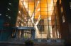
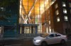
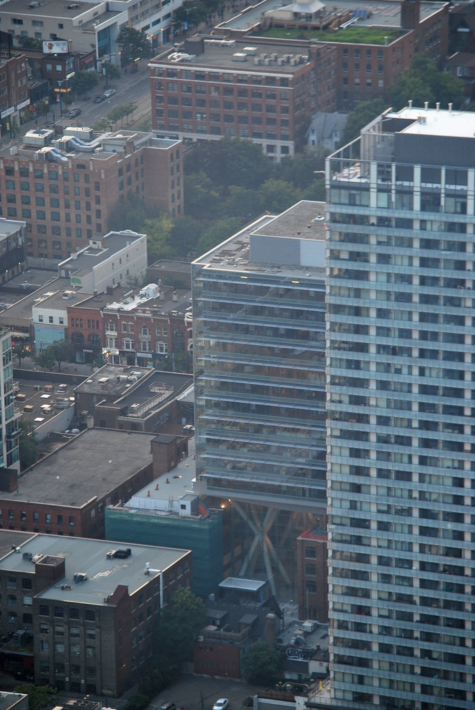
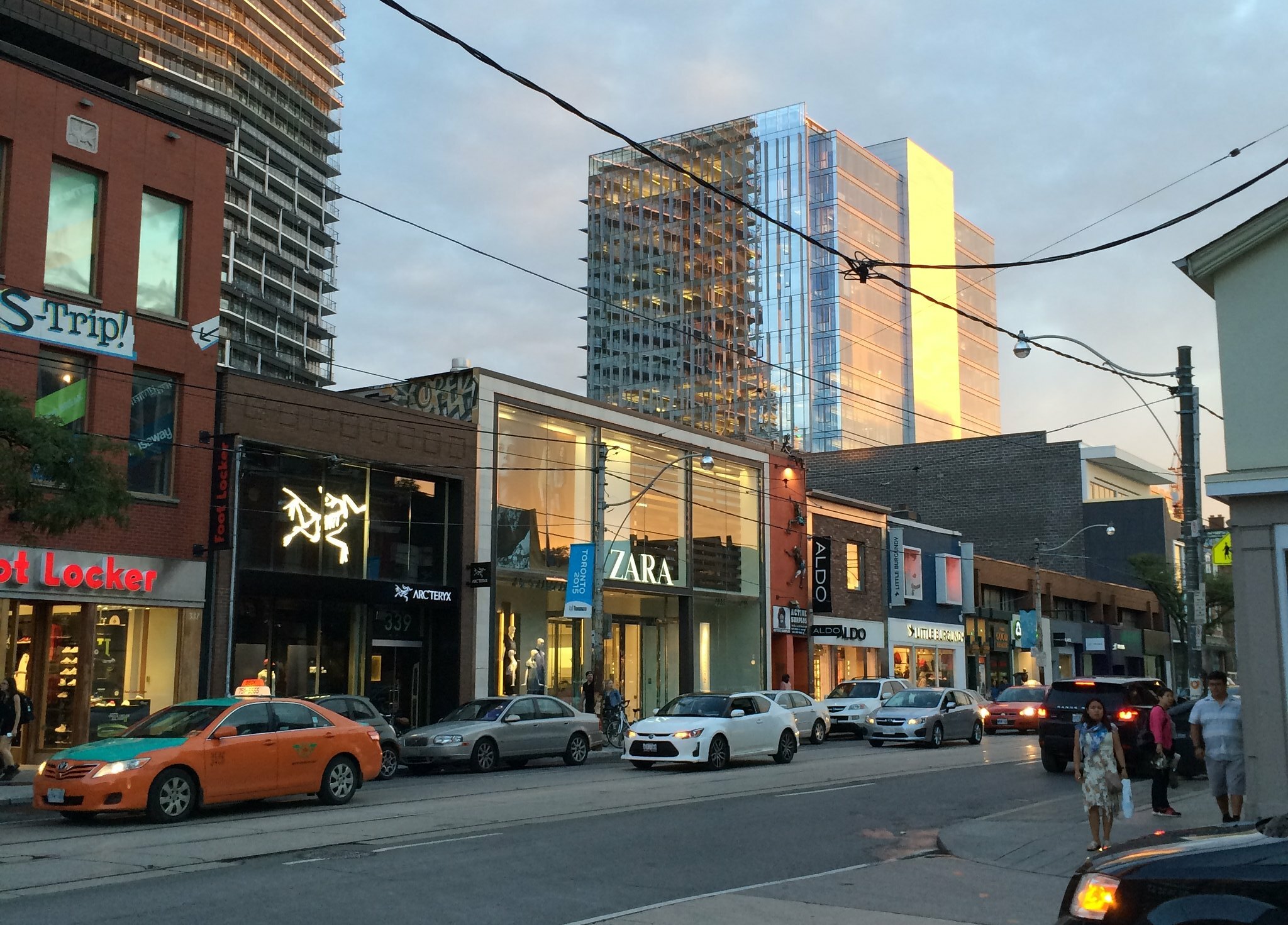
The older base section is wonderful but the glass box on top is as utilitarian, sterile, and monotonous as you will find anywhere.
This isn't a 3 dressed up as a 9 but rather a 3 on top of a 9.
This isn't a 3 dressed up as a 9 but rather a 3 on top of a 9.
lead82
Senior Member
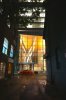
This is what Toronto does best - saving an old industrial brick building by building a boring glass box on top. The street level is beautiful and the lobby looks very cool. The rest of the tower is utilitarian, but that is ok as it needs to have practical uses for an office, and rectangles are the most efficient shape.
WislaHD
Superstar
Both of these are lovely pictures of the building!
Hamiltonian
Active Member
There is such a great opportunity to do something with that blank wall... A large mural maybe?
Miscreant
Senior Member
Member Bio
- Joined
- Oct 9, 2011
- Messages
- 3,616
- Reaction score
- 1,794
- Location
- Where it's urban. And dense.
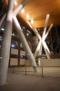
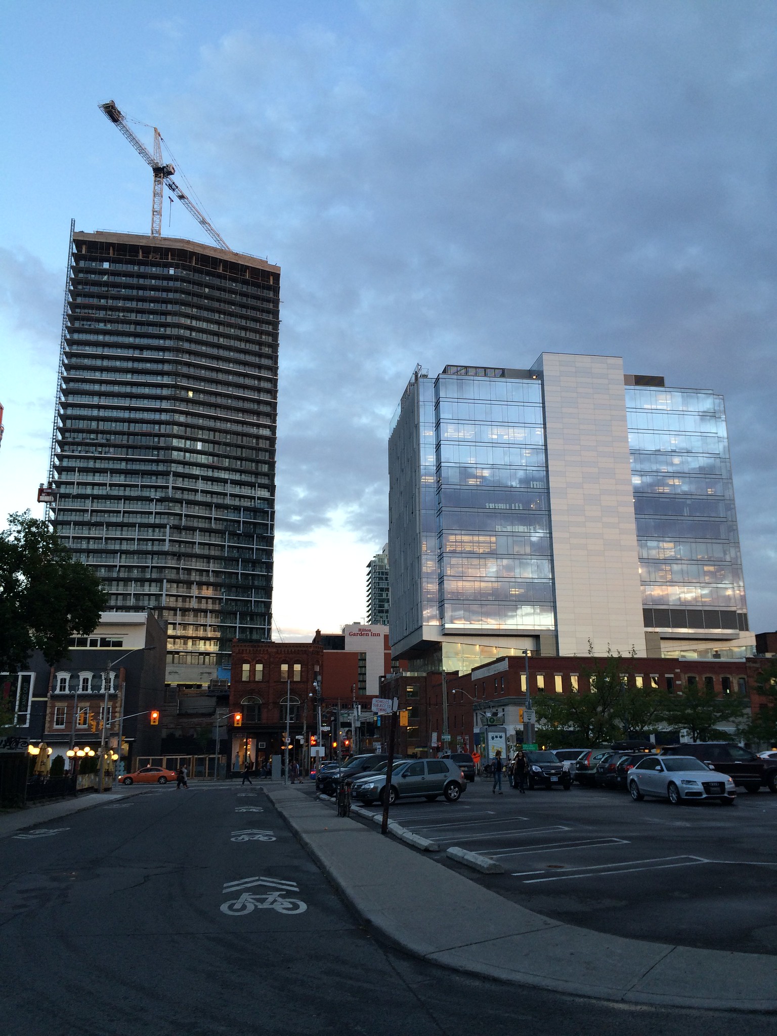
Alright, I'll stick my neck out: I think that this building--at least in these pictures and particularly in the first one--looks gorgeous. The subtle patterning down the elevator wall is interesting without being busy, the fins are attractive, and the glass is rather tastefully reflective without looking like it's 1984 again.
I also think that the contrast between the warm-red brick stores on Queen and the cool, blue hue of the glass is interesting and tasteful.
I also think that the contrast between the warm-red brick stores on Queen and the cool, blue hue of the glass is interesting and tasteful.