News   Apr 18, 2024
 826     3 
News   Apr 18, 2024
 267     0 
News   Apr 18, 2024
 617     1 

GO Accessibility / Digital Signage / Tech

mdrejhon

Senior Member
Member Bio
Joined
Oct 25, 2014
Messages
4,061
Reaction score
2,951
Location
Hamilton
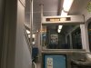
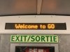
GO Transit has been installing digital signage on their trains.
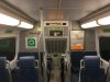
- 12 screens, visible from all seats. Some of them are double sided.
- Beginning with accessibility coaches
- Eventually all GO coaches. Upgrading 2 coaches at a time.
- Will begin displaying GO route and destinations next year.

No more boarding the wrong train!

IMG_1663.JPG
IMG_1664.JPG
IMG_1665.JPG
IMG_1666.JPG
IMG_1670.JPG
 

Attachments

  • IMG_1663.JPG
    IMG_1663.JPG
    1.9 MB · Views: 863
  • IMG_1664.JPG
    IMG_1664.JPG
    1.9 MB · Views: 940
  • IMG_1665.JPG
    IMG_1665.JPG
    2 MB · Views: 1,145
  • IMG_1666.JPG
    IMG_1666.JPG
    1.9 MB · Views: 734
  • IMG_1670.JPG
    IMG_1670.JPG
    580.6 KB · Views: 608
I think this is a great idea - I've fallen asleep on GO trains at night and woken up not knowing where I am due to the darkness outside, and had to use Google Maps to see where I am. Also good for accessibility. Love it how CSAs will still be on trains, they are great and I love their personal touch.
 
Last edited:
The stairway location is clever, anyone who starts going up will see the train "Lakeshore East" and.... oops, I should have boarded the Lakeshore West train.

"Oops" factor:
I've had two GO journeys of more than 3 hours long....Union to Oshawa to Hamilton because I fell asleep on a Lakeshore East train in dark winter hours when I meant to board the Lakeshore West. And only woke up near Oshawa. As a deafie, I cannot hear the announcements, so it is a big thing to me, squinting at mysterious station silhouettes outdoors, foguring out how to disembark at my station without overshooting. Or of course, loading up my GPS.

Accessibility coaches first:
It will be easy enough to upgrade accessibility coaches first, but all coaches will need them. Upgrading two coaches at a time, it will take a while (maybe years) for every single coach to have them, methinks. So head to the accessibility coach next year if you depend on these digital signage.

Signage size:
They seem goldilocks -- not too big (distracting) and not too small (hard to see). They don't seem to flicker (like cheap marquees) and they are reasonably bright (but not distracting). I am glad that GO went "relatively utilitarian" here, as color advertisements would be nauseating. And utilitarian means they can afford 12 per coach, viewable from all seats and nearly all standee locations (quite a feat). That's thousands they will need to install. It looks like they're built into the coaches, relativelty seamless, no visible wiring, so clearly it isn't a hacked-on job. I'd give it a tentative stamp of approval for the decisions they made leading up to this -- pending actual real world use.

What should be displayed?
Keep it simple. Amount of text and animation they choose to do (or don't) in active signage. This will be very important. A two-line rotation (brief vertical scroll, not slow animated motion-y horizontal marquee) will be less distracting perhiperally. Simple rotation between route ("Lakeshore West") and its final destination ("To: West Harbour") whenever dwelling / stopped. The station name announced en motion whenever within two minutes to the next station ("Exhibition Place"), up to the time doors open.

RER needs it:
Long term, it will be important for GO RER and the complex layered routes like express/allstop and Hamilton/West Harbour versus Oshawa/Bowmanville, etc. Reduce the "Is this train stopping at my station?" confusion.
 
Last edited:
What should be displayed?
Keep it simple. Amount of text and animation they choose to do (or don't) in active signage. This will be very important. A two-line rotation (brief vertical scroll, not slow animated motion-y horizontal marquee) will be less distracting perhiperally. Simple rotation between route ("Lakeshore West") and its final destination ("To: West Harbour") whenever dwelling / stopped. The station name announced en motion whenever within two minutes to the next station ("Exhibition Place"), up to the time doors open.

Customers will adapt to any number of formats, so there is no single right answer. I have seen other systems where all upcoming stops are played in sequence. It's reassuring for non-habitual riders, as you can see you are on the right train and still several stops away from your station. I like the Next Station announcement to begin once the train leaves the previous station - again, a little reassurance and allows the most possible time for people to get ready, make their way to the doors, etc. I have seen stop name and schedule time both displayed, too - again, a bit more context.

Absolutely not to be used for propaganda announcements, cutesy marketing slogans, general reminders to riders, promotions, etc..... keep it focussed on the rider getting to the right stop.

- Paul

PS - Consistency between the platform signage and what appears on the train is desirable too. I'm thinking especially of what the signs on the platforms at Union display versus what you see upon boarding. Again, the anxiety factor.
 
Last edited:
Customers will adapt to any number of formats, so there is no single right answer. I have seen other systems where all upcoming stops are played in sequence. It's reassuring for non-habitual riders, as you can see you are on the right train and still several stops away from your station. I like the Next Station announcement to begin once the train leaves the previous station - again, a little reassurance and allows the most possible time for people to get ready, make their way to the doors, etc. I have seen stop name and schedule time both displayed, too - again, a bit more context.
One possible compromise is there apparently is enough room for two rows of text.

One big font and one small.
There is room for a 5 pixel tall all-caps font at the bottom row, if the existing size text is moved up 3 pixels to make room for a 6 pixel tall empty space at bottom.

The important top row of text could remain the same size as in the photos, and display the route while dwelling/stopped ("Lakeshore West") and the upcoming stop while in motion ("Exhibition GO"), using the "GO" suffix to denote a station announcement.

The bottom (small text) row would be a rotating list of all upcoming stops, in a gentle rotation that also pauses. (Many dyslexic readers and vision-impaired readers can't read moving text properly, so any marquees will need to pause at screenfuls)

A long slow one-line horizontal scroll will take too long for announcing all stops, so restrict to either limited info (final destination, and simple express/allstop indicator) with no or minimal animation (brief scroll, preferably vertical) between screens. Or rather, a two-line display will be needed, such as:

Lakeshore West
EXPRESS TO: OAKVILLE - BRONTE - APPLEBY -


Lakeshore West

- BURLINGTON - ALDERSHOT - HAMILTON.


The displays are 16 pixels tall, with the current "Welcome to GO" text being 10 pixels tall. So first line could be same font size as today (10 pixel tall) with the bottom row of text being half height (5 pixel tall).
 
Last edited:
It's always good to see improvements in the system. However to see what are (in my opinion) the best displays, here are some examples from regional trains in Zurich.

The first photo is displayed while en route, and tells you the next station and arrival time (the top blue box). The black box is the line number (S9 in this case), arrival times for the next four stations are in the white box, and the final destination and arrival time are at the bottom, along with a standard Swiss railway clock telling the time.

When arriving at a station, the display changes to a connections table (2nd photo) which shows you the station you're arriving at, arrival time, all connecting routes (train, bus, trams, boats, intercity trains, international trains, etc), their departure times, train platforms (if applicable), status (if delayed), and notes (usually delay time in minutes, if applicable).

These are used on all trains, buses, and trams in the Zurich region, which for reference is about the geographic size of Toronto plus the lower half of York region, but with half the population. I've seen this style being emulated in many other European systems. Maybe something for GO to strive for...


photo1.jpg photo2.jpg
 

Attachments

  • photo1.jpg
    photo1.jpg
    187.8 KB · Views: 488
  • photo2.jpg
    photo2.jpg
    269.2 KB · Views: 413
Very impressive! But that's probably for the next GO refresh cycle (during 2020s). GTHA's network is also not nearly as interwoven as Zurich...

Baby steps. Baby steps.

Brainstorms will go in this thread... I'll email a link to this thread to Anne Marie Aikens as well as accessibility@metrolinx.com so that they can monitor this feedback.
 
Last edited:
The stopped/dwelling display state... (Part 1)
Using the same font height (10 pixels) in a close approximation (Franklin Gothic Medium, 11 point -- but shows up as 10 pixels tall), I determined how cluttered a 1-line versus 2-line display might be.

(This is mockup of possible stopped/dwelling display state)

ESsimple.png


ESfull.png
 

Attachments

  • ESsimple.png
    ESsimple.png
    1.9 KB · Views: 519
  • ESfull.png
    ESfull.png
    2.3 KB · Views: 529
Last edited:
The stopped/dwelling display state... (Part 2)
That might be too cluttered, so theoretically it could instead rotate between two screens every few seconds (in a brief transition).

Perhaps also (E) or (Express) / (All Stops) next to "Lakeshore West"

ESsimple.png


ESterminus.png


Or another (shorter) synonym than the word "Terminus", to denote the end of a specific route. Most experienced commuters will already know all West Harbour trains are express trains.
 

Attachments

  • ESterminus.png
    ESterminus.png
    2.1 KB · Views: 508
  • ESsimple.png
    ESsimple.png
    1.9 KB · Views: 512
Last edited:
The train-in-motion state (station announcements).

ESstation.png


The "GO" suffix would stand for a station.

Maybe the "Lakeshore West" should be displayed as a "Lakeshore West Train".
-- Anything with a "Train" is the train route name
-- Anything with a "GO" is the station name
-- Anything with a "Terminus" is the final station

There needs to be distinguishing prefixes/suffixes to help people identify what screen is currently being displayed, when cycling through multiple pieces of information. People will quickly get familiar with what is being displayed, so that a "Kitchener Train" isn't confused with "Kitchener GO"

Over the long term, each train may need to be branded with a logo or route number (e.g. "LW" or "ST" or "8" inside a circle, like a route number) that can be displayable on low-resolution displays. So there could be a display like "❽ Lakeshore West" so we know it's displaying a train name rather than a station name, omitting the need to use the word "Train"
 

Attachments

  • ESstation.png
    ESstation.png
    1.9 KB · Views: 515
Last edited:
I think that GO should use Japanese like names for express services. So for Lakeshore West there might be a "Local" and a "Rapid" that skips some stops and an "Express" which skips every stop between Oakville and Union and a "Limited Express" which runs between Niagara and Union making no intermediate stops between Hamilton and Toronto at all.
 
It's always good to see improvements in the system. However to see what are (in my opinion) the best displays, here are some examples from regional trains in Zurich.

The first photo is displayed while en route, and tells you the next station and arrival time (the top blue box). The black box is the line number (S9 in this case), arrival times for the next four stations are in the white box, and the final destination and arrival time are at the bottom, along with a standard Swiss railway clock telling the time.

When arriving at a station, the display changes to a connections table (2nd photo) which shows you the station you're arriving at, arrival time, all connecting routes (train, bus, trams, boats, intercity trains, international trains, etc), their departure times, train platforms (if applicable), status (if delayed), and notes (usually delay time in minutes, if applicable).

These are used on all trains, buses, and trams in the Zurich region, which for reference is about the geographic size of Toronto plus the lower half of York region, but with half the population. I've seen this style being emulated in many other European systems. Maybe something for GO to strive for...


View attachment 94607 View attachment 94608

Shows how far behind we are.
 
Not out of the realm of possibility though. Lack of bandwidth would be the biggest issue though, the cars themselves aren't a major barrier.
It's doable over time. Possibly, the infrastructure used to deploy these signage (e.g. ethernet or WiFi) also doubles as infrastructure for later deploying WiFi more inexpensively when the time is right.

And the 700Mhz band deployments (recent 700Mhz spectrum auction) has massively increased potential rural bandwidth as that is a rural-friendly frequency for Rogers/Bell/etc. A few more cell tower along GO routes. On all fronts, the jump to WiFi will indeed be easier.

Edit: Added "Tech" to title. Now this WiFi subtopic is under the same topic umbrella, as it's interrelated/symbiotic technology that may share tech infrastructure.
 
Last edited:

Back
Top