Toronto The Livmore | 138.68m | 43s | Vertica | IBI Group

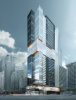
I guess it makes sense for the area. Bay and Gerard isn't really all that exciting now, I know I just fly though that intersection without a second thought. It would have been nice to have some more exciting design elements here, but I can't say I'm surprised by the change. I think it could turn out sharply if the cladding is high quality, but I'm not getting my hopes up. I'll be happy if this doesn't turn into a grey spandrel mess.

I'm imagining Spectra, maybe 300 Front. But maybe we'll get lucky and end up with Couture 2.0.
 
Minor variance application: "To alter the redevelopment plan approved under Site Specific By-law 566-2014 for the construction of a 43-storey mixed use building by increasing the height of a portion of the building to 44-storeys, extending limited portions of the building envelope on the north and south sides, and altering bicycle parking provisions."
 
We have a new high-quality rendering in the dataBase file, with higher-res detail shots of the podium, mid-tower section, and crown. You can see all of those by clicking on the link at the top of the page, but here's the overall image:

43GerrardHeroNE1280.jpg


42
 

Attachments

  • 43GerrardHeroNE1280.jpg
    43GerrardHeroNE1280.jpg
    432.9 KB · Views: 3,069
The podium is a hot mess. And there's no way the crappy window-wall they are going to use will look anything like that shiny, airy rendering. Glad to see inset balconies though.
 
Unless they're facing a service lane, there shouldn't be large blank walls along a street. Architects need to consider how pedestrians walking by at 5 kph will see the building. Blank walls might look good in renderings from just the right angle, but they make streets dull visually and in terms of sidewalk activity.
 
Which blank wall are we talking about here? The one facing south? There is not exactly a high pedestrian flow along there.
At 5kph a parking lot was a lot less interesting.
 
Walton St has next to no pedestrian traffic; usually consists of taxi cabs via the hotel. Now unless people look specifically at that blank wall, it will hardly be noticeable walking down Bay St.
 
The other side of Walton is also a blank wall. And across the street SickKids and the plant also offer blank walls. Walton is really just a glorified service alley. This building animates the frontages that matter (Bay and Gerrard), and their driveway through the ground floor will let pedestrians make a midblock crossing. It's seems fine at ground level.
 
Unless they're facing a service lane, there shouldn't be large blank walls along a street. Architects need to consider how pedestrians walking by at 5 kph will see the building. Blank walls might look good in renderings from just the right angle, but they make streets dull visually and in terms of sidewalk activity.
This is one of my biggest gripes about architects. So much focus is given to how the render looks like, especially at birds eye view. Which is great, if we were designing buildings for birds to look at.

More attention needs to be given to how buildings look like at pedestrian and at midrise level. As you say, blank walls at street level is just abhorrent.
 
The podium is a hot mess. And there's no way the crappy window-wall they are going to use will look anything like that shiny, airy rendering. Glad to see inset balconies though.
I love the term "hot mess" as much as anyone. But its not applicable here. This design is superior to almost anything else on Bay for several blocks north and south.
 
Yep, I agree. I think the podium is really nice, actually. It appears to appropriately showcase the street level retail, the black trim does a good job connecting it to the rest of the building, and I find the orange accents tasteful.
 

Back
Top