News   Mar 18, 2024
 688     0 
News   Mar 18, 2024
 2.4K     4 
News   Mar 18, 2024
 759     0 

Toronto Density Map, 2006

The statistics present a range between most and least dense areas. The eye will create its own sequence, based on tonal weights and warm/cool colour contrasts, so the graphic might as well make it as easy as possible for the viewer by reflecting the data. The contrast between the most and least dense areas is obviously a visible part of that sequence. But, as it presently stands, the least dense area is visually out of sequence.
 
Great map...it really shows which neighbourhoods have hordes of residents, and it shows what a useful line the DRL would be, too. If you have time to keep revising it to get it 100% blip-free (if any more can be done), go for it. I wonder what it'd look like with the 1km buffer changed to 500m or 2km.

Not sure what you mean by blips. Do you mean without small, isolated spots (like the deep red spot at Jane and Steeles) or do you mean without illogical things like Sunnyside beach? Both wouldn't really be possible to correct without being arbitrary.

My hypothesis would be that a 500m version would look midway between this map and the first, non-averaged map. 2km would be interesting to see.

This map was also based upon zonal centroids. It would be interesting to see how a map that allowed another zone that is located partially within its buffer to be included in the calculations would differ in appearance.

CDL.TO: I like your new, more effective colours.

The hot red advances and the eye goes to it first, then to the pink, then to the orange. Everything's nicely differentiated. The colour sequence tells the density story, and the statistics confirm it.

It's pretty clear that the GIS software companies could use the assistance of someone with an eye for design. Many of the default options are terrible and use of the software can be far from intuitive.
 
Yeah, I mean blips like the red spot at Jane & Steeles (which seems impossible, not illogical), rather than things like zones of low density that absorb the high density of neighbouring areas and average out high, too (which probably explains the Steeles/Midland/Finch/Kennedy industrial block, which manages to average out denser than all of the residential neighbourhoods surrounding it).
 
CDL.TO: I think all software can only get you some of the way with things like this. At some point a human being - with a good eye and colour sense - has to step in and finesse it.
 
I've been sitting on this for a while. These are density maps showing an overlay of population PLUS employment for the Toronto area. I think such a map is useful when discussing rapid transit expansion and such.

Click on the thumbnails to expand to full size

Map 1: People and Jobs per square kilometre


Full size


Map 2: People and Jobs within 500m per square kilometre


Full size


Usually, the presence of park space, cemeteries, and water reduces the density of adjacent districts (for example, the Don Valley makes Thorncliffe Park unrealistically low-density). So I removed those features when calculating density for this set of maps.

The first map is the actual, raw density of each district. Since where you place the boundaries affects the result, I have reduced this problem in the second map by drawing a 500m buffer around each district, totalling the number of people, number of jobs, and area within the buffer, and using that figure instead. This has a "smoothing" effect which makes the region-wide perspective more realistic. For example you can see that the densest district has been decreased from ~760,000 pop+jobs/km2 to just ~90,000 pop+jobs/km2.

I'm happy to hear some constructive feedback on how these maps could better reflect the reality "on the ground".
.
 
Last edited:
Me likey. To be extremely useful for transit planning all it needs is a few symbols added, like high schools, colleges/universities, malls, and maybe tourist attractions like the Zoo and the Science Centre.

Does the first map show DAs? Some of those zones seem really tiny.

The only problem with adding employment to residences is that the jobs are added to census tracts which are divided up based on where the residences are...a cluster of condos may receive its own census tract (or one of the smaller census zones) and be set apart from a sea of bungalows, but a cluster of office towers is invariably included with seas of parking lots and warehouses and strip malls because without a residential population there's no reason to sever the area for census purposes.

It's sort of like packing/cracking issues with gerrymandered ridings. This affects areas like the Kennedy/401/Markham/Ellesmere block (STC), as well as the 404 office parks in Markham, even the CBD itself (though that is about uniformly extremely dense with jobs). I don't know if there's any more realistic but still practical way to show where jobs are within employment areas.

One tweak that would be interesting is to show population and jobs on the same map using two colour scales, like red for homes and blue for jobs, where white zones are uninhabited day and night, red zones are dense during the night, blue zones dense during the day, and purple zones dense both day and night. 25-49+ total zones on such a map would help distinguish homes from jobs on a combined map, though this isn't especially useful if one is very familiar with the location of all of the residential and office tower clusters.
 
I'm surprised there isn't more employment density around the Hi-way 404 / 407 area, the Markham employment district.

Did the map include that?
 
^^ It definitely doesn't seem like it. It certainly seems like there's a pretty high density of jobs in that area, and it's also got the higher density area around Leslie.
Just wondering, are there any plans to do infill office development in that 404-Highway 7 area? There might not be room for even more business between Richmond Hill Centre and Markham Town Centre, but I've always though it'd be a great area to get some more high density office development. I know York's got plans for the entire Highway 7 stretch, but I haven't heard anything about how big those plans are.

One tweak that would be interesting is to show population and jobs on the same map using two colour scales, like red for homes and blue for jobs, where white zones are uninhabited day and night, red zones are dense during the night, blue zones dense during the day, and purple zones dense both day and night. 25-49+ total zones on such a map would help distinguish homes from jobs on a combined map, though this isn't especially useful if one is very familiar with the location of all of the residential and office tower clusters.
That'd be great, but it'd probably require multiple maps. Maps showing daytime and nighttime densities would be great (or jobs/homes densities.)

But I'm not pressing CDL.TO to do anymore. Those two maps are absolutely brilliant, and I really like the second "smoothed" map! :D
 
I just noticed that 9 categories are listed but the map contains at least a dozen...it would be easier to distinguish zones (especially the turquoise/green ones) if some categories were combined.

Those jobs in Markham are included...the density adjacent to the highways seems low but most likely they're just cancelled out by parking lots and greenfield sites, as well as the footprint of the 404 and 407 themselves. Beaver Creek, for example, is shown as turquoise, which is about 5500 ppl+jobs/km.sq, and the zone is roughly 2km.sq, which translates into about 11,000 jobs, which is about right. The Hwy 7/Warden/Steeles/Woodbine block is 8km.sq and is listed as roughly 4000/km.sq, making a total of 32,000 jobs, which seems reasonable.

That'd be great, but it'd probably require multiple maps. Maps showing daytime and nighttime densities would be great (or jobs/homes densities.)

It doesn't need two maps...note that 'purple' zones would be a mixture of the two scales. The legend would have a 'cube' of categories. I don't know how difficult it is to make such a map, but it definitely shows not just if an area is dense with people and jobs, but what the area is dense with...people, jobs, both, or neither.
 
^^ Yes, but if you tried to show both daytime and nightime densities in one map, you'd end up basing it on different shades of purple (red for daytime, blue for nighttime.) Which would make it very hard to read. For each area, you'd have to distinguish how much daytime population it has (which requires it's own scale) as well as how much nighttime population it has (which also requires it's own scale.) Combining the two factors in one map would be hard, and reading it accurately would be nigh impossible.
 
^^ Yes, but if you tried to show both daytime and nightime densities in one map, you'd end up basing it on different shades of purple (red for daytime, blue for nighttime.) Which would make it very hard to read. For each area, you'd have to distinguish how much daytime population it has (which requires it's own scale) as well as how much nighttime population it has (which also requires it's own scale.) Combining the two factors in one map would be hard, and reading it accurately would be nigh impossible.

It'd actually be incredibly simple to read...depending on how many categories are included. The legend 'cube' would not just be purple...an apartment cluster would be dark red while an office cluster would be dark blue, while an area like Yonge & Eglinton or Bay & Bloor would be dark purple. Forest Hill would be light red, industry north of Downsview would be light blue, and north Pickering would be pretty much white. Other areas would be various shades of red, blue, or purple depending on what they're dense with. A legend cube with 9 categories on each side would end up requiring dozens of shades of purple, but if only about 5 or so are used, it's very manageable, very easy to read, and extremely insightful. I've seen a map with 4 categories and it's simple to read, but having only 16 density variants isn't that useful. 25 would be better. By 49, it'd probably be very hard to read, but 36 could work well depending on which colours are selected.
 
I am sure the jobs around 404/407 are included on the map. You have to remember that the census tracts are divided according to population, not employment. So certain places with very dense employment will be obscured if they are part of a very large employment district, and therefore the census tract would be huge, and therefore the employment density would averaged out across the whole tracts and the variations of density within would be obscured. Of course, this is assuming that census tracts were used. That is just my guess, based on the first map, so i could be wrong.

They are very good maps I think. Both are very useful in different ways, but I have issues with the colour scheme. For the density I would have just used a yellow-red colour gradient. You used green, but I when I see green I think parks. Normally that isn't an issue, but on these maps the parks are actually shown also, but they are white. That is a conflict I think. But it is a minor thing. Blue is also too similar to the lake. But again, it is a minor issue.

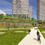
You might consider combining the farmland (i.e the tracts that have been designated as non-urban) with the parks, because obviously the the farmland will have low density anyways, and so the density of those tracts are not important. Even for me, it is sometimes hard to tell the distinguish between low-density urban census tracts and rural tracts, and that distinction is important, imo.

I don't see how add nighttime and daytime density can be to the map without making it confusing. Sometimes it is better to have seperate maps. But what is the point of it anyways? Is there a big difference between population density and nighttime jobs-population density?
 
I don't see how add nighttime and daytime density can be to the map without making it confusing. Sometimes it is better to have seperate maps. But what is the point of it anyways? Is there a big difference between population density and nighttime jobs-population density?

The point isn't density day and night, the point is to separate residences and jobs on the same map. Combining the two doesn't tell you what each zone is dense with - people, jobs, both, or neither. Using two maps, you need to constantly flip back and forth and when you're using divisions even as large as census tracts, it can be impossible to compare them.

Here's a sample of one done by Prof. Sorensen at UTSC:
planning-game-small%20.png


It's incredibly easy to understand unless you include like 7 or more categories for each variable. That map uses 4 variables (16 zones), census tracts, and 2001 data...using 5 variables (25 zones), dissemination areas, and 2006 data would result in an amazingly useful map.
 
I'm surprised there isn't more employment density around the Hi-way 404 / 407 area, the Markham employment district.

Did the map include that?

My guess it that although that area has a number of large office buildings, those buildings are usually surrounded by large parking lots and/or parkland. Contrast that with the Toronto CBD where office towers butt up against office towers. I'm sure that leads to a lower overall density.
 

Back
Top