Toronto Aura at College Park | 271.87m | 78s | Canderel | Graziani + Corazza

I think the blue might be plastic protective tape over the spandrel frame.

Actually, what I've seen at Aura so far reminded me of the Yonge facing stretch of 10 Dundas East - specifically, the food court section.

AoD
 
Last edited:
^ They may be, but I'm pretty sure those are part of the design. Here's what I was talking about on Trump. It seems they've used teal accents in between the windows. I don't get it... why do that? It looks so basic and obvious to me.

75f0353c4c60a4ef45ff82d78a1e.jpg
 
4grand; You're complaining about different things. I think you need to decide what it is you don't like about glazing systems because you're all over the place/ being a bit insufferable.

First of all, the Schulich building by Hariri Pontarini doesn't even have spandrel glass as far as I know, and the mullions are not capped... the glass is a seemless wall of smooth glass. Are you saying you wish that it was just one big block of glass? Of course the glass has to be separated into sections. That's why you get lines or gaps. I would say the glass on the corner of this particular project is as smooth as it comes. The colour variation in the glass is due to blinds and curtains behind the glass.

Next up; the blue you see behind the Aura glass is not spandrel glass, nor is it a final colour that's part of the cladding; it's a protective tape over the metal that separates the glass panes.

On Trump, it's the spandrel glass you are complaining about (the teal panels). These are actual panels, and are a separate matter than the gaps/lines that separate panes of glass. I can understand why some people don't like them, but they are completely different than the light blue protective strips in Aura's glazing system, and they are also not present on the Hariri Pontarini design.
 
Last edited:
"insufferable"? calm yourself my friend... I posted two posts, which you apparently didn't completely understand.

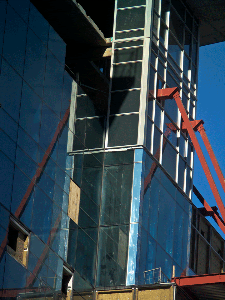
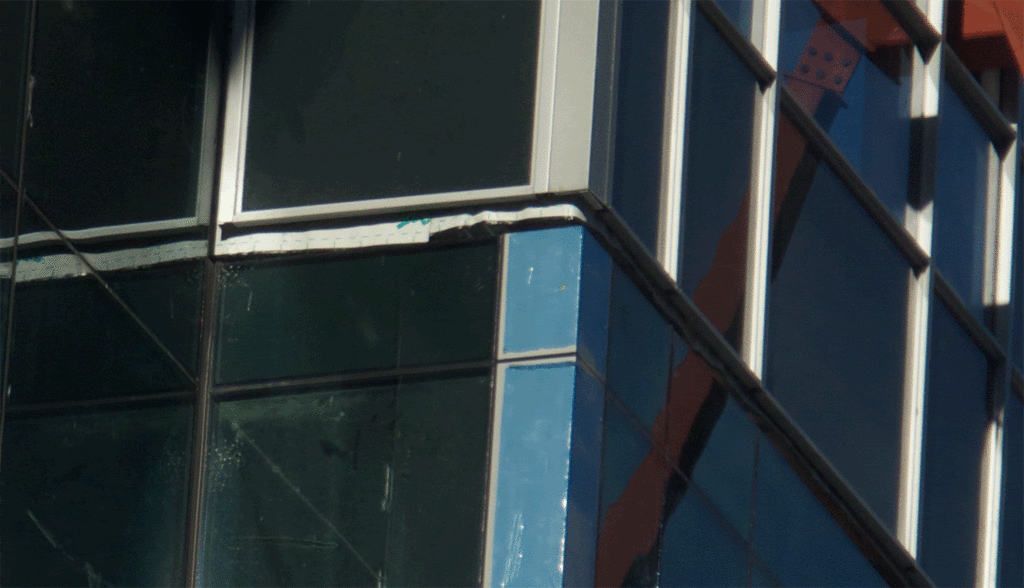
In the picture of Schulich, what are those glazed panels of glass and why the hell are they included in the design? All they do is cheapen the exterior. Architecture used to include creative design in it's dynamics; caryatids, cornices, strapwork, guilloche, and just general molding and detail in, well, at least, the podiums or aspects of the buildings which meet the street. Why have we reduced our creativity to strips of glazed glass in between window panes?

And before you have a conniption fit, I understand that architecture has changed since the days of Art Deco and Neo-Gothic, but that doesn't mean we can simply reduce our aesthetics because of 'progression' of architecture.

You are correct however when you point out that there are no spandrels... My mistake, I meant mullions, which to me, cheapen the look of any building.
 
I'm not having a conniption fit... I responded calmly and respectfully but pointed out that I felt your argument was all over the place.

As for mullions, again, the Schulich building plays them down... the glazing is very seamless and smooth. I am confused about what you don't like on that building... is it the lines between the panes? Because the glass has to be separated somehow.
 
One is nearly complete, the other is not. Nice try.

"Nice try"? there is no need to try. the pictures speak for themselves because, those who care about good architecture, as opposed to those who only care about um, "the size" of a building, can see that Aura is well on its way to its final destination: as a failure of Chernobyl-size proportions.
 
No, not the lines between the panes, I understand the glass has to be secured somehow... I'm talking about those grey, opaque strips that are randomly tossed in along with the transparent glass windows. I don't believe you can see through them and I think the cheap tossing-in of coloured glass panels is a cheap, boring, lazy and unaesthetic move.

They are quite ubiquitous on Trump and other buildings which escape me at the moment. Here's another example of what I'm talking about, from 83 Redpath:

toronto_Redpath_condo_910_header1-300x300.jpg
 
Why not just make those strips transparent glass windows?

Because there's something on the other side of the glass that you wouldn't necessarily want a view of? Like the edge of a floor slab, or a column, or mechanical ducts, or....
 
^Perhaps, but I don't think the infrequency and randomness of their placement would indicate structural properties being hidden behind them. And besides, countless other new buildings (Bay Adelaide, Four Seasons, RBC Centre) are able to have wrap around glass windows without any coloured panels interspersed here and there. I believe they are just a horribly cheap and lame architectural element.
 
Sure, but that's not what I'm referring to. I'm referring to the strips of white, grey and teal that are interspersed throughout the windows of all three buildings I posted above. They just seem like architectural, not structural elements and I'm saying that I feel they are a cheap cop-out.

Does anyone know what they're called and why architects think they look "good"? Or am I the only one who feels they are lame as hell?
 
Of course it's architectural. It's been a century and a half since anyone's really built anything with a structural facade.
 
A couple of points:

a) Aura is awful in both conception and execution. Sometimes one can make up for the other but here, nobody seems to care.

b) Schulich does indeed sport some spandrel but Sp!re is right to note that the mullion caps are pretty flush: Image.

c) Spandrel is awful when its used to cover space cheaply (eg. The Graziani + Corazza Effect). When it's used self-consciously as part of a design however, it can indeed add some depth to a building. H+P (also architects of Schulich above) seem to have been thinking this way when they were conceiving their Waterloo School of Pharmacy: Image and Image. Here, the plants on the exterior panels have all contributed to the study of pharmacy and medicine at some point in history.
 
f1b61617.gif


d9cfef5a.gif


here is how the geniuses at Graziani + Corazza are (not ) handling the transition from the cheap curtain wall on the podium, and the cheap window wall system they are using for the condominium tower. not surprisingly, it is amazingly incompetent and astonishingly bad. they are clearly just making it up as they go along.
 

Back
Top