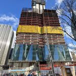
400m is a bit close to be forking over money for a new station. Regardless, B/D is fairly shallow there. More than likely every property through that stretch would have a basement or parking garage right up against the tunnel.
To add more stations to the system we have now, maybe we can use emergency exits and ventilation shafts. And have it set up so that the trains never stop, but rather roll through the tunnels slowly with their doors open. One can hop on or hop off wherever.
")
/sarc
__
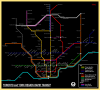
Here’s my attempt at a simplified schematic map, with some added fantasy. Like the Tube map, I only used 90 and 45 degree angles. This wasn’t as tricky as I thought, considering Toronto is fairly grid-like and follows the concession system. Although it looks more top-heavy than I’d like, the level of distortion is quite minimal. I decided to share it before I started tinkering/tweaking it to death, or making it too busy by adding highways and geographical features.
It’s fairly self-explanatory and mostly a repeat of what I posted over the last few weeks. And the York Region system is a carry-over from what I posted in the Spadina Extension thread (i.e - light RT north of Steeles).
The Spadina extension is shortened to Steeles, with some kind of Jane RT either using its tunnel; or having the tunnel abandoned altogether. Steeles and Jane south of the 407 just seems more of a logical terminus than Hwy 7 and Walmart. It’s a fantasy thread, so why not go back in time and pretend there’s no extension.
Yonge is extended along the Finch hydro corridor. I thought about Sheppard, but Finch has more density and the opportunity for less obtrusive tunnelling along the hydro cut. Plus, closing the loop in the north end allows for deadheading.