News   Jan 03, 2025
 1K     1 
News   Jan 03, 2025
 1.2K     0 
News   Jan 03, 2025
 1.7K     0 

Toronto Density Map, 2006

CDL.TO

Moderator
Member Bio
Joined
Apr 22, 2007
Messages
4,274
Reaction score
123
Location
Christie Pits
Residential density

Thought this could spark some discussion.

Updated July 30 with new colour scheme.

torontodensity3dw1.gif
 
Very interesting. Probably not the response you are looking for, but I like the colours used. Are these available for other Canadian cities? I would find a comparison interesting.
 
11003 to 620221 is quite a gap. So much so, that it almost seems useless.
Also, where did they come up with such bizarre numbers? (why not 1100 to 620000?)
 
I quickly made this map, so send any of your questions my way.

Very interesting. Probably not the response you are looking for, but I like the colours used. Are these available for other Canadian cities? I would find a comparison interesting.

I like the colours, too. They are clearer than a colour gradient, but if I handed it as a student it would be an instant fail (not least because only water should be blue). I could do this for other cities.

11003 to 620221 is quite a gap. So much so, that it almost seems useless.
Also, where did they come up with such bizarre numbers? (why not 1100 to 620000?)

There are equal number of records in each class (752). What you're looking at are seven equal quantiles. If the classes had equal intervals, basically all the map would be blue because Crescent Town, Galloway, and other dense neighbourhoods really skew things.

9 is the lowest record (north Pickering) and 620221 is the highest record (Crescent Town). 11003 to 620221 is a large class, but only 6 out of the 752 areas in that class have a density over 100,000/km2.
 
How come Dufferin is never seriously looked at for an RT route? It runs strait down one of the most dense areas of the city. A N/S line from Eglinton-Queen should have good ridership no?
 
Canada06DA means dissemination areas, right? This map is so much more subtly useful than a census tract map, really showing that most people live on a rather small percentage of Toronto's land.

I should point out that those red spots in Markham at McCowan & Steeles are entirely single detached houses.

I guess Crescent Town is the new walled city of Kowloon :) It would be useful to split up the red a bit, though, like a 10K-20K zone and a 20+K zone (although I say that without knowing how many are in each...I know choosing the numbers to make a map as useful as possible is more of an art than a science).

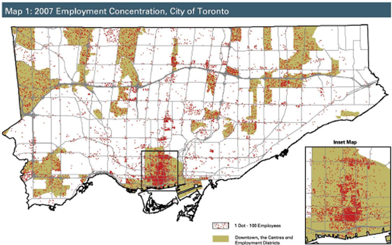
I'm as tempted as anyone to plan imaginary lines connecting red blotches together, but seeing those vast purple areas makes me long for a map of employment density, followed by a map of both residential and employment, with malls and schools and tourist sites and parkland and industrial land, too. There's a residential + employment density map in the hall of U of T's geography department, but I believe it's from 2001, which means there's dramatic condo activity and suburban growth not included.

This map suggests that arterials like Bathurst, Victoria Park, and Lawrence would have been ideal candidates for Transt City.
 
Strange colour choices. The yellow/blue/green colours aren't very clearly differentiated. The peach ( 7772 to 11003 ) stands out reasonably well against the red ( 11003 to 620221 ) but has problems next to the green/yellow ( 5808 to 7772 ). The violet, used for the least dense area, is actually a warmer colour ( and is used for a larger area ) than most of the other colours and advances visually almost as strongly as the red does.
 
Ideally the map would have also shaded river valleys a different colour. That would have allowed one to differentiate between areas that are simply not dense from those that can't be developed at all. The fact that the eastern part of North York appears so sparse is entirely attributed to the fact that half of the land area is occupied by the Don River park system.
 
Ideally the map would have also shaded river valleys a different colour. That would have allowed one to differentiate between areas that are simply not dense from those that can't be developed at all. The fact that the eastern part of North York appears so sparse is entirely attributed to the fact that half of the land area is occupied by the Don River park system.

Well, not "entirely"...most detached house areas along Bayview and Leslie are extremely low density, even when you factor out the ravines. That's partly why density is an infinitely malleable statistic.
 
Interesting that more of the comments pertain to the cartography than to the map itself.

It would be useful to split up the red a bit, though, like a 10K-20K zone and a 20+K zone (although I say that without knowing how many are in each...I know choosing the numbers to make a map as useful as possible is more of an art than a science).

I'm as tempted as anyone to plan imaginary lines connecting red blotches together, but seeing those vast purple areas makes me long for a map of employment density, followed by a map of both residential and employment, with malls and schools and tourist sites and parkland and industrial land, too. There's a residential + employment density map in the hall of U of T's geography department, but I believe it's from 2001, which means there's dramatic condo activity and suburban growth not included.

Right you are about how deciding on the numbers for each class (without being arbitrary) is a bit of an art. You can scroll through all the options and see which method seems to convey the clearest message, and in this case quantiles clearly did. I should have also considered dot density, but I've never been a fan of that style of map.

I'd love to see employment and employment+population maps in this style as well. I'll see if I can hunt down the data.

Strange colour choices. The yellow/blue/green colours aren't very clearly differentiated. The peach ( 7772 to 11003 ) stands out reasonably well against the red ( 11003 to 620221 ) but has problems next to the green/yellow ( 5808 to 7772 ). The violet, used for the least dense area, is actually a warmer colour ( and is used for a larger area ) than most of the other colours and advances visually almost as strongly as the red does.

Interesting. The specific colours were chosen by the software. What colours would you suggest?

Ideally the map would have also shaded river valleys a different colour. That would have allowed one to differentiate between areas that are simply not dense from those that can't be developed at all. The fact that the eastern part of North York appears so sparse is entirely attributed to the fact that half of the land area is occupied by the Don River park system.

This was a quick map intended for those already familiar with the geography of the Toronto area (hence no street names or labels), who would hopefully be familiar with the ravine and parkland system. I'll see if I can find parkland data to add to this map, but parkland does still reduce the density of a district.

Where you draw the boundaries between zones affects the output, an issue known as the modifiable areal unit problem. There is no solution to the problem, and is a particular problem in traffic modelling. It's important to combine your knowledge of the local geography with the data on the map in order to reach accurate conclusions.
 

Back
Top