

unimaginative2
Senior Member
Bay Street is awash in banality

MICHAEL STUPARYK/TORONTO STAR
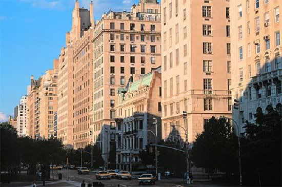
The Liberties at 717 Bay St. is a building you want to get past as fast as possible, according to Condo Critic Christopher Hume.
You don't have to get far north of Queen St. to go from distinguished to dispiriting buildings
Apr 05, 2008 04:30 AM
Christopher Hume
Every generation looks back and sees evidence of a time when everything was better. It may not be true, but in this regard we are no exception.
Still, it's hard to wander around this city and not become convinced that the quality of architecture has deteriorated badly in recent decades. That's not to say there aren't spectacular things being built; it's more that the level of design of the non-landmarks, the background buildings, of the urban fabric has never been worse.
Perhaps it's that only the best of the past survives, but by contrast the bulk of work done by architects today is appalling. Let's be honest: Most people dislike contemporary architecture passionately and often for good reason.
Bay St. is as good a place as any to see firsthand how this profession has lapsed into banality. Starting at Bay and Queen St., of course, we have two of the most distinguished buildings in Toronto – New and Old City Hall – but by the time we reach Dundas St. a couple of blocks north, the landscape has devolved into one of architectural mediocrity and civic indifference. By the time Bay meets Gerrard St., it has become a contemporary wasteland, the kind of downtown neighbourhood desirable for everything but what it has become.
The template here is the tower sitting on a base with a canopy at grade. Nothing wrong with that, but it's surprising how something so simple and straightforward can be messed up in so many different ways. For the most part, the architecture here is artless and devoid of any spark of imagination. It is clumsy, dull and apparently built by architects and developers who couldn't care less. The materials are cheap, the façades monotonous and the results deadly.
Interestingly, this same culture of indifference applies to corporate, institutional and residential buildings. The last remnant of architectural self-respect comes in the form of a row of two-storey houses that extend west from Bay on the north side of Gerrard. These aren't fancy structures, but they were clearly conceived with something larger in mind, namely the city and the idea it represents, civilization itself.
To a great many contemporary architects, this must seem precious and all rather beside the point. Their job is to deliver their client's bidding as cheaply and painlessly as possible, and to hell with the rest.
And the city, why should they worry about that, it's not their concern?
Condo critic
THE LIBERTIES, 717 BAY ST.: This nasty slab sums up the ethos of a generation of architects that may be well trained, but was certainly poorly educated.
There isn't a single element of this complex here that engages us at any level; more disturbing, there wasn't meant to be.
It comes to us as one of those poor architectural creations unloved by those who gave it birth. Its justification is strictly an economic one.
Indeed, architecture here involves little more than a series of mechanical calculations, the sort of things a machine could do – and probably better.
The miserable green metal columns that support the glass canopy clutter the sidewalk and the building. You just want to get past it as fast as possible.
The frontage on Bay and Gerrard Sts. has been broken up into a series of bays that reach up from a four-storey base.
The bricks are beige and the results aren't pretty.
GRADE: D
WHAT DO YOU THINK? Email us at condocritic@thestar.ca
chume@thestar.ca
MICHAEL STUPARYK/TORONTO STAR
The Liberties at 717 Bay St. is a building you want to get past as fast as possible, according to Condo Critic Christopher Hume.
You don't have to get far north of Queen St. to go from distinguished to dispiriting buildings
Apr 05, 2008 04:30 AM
Christopher Hume
Every generation looks back and sees evidence of a time when everything was better. It may not be true, but in this regard we are no exception.
Still, it's hard to wander around this city and not become convinced that the quality of architecture has deteriorated badly in recent decades. That's not to say there aren't spectacular things being built; it's more that the level of design of the non-landmarks, the background buildings, of the urban fabric has never been worse.
Perhaps it's that only the best of the past survives, but by contrast the bulk of work done by architects today is appalling. Let's be honest: Most people dislike contemporary architecture passionately and often for good reason.
Bay St. is as good a place as any to see firsthand how this profession has lapsed into banality. Starting at Bay and Queen St., of course, we have two of the most distinguished buildings in Toronto – New and Old City Hall – but by the time we reach Dundas St. a couple of blocks north, the landscape has devolved into one of architectural mediocrity and civic indifference. By the time Bay meets Gerrard St., it has become a contemporary wasteland, the kind of downtown neighbourhood desirable for everything but what it has become.
The template here is the tower sitting on a base with a canopy at grade. Nothing wrong with that, but it's surprising how something so simple and straightforward can be messed up in so many different ways. For the most part, the architecture here is artless and devoid of any spark of imagination. It is clumsy, dull and apparently built by architects and developers who couldn't care less. The materials are cheap, the façades monotonous and the results deadly.
Interestingly, this same culture of indifference applies to corporate, institutional and residential buildings. The last remnant of architectural self-respect comes in the form of a row of two-storey houses that extend west from Bay on the north side of Gerrard. These aren't fancy structures, but they were clearly conceived with something larger in mind, namely the city and the idea it represents, civilization itself.
To a great many contemporary architects, this must seem precious and all rather beside the point. Their job is to deliver their client's bidding as cheaply and painlessly as possible, and to hell with the rest.
And the city, why should they worry about that, it's not their concern?
Condo critic
THE LIBERTIES, 717 BAY ST.: This nasty slab sums up the ethos of a generation of architects that may be well trained, but was certainly poorly educated.
There isn't a single element of this complex here that engages us at any level; more disturbing, there wasn't meant to be.
It comes to us as one of those poor architectural creations unloved by those who gave it birth. Its justification is strictly an economic one.
Indeed, architecture here involves little more than a series of mechanical calculations, the sort of things a machine could do – and probably better.
The miserable green metal columns that support the glass canopy clutter the sidewalk and the building. You just want to get past it as fast as possible.
The frontage on Bay and Gerrard Sts. has been broken up into a series of bays that reach up from a four-storey base.
The bricks are beige and the results aren't pretty.
GRADE: D
WHAT DO YOU THINK? Email us at condocritic@thestar.ca
chume@thestar.ca