


299 bloor call control.
Senior Member
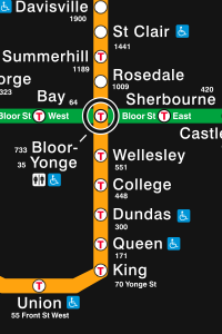
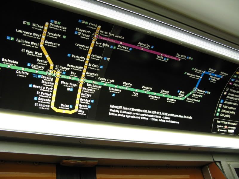
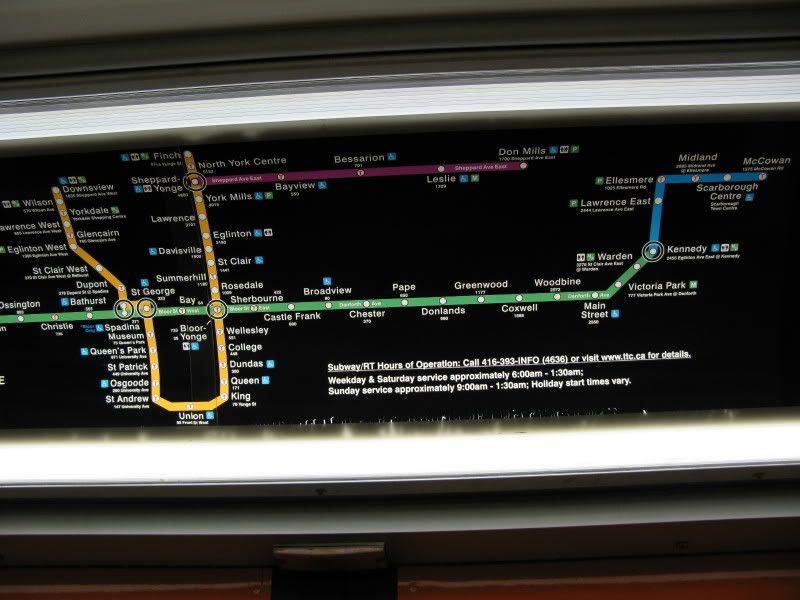
No one's mentioned it yet, but the TTC has started putting up updated versions of the subway map on its cars... and it's ridiculous. They've changed the font identifying the stations from faux-Helvetica/Arial (the Swis721 that Joe Clark speaks of) to a condensed, bolded look-alike. They've screwed up the spacing between the line and the station names. And to increase visual clutter, as if there wasn't enough already, they've decided to put the full station addresses (instead of the street number along Yonge or B-D) at every single station.
I'll snap a pic when I see it when I get a chance, since it's yet to be put up on ttc.ca
I'll snap a pic when I see it when I get a chance, since it's yet to be put up on ttc.ca