

middeljohn
New Member
One of my favourite things to do when I'm on one of my urban research binges (as I imagine all of us on this site tend to be plagued with from time to time) is to look at cities on Google Earth to see what they look like from space, how the city developed, where new development seems to be taking place, etc. I don't know why this fascinates me so much, but it does.
It's interesting to look at cities from above, because only then can you truly understand how some cities can boast having 5000 people/km yet not have many highrises, while other cities have world famous skylines, but have an urban density of less than 1000 people/km. What I haven't done before though is compare cities head-to-head before by taking screen captures at the same scale and viewing them next to each other. I've been meaning to do this for a while.
Until today that is.
I've chosen three cities to compare - Toronto, Atlanta, London (UK) - because they are all large urban areas between 5 and 10 million people, and because each of those cities has completely different density statistics. I noticed a long time ago how much denser Canadian cities tend to be when compared to American cities, and I was curious what the differences are in how buildings are spaced out, highway density etc.
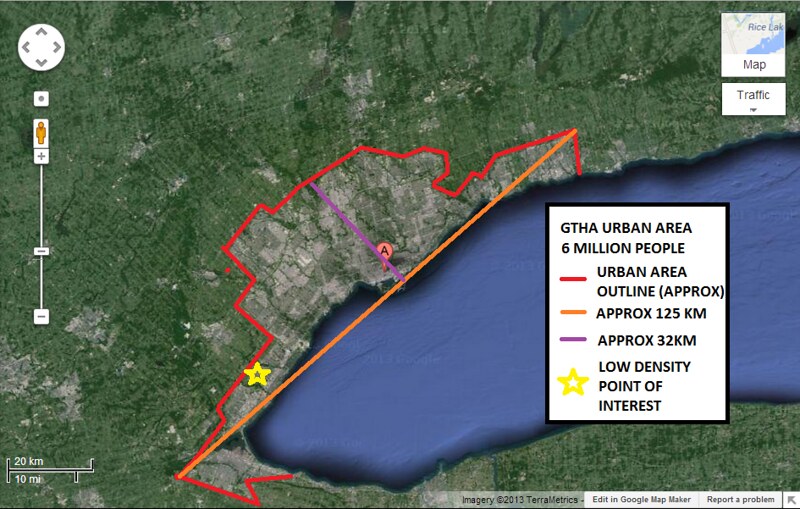
Before I share the results I'll explain the method I used. I took screenshots of each of the cities at almost the same scale and outlined the continuous urban areas. If significant green space separated a satellite city from the urban core (ie Milton for the GTA), I didn't include it. I also marked two lengths across the urban area, one of them being the longest straight line I can draw that is all urban, and the other the longest straight line that is roughly perpendicular to the first line. Lastly, I tried to find the best example of a common low density suburb for each city, because it's astounding how much it differs across countries.
First I'll just show you the images of the entire urban areas in succession without any discussion in between so you can appreciate the vast differences between how each city is laid out.
Toronto:
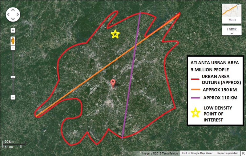
Atlanta:
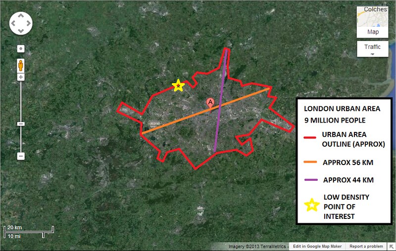
London:
Toronto stretches pretty far from Hamilton to Oshawa, but I was surprised that the longest north south built urban area I could find (section passing through east Brampton to the lake) is only 35km. I always thought that it'd be closer to 50km. Atlanta takes up much more space than Toronto, with the longest distance across I could find being 150 km. In case you don't believe me that that is all urban area, I recommend you go check it out for yourself. A lot of the area appears green, but that is just because there is so much space between houses. Truthfully, I don't think I even got it all. It's insane how far it stretches! And unlike Toronto, it goes stretches out in all directions, whereas Toronto's long continuous urban stretch is relatively contained when you go in the perpendicular direction.
London really surprised me by how contained it is. Despite being the most populous urban area of the three, the longest distance I could find is only 56 km, or about the distance from Hamilton to Mississauga. I saw after making the picture that there is a longer possible route if you use that section in the south-east corner, but that is such a secluded little section of the urban area that I didn't think think it is a fair way to judge the city.
Toronto longest direction = 125 km
Atlanta longest direction = 150 km
London longest direction = 56 km
Toronto longest perpendicular = 35 km
Atlanta longest perpendicular = 110 km
London longest perpendicular = 44 km
The second series of images corresponds with the yellow stars you see in the first series of images. These are the typical low density suburbs you see in cities that are on the outer periphery, typically indicating modern suburbs built after highways became what they are today. These are zoomed to about the same scales for each one, but not exactly the same, so pay attention to the scale in the bottom left corner.
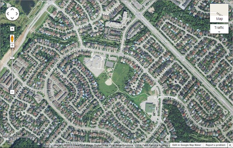
Toronto
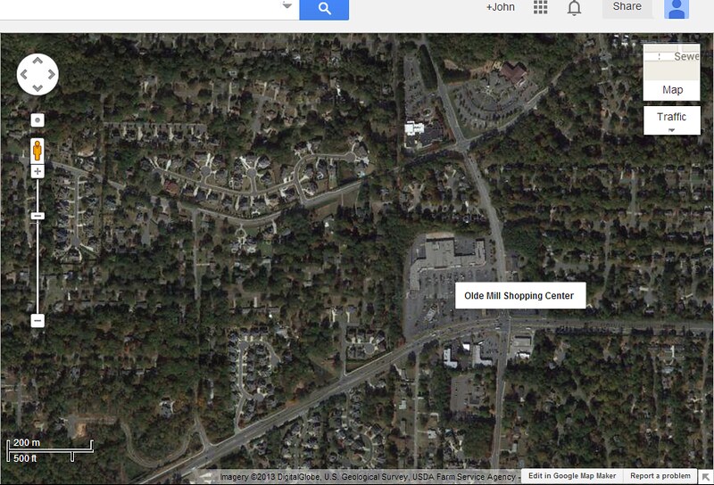
Atlanta
London
From these pictures it becomes much more apparent how each city values urban density. London's outer fringe suburbs are much more similar to the suburbs you would find in Toronto proper, with the long narrow yards, but with houses relatively small and close to each other. It is noticably denser than Toronto (I used north Oakville FYI), although Oakville looks hyper-dense when compared to Atlanta.
A couple things about Atlanta:
1. I didn't go out of my way to find the worst possible example, suburbs like that exist all around the city, check it out for yourself.
2. That's not even the worst example. I found other areas where there is even more space between houses that it looks almost rural, however it stretches on in that pattern for miles and miles. Just super low density.
Atlanta seems to just fade from city to rural, with the lots just getting bigger and bigger as you go further out, until at some point you notice that they have farms. Extremely poor planning, which helps explain why their highways are more congested than almost any other city in the US.
Toronto basically falls in between the two cities in terms of containment. Toronto suburbs look like they are built with a certain density in mind, and new development doesn't take place until the first space has been completely filled. Could it be more dense? Definitely. Those houses you see in the Toronto pic are all about 3500 sq ft, 2 storeys with pretty big backyards. I know because I grew up close to there.
London should be what we're striving for. They have an urban area density of 5000/km whereas the GTA is at 2700/km. The greenbelt should help a lot as it is almost filled out. With suburb cities like Mississauga, Richmond Hill and Burlington already completely filled out, and others like Oakville, Markham and Vaughan almost at their borders, we'll be seeing more and more high density development I'm sure. It is really incredible how dense London is without forcing people to sacrifice their privacy. Looking at the city in this way it becomes clear why they're able to operate a subway system as large as they have; they have high density across the entire urban area so that each stop becomes economically feasible.
It's interesting to look at cities from above, because only then can you truly understand how some cities can boast having 5000 people/km yet not have many highrises, while other cities have world famous skylines, but have an urban density of less than 1000 people/km. What I haven't done before though is compare cities head-to-head before by taking screen captures at the same scale and viewing them next to each other. I've been meaning to do this for a while.
Until today that is.
I've chosen three cities to compare - Toronto, Atlanta, London (UK) - because they are all large urban areas between 5 and 10 million people, and because each of those cities has completely different density statistics. I noticed a long time ago how much denser Canadian cities tend to be when compared to American cities, and I was curious what the differences are in how buildings are spaced out, highway density etc.
Before I share the results I'll explain the method I used. I took screenshots of each of the cities at almost the same scale and outlined the continuous urban areas. If significant green space separated a satellite city from the urban core (ie Milton for the GTA), I didn't include it. I also marked two lengths across the urban area, one of them being the longest straight line I can draw that is all urban, and the other the longest straight line that is roughly perpendicular to the first line. Lastly, I tried to find the best example of a common low density suburb for each city, because it's astounding how much it differs across countries.
First I'll just show you the images of the entire urban areas in succession without any discussion in between so you can appreciate the vast differences between how each city is laid out.
Toronto:
Atlanta:
London:
Toronto stretches pretty far from Hamilton to Oshawa, but I was surprised that the longest north south built urban area I could find (section passing through east Brampton to the lake) is only 35km. I always thought that it'd be closer to 50km. Atlanta takes up much more space than Toronto, with the longest distance across I could find being 150 km. In case you don't believe me that that is all urban area, I recommend you go check it out for yourself. A lot of the area appears green, but that is just because there is so much space between houses. Truthfully, I don't think I even got it all. It's insane how far it stretches! And unlike Toronto, it goes stretches out in all directions, whereas Toronto's long continuous urban stretch is relatively contained when you go in the perpendicular direction.
London really surprised me by how contained it is. Despite being the most populous urban area of the three, the longest distance I could find is only 56 km, or about the distance from Hamilton to Mississauga. I saw after making the picture that there is a longer possible route if you use that section in the south-east corner, but that is such a secluded little section of the urban area that I didn't think think it is a fair way to judge the city.
Toronto longest direction = 125 km
Atlanta longest direction = 150 km
London longest direction = 56 km
Toronto longest perpendicular = 35 km
Atlanta longest perpendicular = 110 km
London longest perpendicular = 44 km
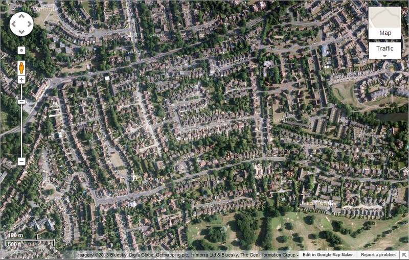
The second series of images corresponds with the yellow stars you see in the first series of images. These are the typical low density suburbs you see in cities that are on the outer periphery, typically indicating modern suburbs built after highways became what they are today. These are zoomed to about the same scales for each one, but not exactly the same, so pay attention to the scale in the bottom left corner.
Toronto
Atlanta
London
From these pictures it becomes much more apparent how each city values urban density. London's outer fringe suburbs are much more similar to the suburbs you would find in Toronto proper, with the long narrow yards, but with houses relatively small and close to each other. It is noticably denser than Toronto (I used north Oakville FYI), although Oakville looks hyper-dense when compared to Atlanta.
A couple things about Atlanta:
1. I didn't go out of my way to find the worst possible example, suburbs like that exist all around the city, check it out for yourself.
2. That's not even the worst example. I found other areas where there is even more space between houses that it looks almost rural, however it stretches on in that pattern for miles and miles. Just super low density.
Atlanta seems to just fade from city to rural, with the lots just getting bigger and bigger as you go further out, until at some point you notice that they have farms. Extremely poor planning, which helps explain why their highways are more congested than almost any other city in the US.
Toronto basically falls in between the two cities in terms of containment. Toronto suburbs look like they are built with a certain density in mind, and new development doesn't take place until the first space has been completely filled. Could it be more dense? Definitely. Those houses you see in the Toronto pic are all about 3500 sq ft, 2 storeys with pretty big backyards. I know because I grew up close to there.
London should be what we're striving for. They have an urban area density of 5000/km whereas the GTA is at 2700/km. The greenbelt should help a lot as it is almost filled out. With suburb cities like Mississauga, Richmond Hill and Burlington already completely filled out, and others like Oakville, Markham and Vaughan almost at their borders, we'll be seeing more and more high density development I'm sure. It is really incredible how dense London is without forcing people to sacrifice their privacy. Looking at the city in this way it becomes clear why they're able to operate a subway system as large as they have; they have high density across the entire urban area so that each stop becomes economically feasible.
Last edited:


")