News   Apr 17, 2024
 726     0 
News   Apr 17, 2024
 310     0 
News   Apr 17, 2024
 1.9K     1 

TTC to retrofit stations with "classic" wall panels

M II A II R II K

Senior Member
Member Bio
Joined
Apr 24, 2007
Messages
3,944
Reaction score
1,061
TTC to retrofit stations with "classic" wall panels


DECEMBER 2, 2013

By Chris Bateman

Read More: http://www.blogto.com/city/2013/12/ttc_to_retrofit_stations_with_classic_wall_panels/

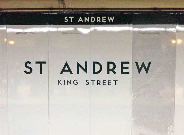
Preservationists be happy - the TTC is looking to the past in its ongoing overhaul of several damaged and dust-covered subway interiors. Whether intentional or not, the new reflective galvanized metal wall panels at St. Andrew station, roughly a third of which are installed, hark back to a time when many of Toronto's stations were decorated in glassy coloured tile.

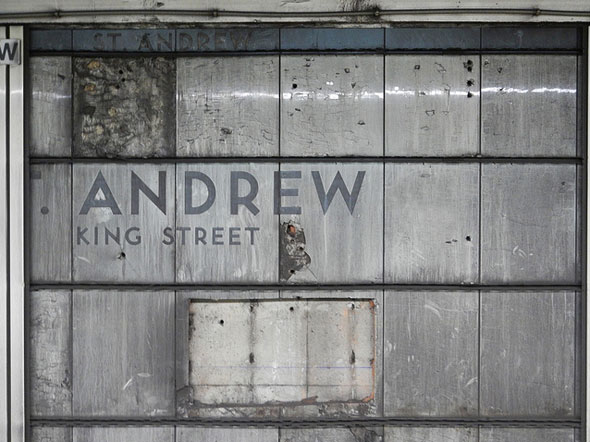
- The TTC covered the original vitreous marble wall panels at St. Andrew and Osgoode stations when water damage caused the brittle tiles to warp and break. As photos show, the present vertical strips of plastic - also a feature of Kipling, Kennedy, Sheppard-Yonge, and Finch stations - simply cover the original pockmarked and dusty walls. The original tiles at every station from Union to Davisville were either knocked out or covered over in the 70s and 80s. Eglinton, trivia lovers, is the only stop to retain some of its original glossy aesthetic at track level.

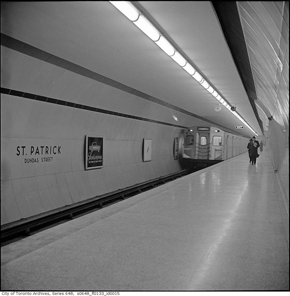
- The $275,000 cost of the new wall treatment, which doesn't include the tile in the ticket hall or on the platform, came out of the TTC's annual maintenance budget. Osgoode, St. Patrick, Queen's Park, York Mills, Kipling, and Finch stations are also scheduled to get the same treatment in the next few years.

.....


2013102-StAndrew-New.jpg


20131202-StAndrew-Virtolite.jpg


20131202-StAndrew-StPat.jpg
 
Indeed. I'm not a fan of the slatted style currently used in these stations (mainly St. Andrew/Osgoode). A return to the Vitrolite look would be very welcome.

I'm interested to see how they do the tunnel-bored stations (Queen's Park and St. Patrick). Due to the curved walls, they can't just hang wall-high panels like they did at St. Andrew. I assume that those two stations will retiled in the same style as today.
 
That Don't Impress Me Much
[video=youtube_share;mqFLXayD6e8]http://youtu.be/mqFLXayD6e8[/video]

Now these stations do (from this link):

naples-toledo_2413808k.jpg


moscow-Komsomolska_2413822k.jpg

stockholm-solna_2413817k.jpg


london-westminster_2413849k.jpg


frankfurt-entrance_2413868k.jpg


moscow-Mayakovskay_2413798k.jpg


lisbon-Olaias_2413870k.jpg


st-petersburg_2413878k.jpg


warsaw-Plac-Wilson_2413810k.jpg


stockholm-stadion_2413819k.jpg


munich-reflected_2413863k.jpg


london-north-green_2413846k.jpg


stockholm-t-centra_2413820k.jpg


But to have those kind of stations maybe considered just gravy, and we can't have that. Can we?
 
Those are very interesting. Note that all of those are in Europe.

Sure that Toronto has a station with columns that look like museum artifacts, another that has giant flowers facing each other, another with PCC vehicles facing each other, few with mosaics of the countryside, and such.

Should the TTC become an art gallery? Note that the Moscow Metro is considered the world's longest art gallery.
 
I've seen some articles list Museum and Dupont stations among the "world's best/most beautiful/most impressive stations or whatever", but wow these stations are insane. I hope the Spadina extension will impress, and actually get used by many people.
 
highway 407 is probably my favourite, and it will likely be the least used haha.

Dupont isn't even that nice I find, I like Downsview a lot more.
 
But to have those kind of stations maybe considered just gravy, and we can't have that. Can we?

We actually tried a bit with Spadina extension stations. There were far more complaints about the 5% cost bump than praise for the designs.

Some on this forum use those stations as an example of poor capital spending. So no, we probably can't have that, although I would very much like to see more.
 
We actually tried a bit with Spadina extension stations. There were far more complaints about the 5% cost bump than praise for the designs.

Some on this forum use those stations as an example of poor capital spending. So no, we probably can't have that, although I would very much like to see more.
We are stuck with utilitarian Sheppard line designs with token artwork.
 
These new panels aren't ambitious or interesting. At best, they're "clean" like the original stations. As a nod to history, they don't cut it. King had a combination of grey and blue Vitrolite, but the panels meant to evoke Vitrolite are white and black. The colour scheme was an important part of the Vitrolite tiles. You see the Spadina line extension and think that the TTC has raised its standards to the best in the world--where they should be. But renovations to busy, important stations like Dufferin look unsophisticated.
 
A bit off topic, but I hate hate hate the exposed concrete platform walls along the Sheppard line, and by the looks of it, the Spadina extension.

My brother finally rode the Sheppard line last year. He told me he was "surprised they hadn't finished by now" I asked him what he meant. He thought that the exposed concrete walls were just temporary and that they were eventually going to put tiles on them.

Can the TTC do something to make them somewhat more visually attractive? How about using lights to project different shapes or designs, or have some interesting po-mo paintings commissioned.
 
Depends on the station for Spadina. Some are tiled some aren't, its an aesthetic choice rather than on Sheppard where they just went for the cheapest option.
 
I hope we get some interesting station designs for the Scarborough extension. Looking at some of the early designs for the Eglinton LRT and they look boring and plain looking.
 

Back
Top