Toronto 16 York | 154.83m | 32s | Cadillac Fairview | a—A

Ramako

Moderator
Member Bio
Joined
Oct 30, 2007
Messages
4,673
Reaction score
907
Location
Toronto, ON
Renderings and video from http://www.16york.ca


urbantoronto-5999-19124.jpg


dramatic-offset.jpg


storey-glass-curtain.jpg


green-roof.jpg


soaring-lobby.jpg


site-plan.jpg


podium-plan.jpg


stacking-plan.jpg


overview.png


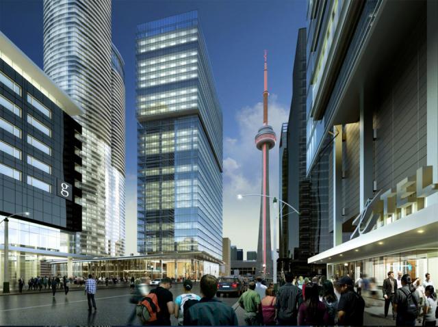
I like how the offset massing of the tower reflects the similar design element that you see halfway up on each of the condo towers. It evokes the image of shifting glaciers.
 
Last edited:
I like how something as simple as offsetting the upper half of the tower can redeem an otherwise pedestrian tower.

Bay Adelaide is such an utter failure that it's hard to stomach they're getting out of the gate first...
 
amazing renders but ENOUGH WITH THE STACKED/SLIDING BOXES!!!!! this is being way overdone. 43 Gerard, Karma, Studio (to a lesser extent), etc.

give me more Aura's and 50 bloors
 
Amen to that Steveve! Apparently aA thinks that since sliced bread was such a big deal a sliced box will be just as epic :rolleyes:
 
What a letdown. Just what this intersection didn't need.

There's no ornamental reason for the offset, no integral reason, no functional reason, no exciting reason, no innovative reason - no reason at all, actually. Just a lame, middling, useless gesture in place of any genuine innovation, creativity, or compositional sense. It makes me think of a 50's businessman putting his hip out trying to do this new thing called the 'twist'.
I like to look at aA through rose-coloured artistic glasses, but buildings like this confirm the other truth - that they can be a bunch of silver-heeled corporate sellouts just as gutless and boring as the rest of them.

aA does a lot of good work a lot of the time within their limits, but this building is just horrible, really, when you think of all the possibilities. Depressing, actually, given the surroundings. They could have done us all a favour, but I guess they thought maybe Karma would look less useless if they doubled it and turned it office space. If you're going to fail at a gesture, at least make it a good one. I don't think it's a stretch to say an opportunity has been lost here, and aA lost it. Southcore really, really badly needed something with art, brains and style, not another grey box. This ain't it. Congratulations.
 
Last edited:
I'm finding it difficult to be disappointed, as I was very much expecting yet another simple box all along. Of course in my heart of hearts I was hoping for something a little more engaging, but at this point even a token gesture of whimsy is enough to exceed my expectations.
 
everyone will say "its another box" with that said its a nice box

thing what people dont understand is this building is for office- they have a height limit here and going box ensures you can get good square footage-

though i would have preferred a taller non box
 
What bothers me most isn't its perfunctory attempt to avoid being a box while being a box, it's that it's covered in glass like everything else around it. It's as though architecture now has been reduced to mere shapes – is it a box or not? – because the cladding is all taken for granted: just throw a glass curtain over it and it's done.
 
What bothers me most isn't its perfunctory attempt to avoid being a box while being a box, it's that it's covered in glass like everything else around it. It's as though architecture now has been reduced to mere shapes – is it a box or not? – because the cladding is all taken for granted: just throw a glass curtain over it and it's done.

There's nothing wrong with glass. It's the colour and shape that's the issue. TD tower is a box but it's black glass. FCP is a box, but it's white (glass?), Scotia is also somewhat a box, but it's red. RBC tower has more interesting design and it's gold coloured glass.
 
I'm not sure what all the criticism is about. Most office buildings are boxes. This one is a box. Life goes on.

Some seem to want soemthing iconic with every project.
 
There's nothing wrong with glass. It's the colour and shape that's the issue. TD tower is a box but it's black glass. FCP is a box, but it's white (glass?), Scotia is also somewhat a box, but it's red. RBC tower has more interesting design and it's gold coloured glass.

TD is steel and glass though, which I find far more solid looking. I generally like glass towers, but like many here I long for something with at least a touch of metal or stone. With the loss of a number of our more prominent concrete structures, I'm almost nostalgic for the pre-cast days of the 90s and early 00s!
 
TD is steel and glass though, which I find far more solid looking. I generally like glass towers, but like many here I long for something with at least a touch of metal or stone. With the loss of a number of our more prominent concrete structures, I'm almost nostalgic for the pre-cast days of the 90s and early 00s!

I'm not really into pre-cast unless it's something like CT/TD tower. It might end up being a box and look like 1 Yonge. I'll take 16 York design to 1 Yonge St.
 

Back
Top