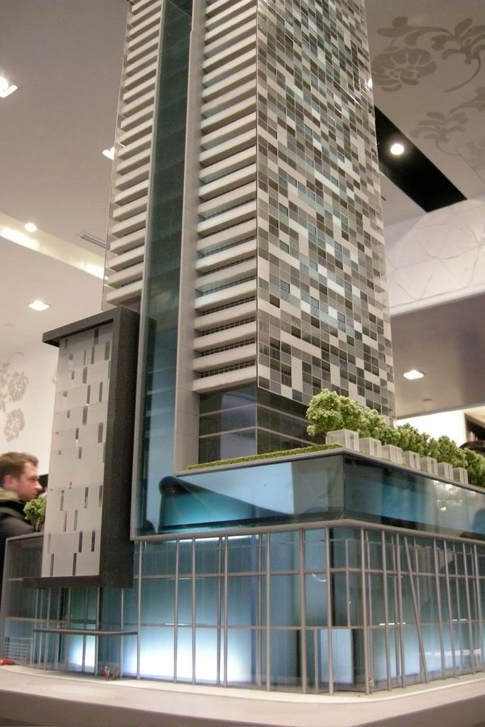
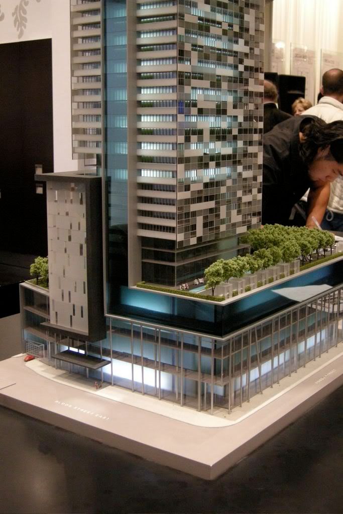
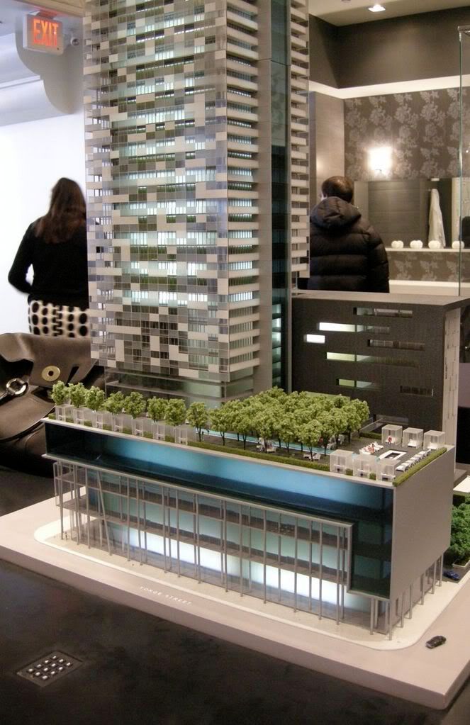
My preference is for H+P's current design but, to be honest, none of those proposals strikes me as particularly refined.
In all cases, something is just a bit off. The Kolter proposal, which is now almost 10 years old, has aged badly. Very few buildings like it were built in Toronto, but examples of this sort early 2000s architecture, like Q1 in Australia's Gold Coast, look somewhat comical today. The Bazis proposal (aka: "The Clippers") also had a sort of resort town silliness to it; the checkered pattern was interesting but the crown of fins was ridiculous. H+P's latest one is probably the most tasteful, but the giant recessed tulip is a somewhat incongruous match with the standard box shape of the tower itself.
I know that Toronto architects are trying harder to dress up the standard glass box. Somehow the slanted balconies on U condos and the hat on Casa can pull it off, while the tulip on 1 BE looks a little bizarre.