|
|
|


Recent content by egotrippin
-

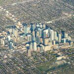
Markham Gallery Towers | 102.51m | 30s | Remington Group | BDP Quadrangle
Need to get out and get some better shots next time I'm in Markham, but this tower is looking quite sharp. There's a nice urban streetwall developing in there too, although this is all I managed to capture for the time being.- egotrippin
- Post #40
- Forum: Buildings
-
Hamilton Hamilton Passive House Modular Housing | ?m | 3s | CityHousing Hamilton | Montgomery Sisam
The irony considering the whole idea behind pre-fab modular assembly is speed of construction...- egotrippin
- Post #31
- Forum: Buildings
-
Toronto St Lawrence Centre Redevelopment | ?m | ?s | CreateTO | Hariri Pontarini
Why can't we have both?- egotrippin
- Post #400
- Forum: Buildings
-
Multiplexes
I think it comes down to cost. Metal siding and EIFS are cheap and easy to install compared to masonry.- egotrippin
- Post #173
- Forum: Buildings
-
Toronto Kennedy Co-Ops | 142.55m | 41s | CreateTO | Henriquez Partners
Same motif but in a different colour for each building would look great, or even just one in a contrasting colour. I'm thinking terracotta-esque, burnt orangey-red or something like that.- egotrippin
- Post #88
- Forum: Buildings
-
Mississauga M3 at M City | 260.29m | 77s | Rogers Real Estate | Arcadis
Population wise, maybe, but Mississauga lacks the developed core of a standalone city. It's still to some degree a bedroom community to Toronto with a lot of people commuting there for work. There's no CBD to speak of, with many of its bigger employers spread out in campus-style office parks...- egotrippin
- Post #616
- Forum: Buildings
-
GO Transit Electrification | Metrolinx
To that effect I use GO to get from Scarborough to downtown when I go to things like concerts after work. It's wayyy faster than the TTC if you're close to the Lakeshore East line and it's almost as cheap from Scarborough station ($3.70 one-way). Very convenient.- egotrippin
- Post #3,407
- Forum: Transportation and Infrastructure
-
Toronto Concord Sky | 299m | 85s | Concord Adex | Kohn Pedersen Fox
Even the most basic of our heritage buildings have more architectural interest and merit than this terminally bland wedge of glass. In the case of this project the old facades at base are the only thing providing a modicum of visual interest.- egotrippin
- Post #3,136
- Forum: Buildings
-
Toronto The Well | 174.03m | 46s | RioCan | Hariri Pontarini
Gotta head out to the east end, most options at the Birchcliff are still under 5-6 bucks these days; regular coffee around 3 bucks. That's kind of how it goes though, prices decrease the farther away you are from the core. I imagine the rents at Kingston/Birchmount are a touch lower...- egotrippin
- Post #6,449
- Forum: Buildings
-
Zoning Reform Ideas
Capacity would be added to meet growing demand, not necessarily provide enough surplus to drive prices down meaningfully. I'm not saying more supply would hurt things, but it seems the type of supply we're adding now isn't helping much. And seeing as there are constraints in how much can be...- egotrippin
- Post #1,197
- Forum: Design and Architectural Style
-
Zoning Reform Ideas
https://www.theguardian.com/lifeandstyle/2024/mar/19/end-of-landlords-surprisingly-simple-solution-to-uk-housing-crisis So I'll preface by saying this is an article specific to the UK, so there are obviously differences in their housing makeup and whatnot, but I do see some parallels to our...- egotrippin
- Post #1,189
- Forum: Design and Architectural Style
-
Vaughan VMC Block 4S | 180.35m | 55s | QuadReal | Giannone Petricone
Agreed, massing could use work. I just hope some colour makes the cut when it comes time for changes.- egotrippin
- Post #11
- Forum: Buildings
-
Vaughan VMC Block 4S | 180.35m | 55s | QuadReal | Giannone Petricone
Yea I've gotta say I (potentially) love that green glass brick at grade, reminds me of the stuff they used over at 50 Ossington (Formula Fig). The rest of the tower? It's vivid bordering on garish, but it'll certainly stand out. VMC is terminally depressing and could use something bold. And...- egotrippin
- Post #9
- Forum: Buildings
-
Toronto École Secondaire Greenwood | ?m | 4s | Conseil Scolaire Viamonde | Snyder Architects
Wartime bunker before, modern penal now. Gotta love that lone colourful window frame too. The design is very human, the children will be very happy.- egotrippin
- Post #24
- Forum: Buildings
-
Vaughan 88 Steeles Avenue West | 185.55m | 58s | Sisley Honda | WZMH
I'm starting to think it actually would. Whoever's in charge of colour decisions would go into complete sensory overload and spontaneously combust. It's the only logical explanation at this point.- egotrippin
- Post #13
- Forum: Buildings