Toronto Festival Tower and tiff Bell Lightbox | 156.96m | 42s | Daniels | KPMB

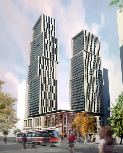
Is that the building with the wind turbines in the roof that I see?

Yep, that one now looks like this
3277495750_b6930439d7.jpg


also the renders on the previous page don't show 290-294 Adelaide.... and I guess 224 King St. W and various other 30-40 storey proposals within 1-2 blocks would also be relatively close
 
Last edited:
4 Feb 2010:

dsc00380y.jpg


I've decided I like this building, but think its main flaw is the wrong setting for this architectural style/massing. It would fit in better in the Yonge/Bloor area, or perhaps near Dundas Square. Here, it overwhelms the red brick 'hood. The second anti-urban crime committed is the blank wall facing Widmer--glass at street level would've made a nice cafe corner.

I'd love to see that wall of black brick facing Widmer lined with back-lit movie posters. Something like what the Cumberland theatre in Yorkville has in that little alley to Bloor. That would really help the podium relate to pedestrians,
 
dsc00376j.jpg

Urbandreamer

Wow great picture urbandreamer. I just love it!! The glass is so sharp, so clean.
I was wondering if this building is now the Toronto answer to the Fairmont just now opening in Vancouver.

from uncle Bhuddha at www.flickr.com

4268096114_af863aa2c1_b.jpg
 
I am not a big fan of TIFF but thanks to Cal's comparison post with Fairmont in Vancouver, I realize it could be worse. The Fairmont looks like a transporter accident on Star Trek. How many building designs are fused into one tower? It's not PoMo. Is it Post Post Modern or PoPoMo?
 
Yep, that one now looks like this
3277495750_b6930439d7.jpg


also the renders on the previous page don't show 290-294 Adelaide.... and I guess 224 King St. W and various other 30-40 storey proposals within 1-2 blocks would also be relatively close

Hmm, I think I saw it before... It looks like Moscow's City of Capitals twin towers, but on smaller scale (in Moscow, they are 302m and 257m):

0_1372b_6abc533e_XL.jpg
 
^No. You've got to look at the gorgeous public art and details surrounding Fairmont. The quality of landscape design is much higher in Vancouver than in Toronto. Take a look here:

http://forum.skyscraperpage.com/showthread.php?t=138029&page=33

The floorplans of FPR are indeed crap, but the design details, with the poem wrapping around the building is sheer genius!
 
The glass on the Fairmont is much nicer than Tiff. If Menkes had gone with large pieces of glass to match the seamless nature of the balconies, we'd have a winner. As it stands, the regular windows look a little too busy compared to the slick balconies.
 
I prefer the Vancouver Fairmont over our TIFF tower. Much nicer glass.. two different tones were used it seems, interesting detailing on the balconies, and fabulous job of engaging the street!
 

Back
Top